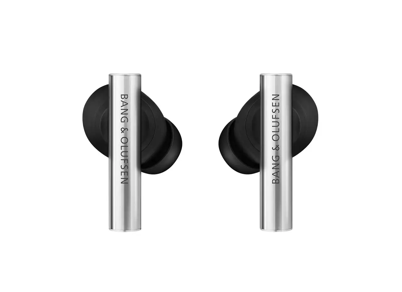
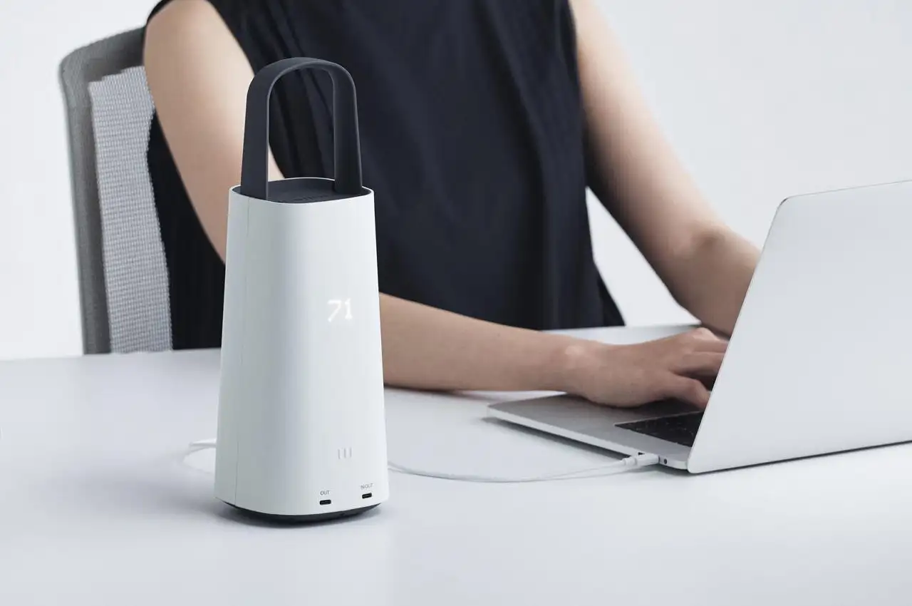
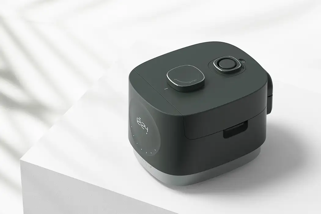
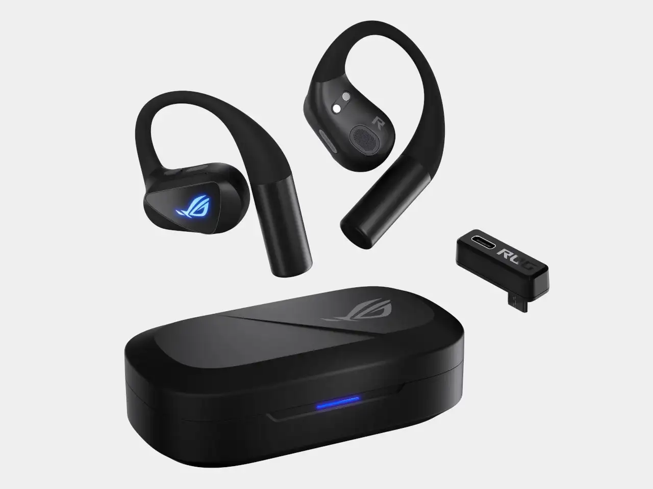
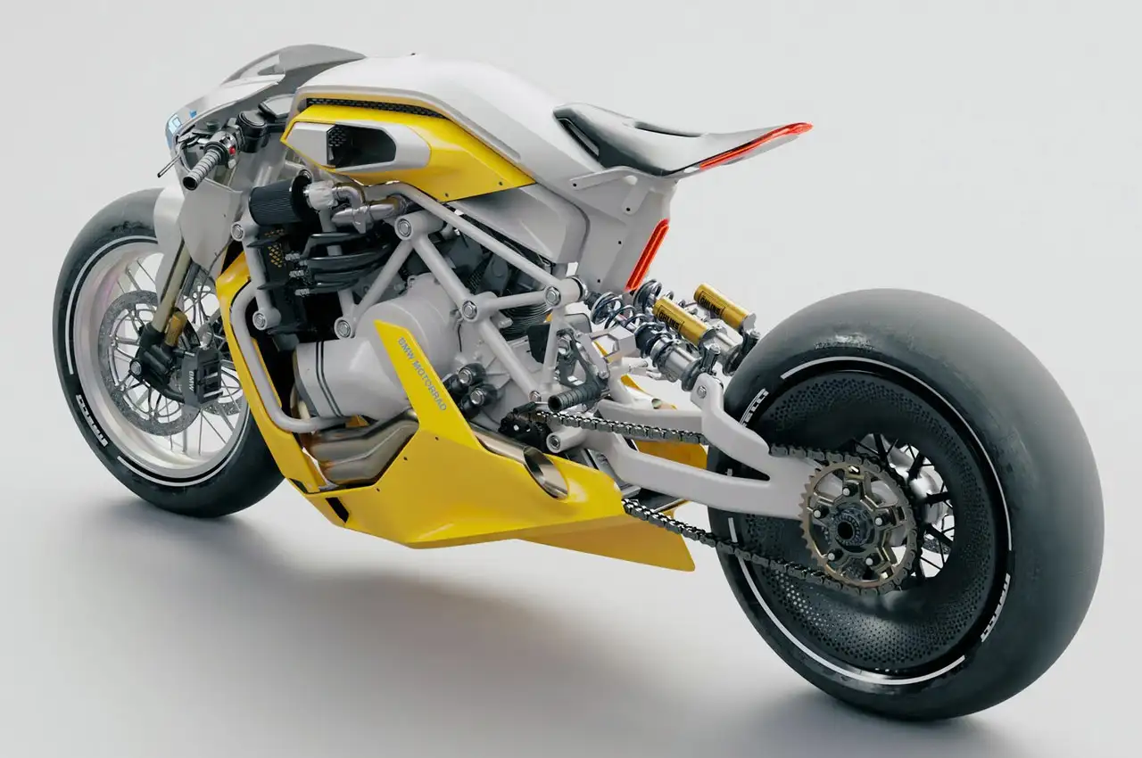
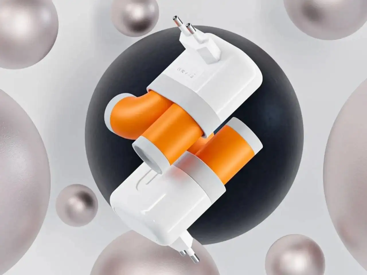
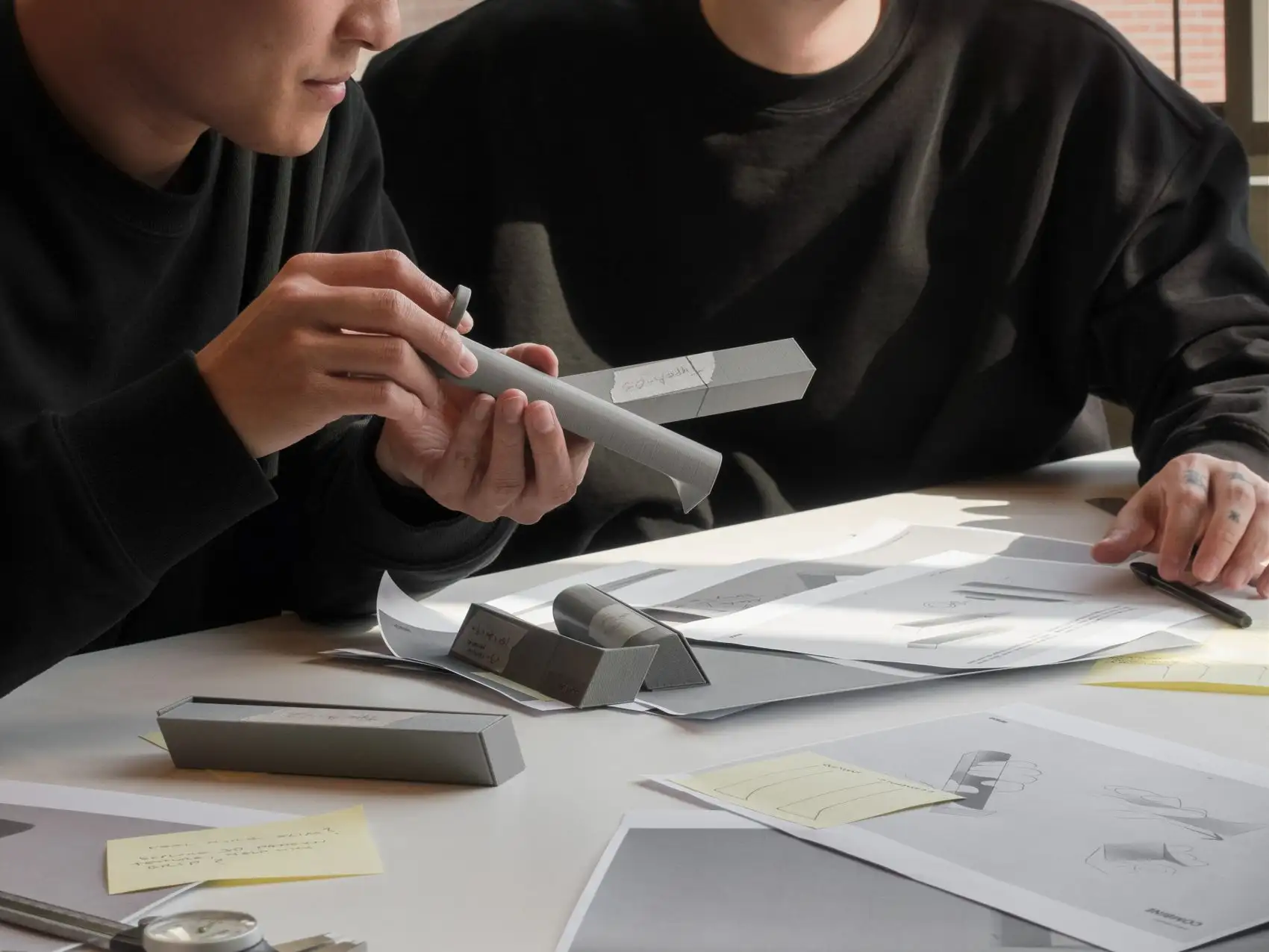
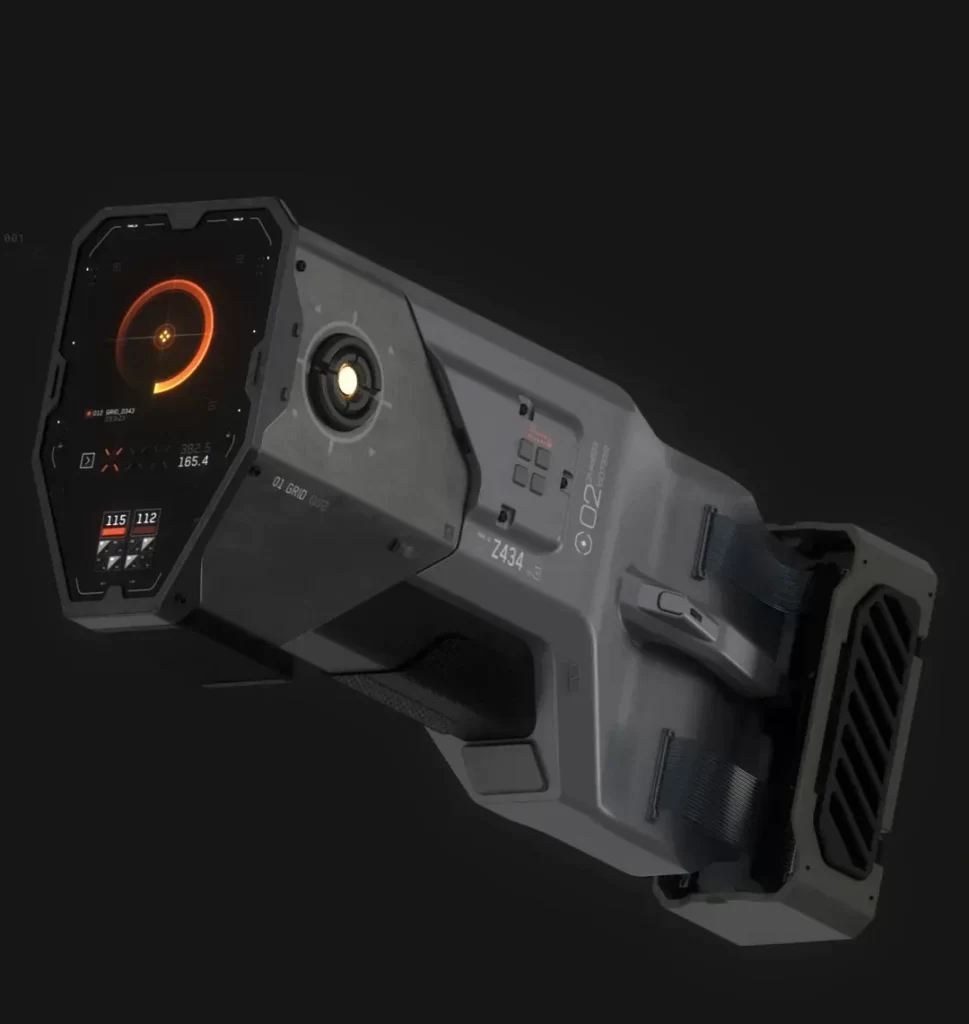
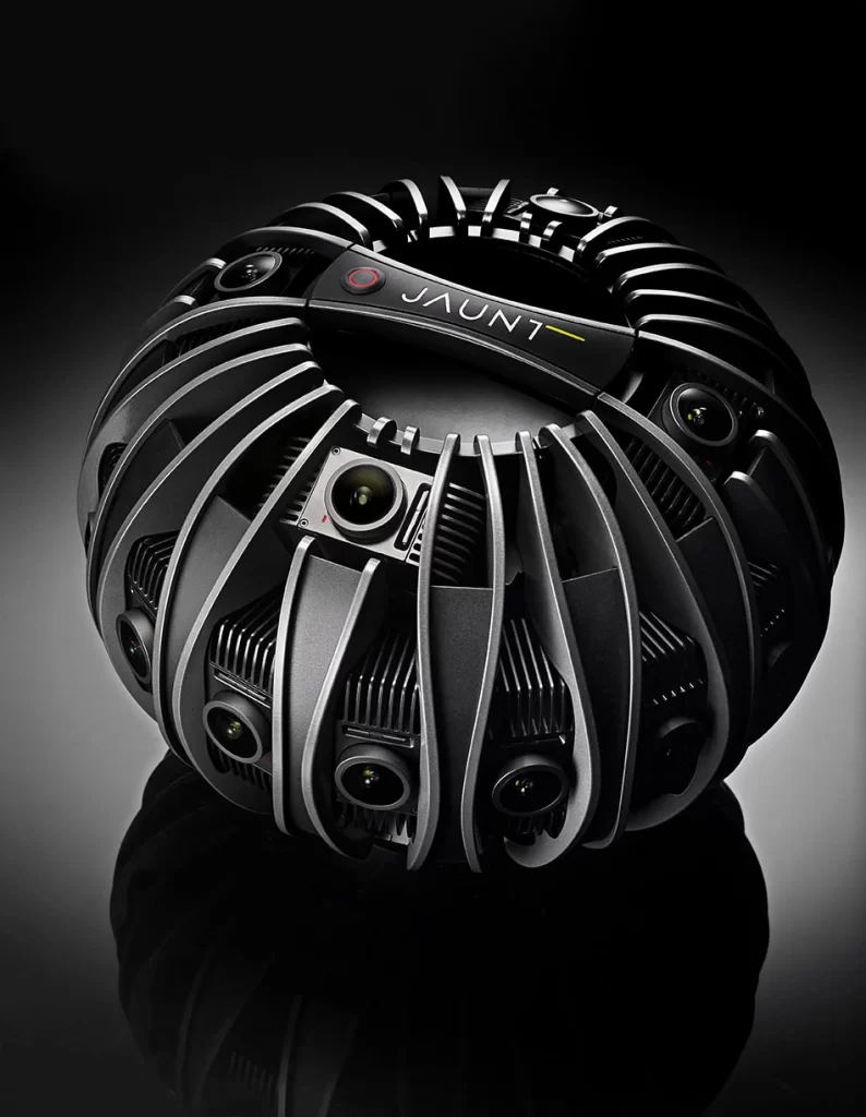
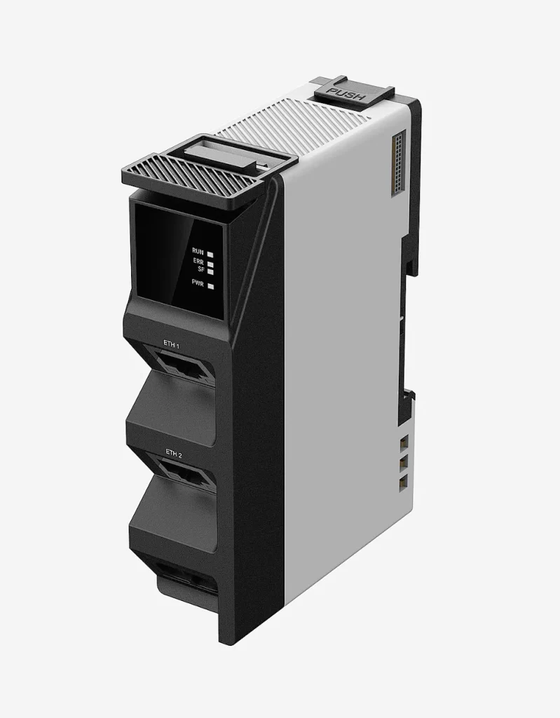
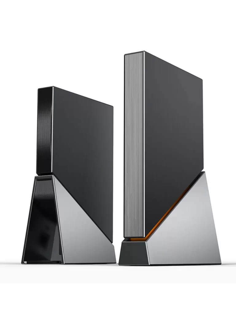
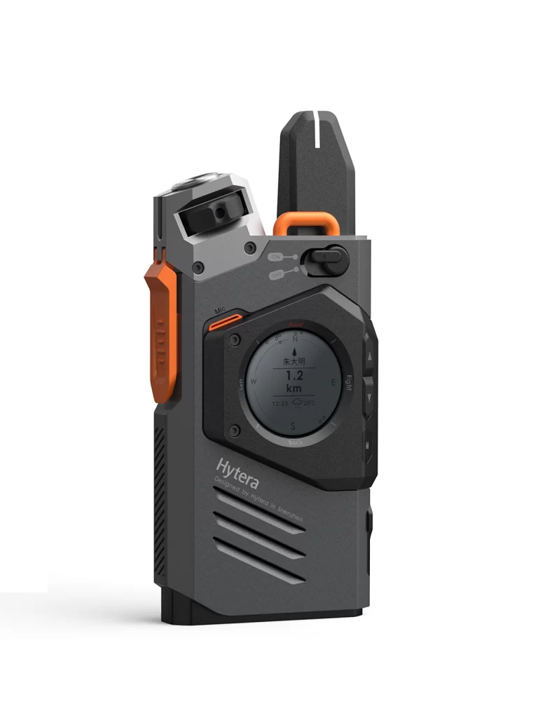
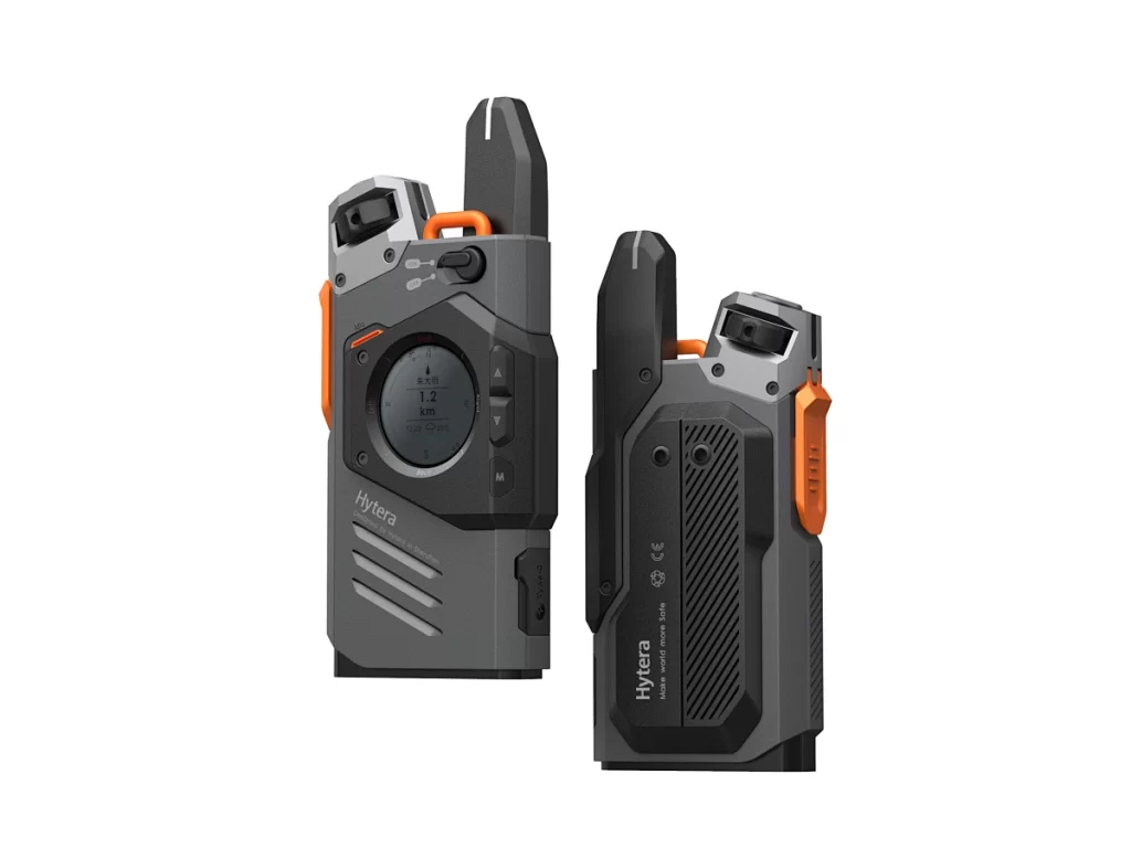
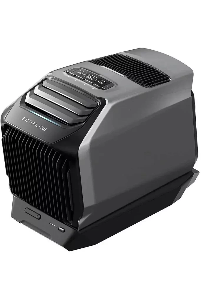
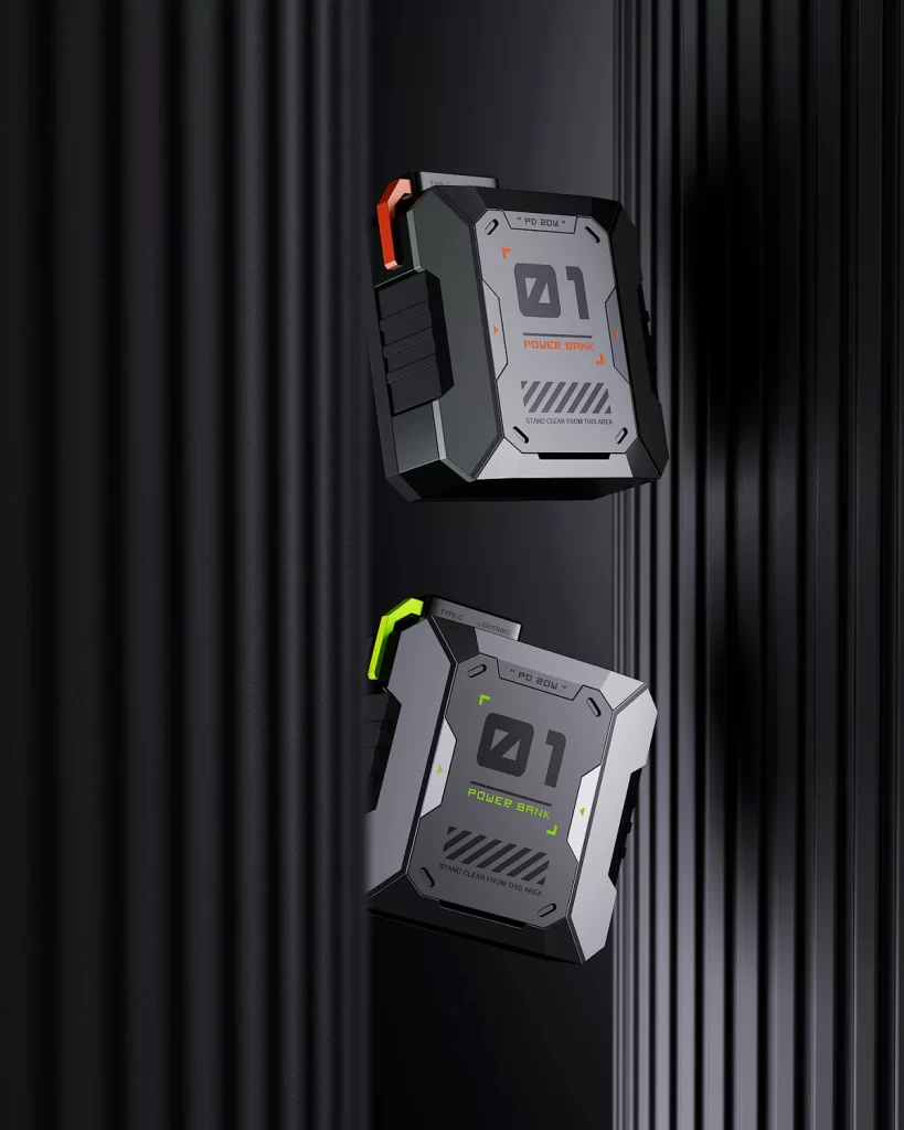
NINEIDEA:硬朗产品设计就像设计界的 “硬汉”,浑身透着力量感和不妥协的硬核美学。就是把 “不装、不软、不凑合”变成看得见摸得着的样子。
形状:棱角越多越硬核
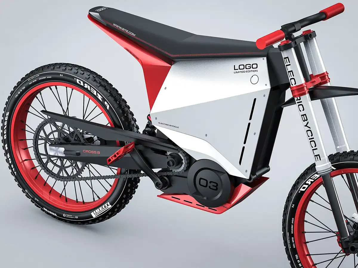
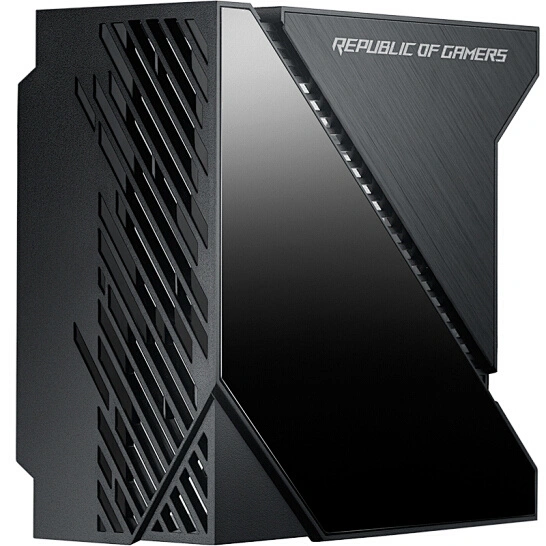
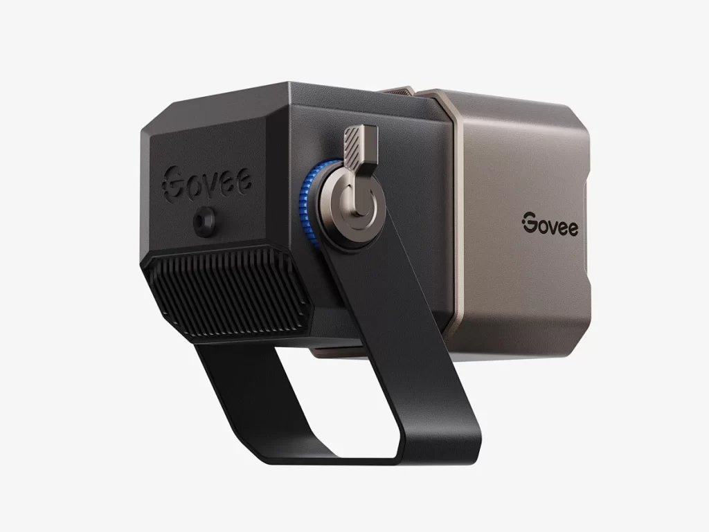
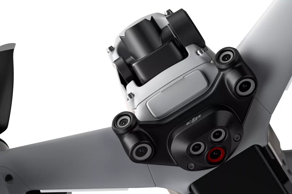
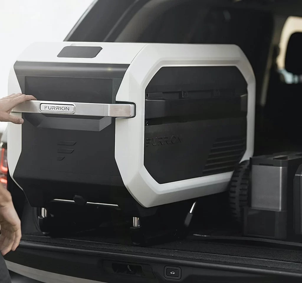
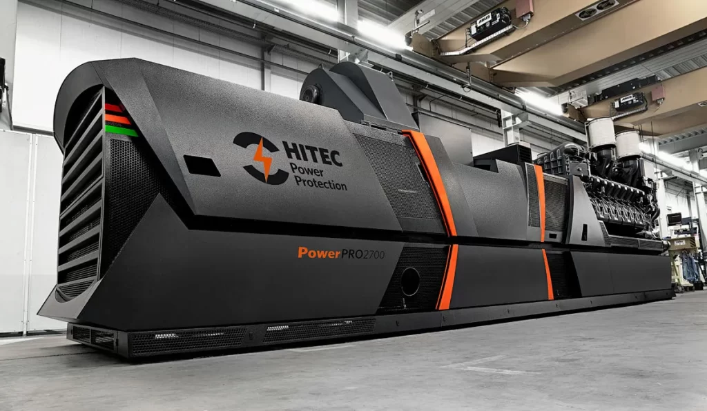
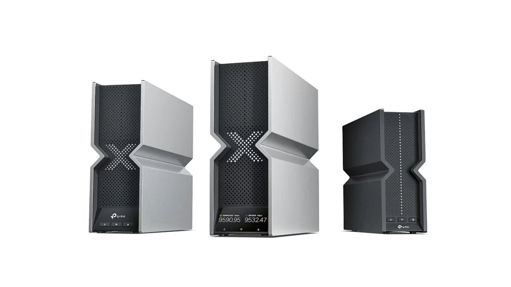
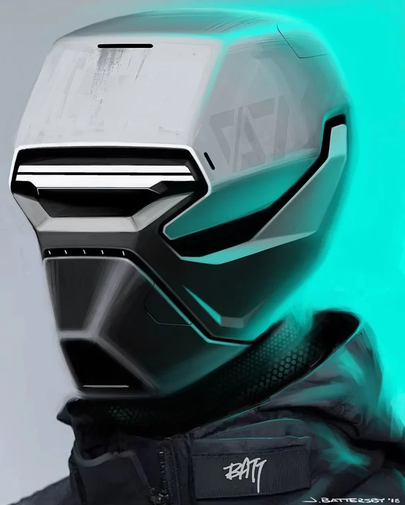
硬朗设计最爱 “直来直去”:线条要硬,拒绝圆滚,偏爱直角、斜线、方正的轮廓,比如 Jeep 越野车的方盒子车身,G-Shock 手表的棱角外壳,看着就像 “不好惹” 的家伙。
结构要 “露骨”:户外背包的骨架、机械键盘的按键支架直接露出来,不藏不掖,就像把 “我很结实” 写在脸上。举个栗子:你看路上的坦克 300,方方正正的车头配直线腰线,一眼就能联想到 “能扛能打”,这就是用形状传递 “硬核” 的信号。
材质:越 “糙” 越有范儿
硬朗设计不追求光滑精致,反而喜欢 “带点脾气” 的材质:
金属、塑料、粗布是常客:比如自行车的铝合金车架(冷冰冰但很刚)、工装裤的耐磨帆布(粗糙但抗造),甚至家具故意保留焊接的螺丝、裸露的砖墙,看着像没做完,其实是故意 “露一手” 材质的原始感。
颜色要 “冷”:黑色、深灰、军绿为主,很少用粉色、黄色这种柔和色,就像穿着皮衣的硬汉,自带生人勿近的气场。比如家装工业风,用铁艺吊灯、水泥墙面,不用解释,一眼就知道 “这风格很刚”。
功能:好用比好看更重要
硬朗设计的核心是 “能干活”,所有设计都是为了 “实用” 服务:
多口袋工装裤:裤子上七八个口袋,不是为了好看,是真的能装工具、手机、钥匙,实用性拉满。
户外鞋的防滑底:鞋底的深纹路、凸起的颗粒,既是设计又是功能,下雨爬山不打滑,好看和好用二合一。就像机械键盘,按键回弹快、声音脆,看着方方正正没啥装饰,但打字爽、耐用,这就是 “把好用变成设计”。
混搭:老派 + 科技,碰撞出个性
硬朗设计喜欢 “穿越感”,把复古设计元素和现代科技风格揉在一起:
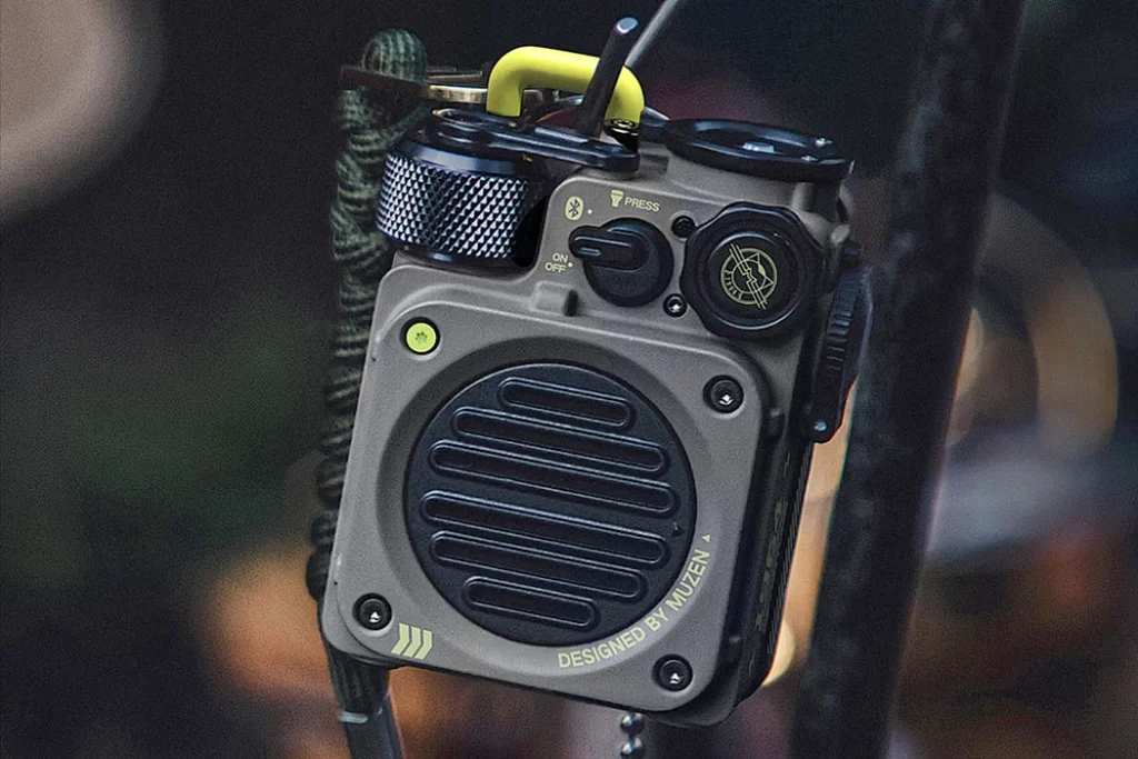
老式收音机的旋钮 + 蓝牙功能:外观像爷爷年代的物件,却能连手机放歌,既有怀旧感又有新鲜感。
汽车的复古圆灯 + LED 光源:比如福特 Bronco,车灯看着像几十年前的款式,但里面用的是最新的 LED 灯,老样子里藏着新科技。这种 “新旧混搭” 让产品既有历史的厚重感,又不落后于时代,就像穿工装裤配智能手表,硬核又时髦。
硬朗设计到底啥气质?
简单说,就是 “不装、不软、不凑合”—— 形状硬邦邦,材质糙兮兮,功能实打实,还带点 “老物件 + 新科技” 的混搭个性。它适合喜欢 “有态度” 的人,比如觉得普通产品太软萌、太精致,就爱这种 “能抗造、有脾气” 的设计。下次看到方方正正、金属感强、功能一目了然的东西,那大概率就是硬朗风格啦!
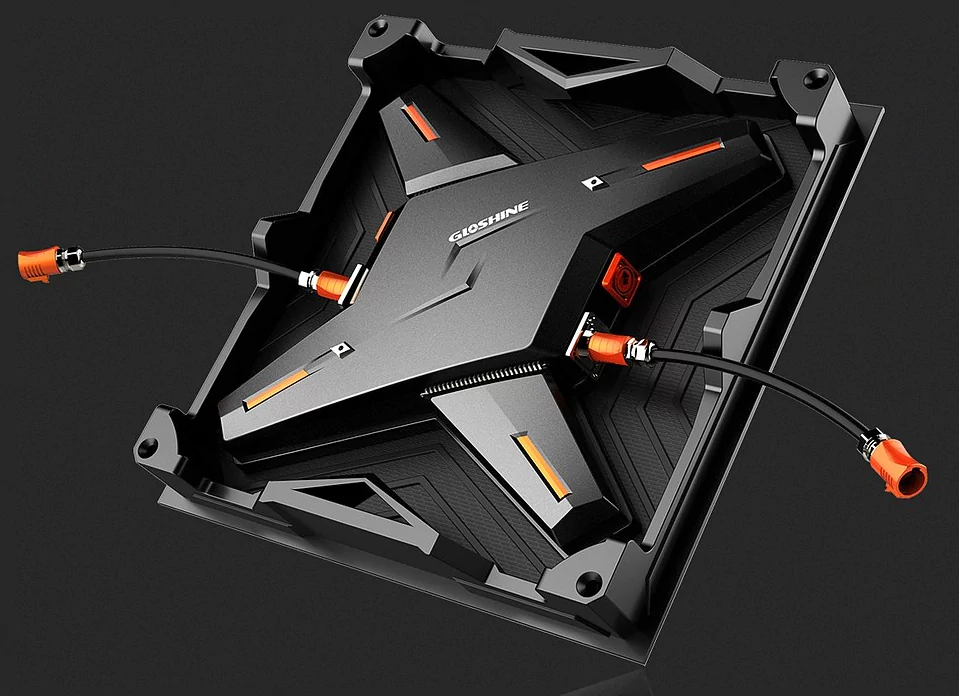
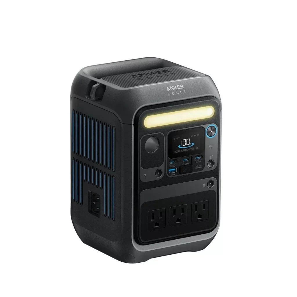
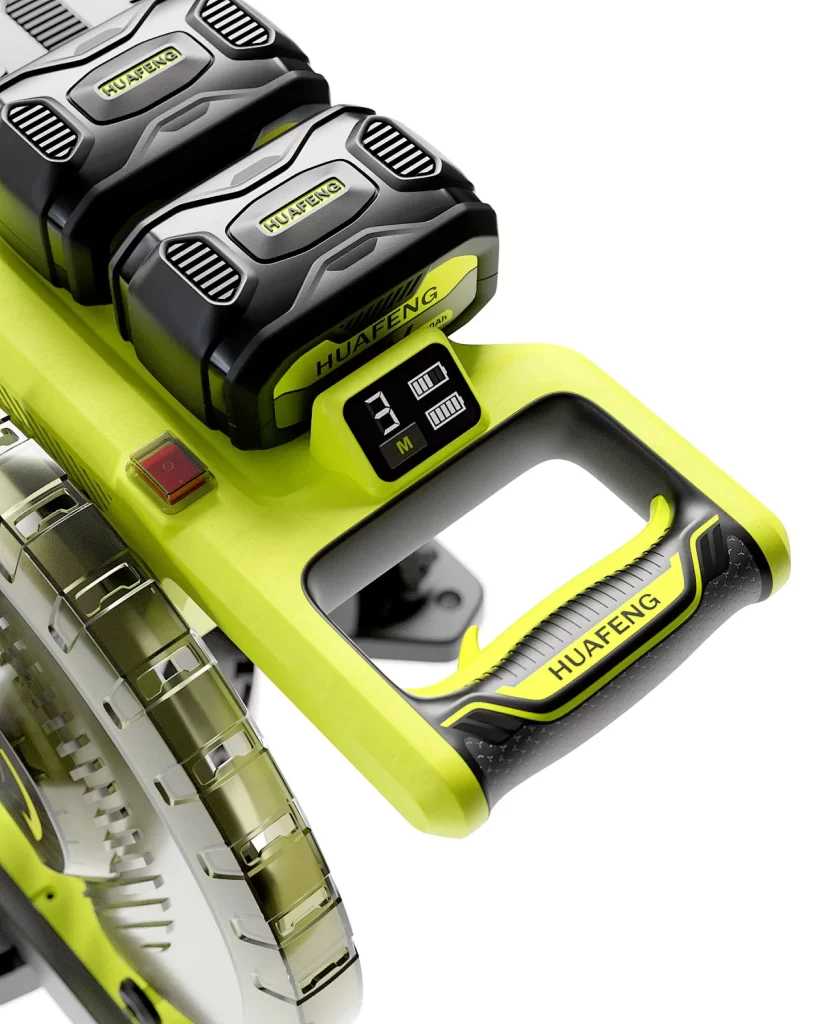
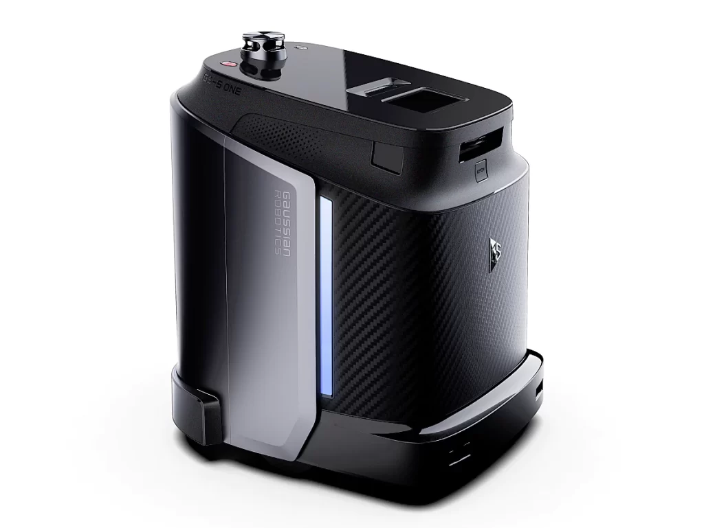
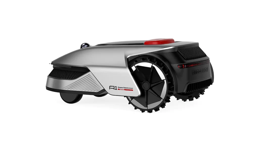

NINEIDEA:Tough product design is like the “tough guy” in the design industry, exuding a sense of power and uncompromising hardcore aesthetics. It’s about turning ‘not pretending, not being soft, not making do’ into something visible and tangible.
Shape: The more edges, the harder the core
Hardcore design loves to be “straight and straightforward”: the lines should be hard and reject roundness, preferring right angles, diagonal lines, and square contours, such as the square box body of Jeep off-road vehicles and the angular shell of G-Shock watches, which look like “difficult to mess with” guys.
The structure should be ‘exposed’: the skeleton of the outdoor backpack and the key bracket of the mechanical keyboard should be directly exposed, without hiding or hiding, just like writing ‘I am very sturdy’ on the face. For example, if you look at Tank 300 on the road, with a square front and a straight waistline, you can immediately associate it with “able to carry and fight”, which is the signal of using shape to transmit “hardcore”.
Material: The rougher the texture, the more stylish it is
Hardcore design does not pursue smoothness and delicacy, but instead prefers materials that are “a bit temperamental”:
Metal, plastic, and coarse cloth are common items: for example, the aluminum alloy frame of a bicycle (cold but stiff), the wear-resistant canvas of work pants (rough but durable), and even furniture intentionally retaining welded screws and exposed brick walls, which may seem unfinished but actually intentionally “expose” the original feel of the material.
The color should be “cool”: black, dark gray, and military green are the main colors, and soft colors such as pink and yellow are rarely used, just like a tough guy wearing a leather jacket, with an aura of avoiding strangers. For example, in the industrial style of home decoration, using iron chandeliers and cement walls, without explanation, one can tell at a glance that ‘this style is very rigid’.
Function: Good usability is more important than good appearance
The core of tough design is “being able to work”, and all designs are designed to serve “practicality”:
Multi pocket work pants: There are seven or eight pockets on the pants, not for looks, but for the ability to hold tools, phones, keys, and practicality.
The anti slip sole of outdoor shoes: The deep patterns and raised particles on the sole are both design and function, making it suitable for rain and mountain climbing without slipping. It combines good looks and functionality. Just like a mechanical keyboard, the keys bounce back quickly, the sound is crisp, and it looks square without much decoration, but typing is cool and durable. This is what “turning good use into design” means.
Mix and match: old school+technology, collide to create personality
Hardcore design likes a sense of time travel, blending retro elements with modern technology:
The knob and Bluetooth function of the old-fashioned radio: it looks like an object from the grandfather’s era, but it can be connected to a phone to play music, which has both nostalgia and freshness.
Retro round lights and LED light sources for cars: For example, the Ford Bronco has headlights that look like models from decades ago, but use the latest LED lights inside, hiding new technology in the old style. This “mix and match of old and new” gives the product a sense of historical weight without falling behind the times, just like wearing work pants with a smartwatch, hardcore yet fashionable.
What is the temperament of tough design?
Simply put, it means “not fitting, not soft, not making do” – the shape is tough, the material is rough, the function is practical, and it also has a mixed personality of “old objects+new technology”. It is suitable for people who like “attitude”, such as those who think ordinary products are too soft, cute, and exquisite, and love this kind of “resistant and temperamental” design. The next time you see something square, metallic, and functional at a glance, it’s most likely a rugged style!


