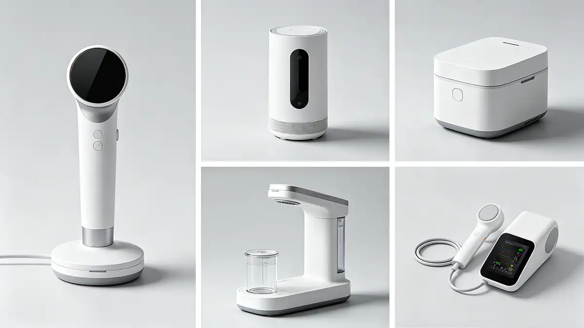
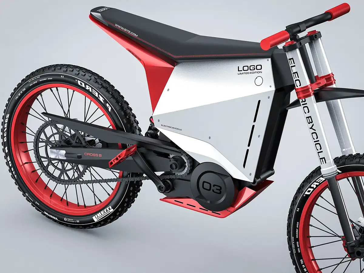
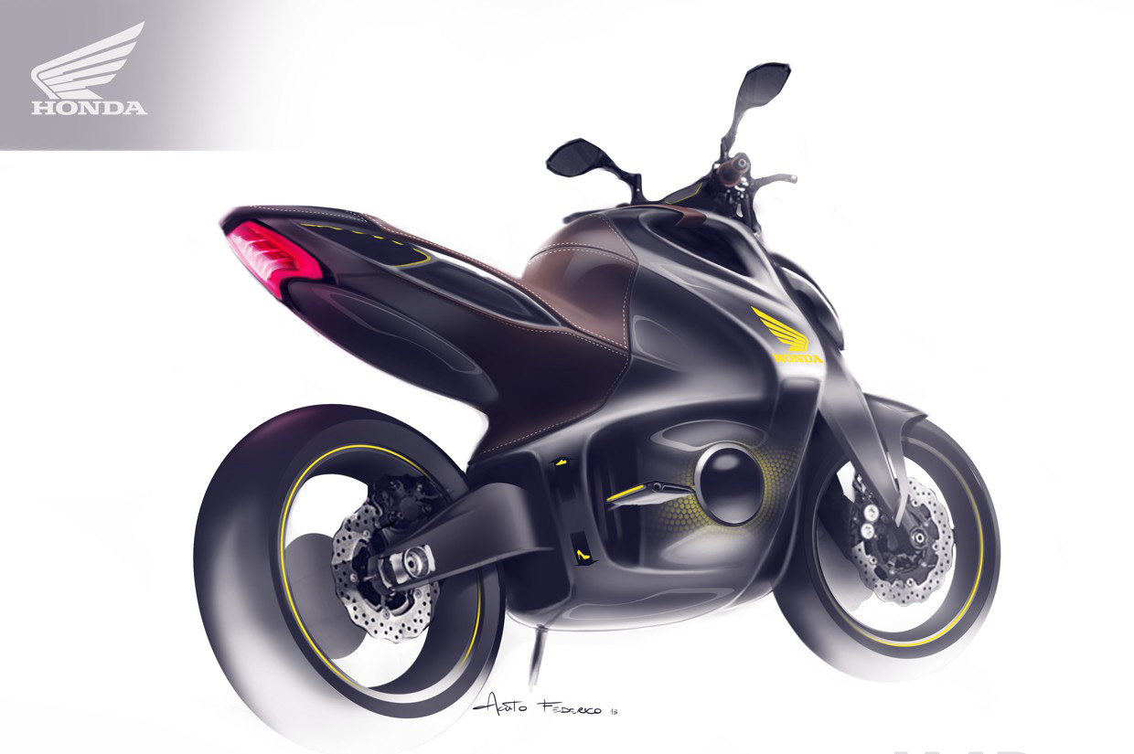
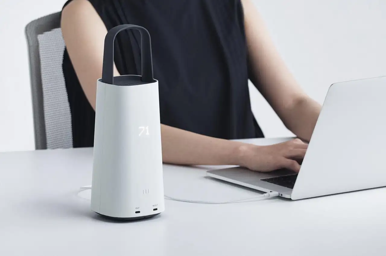
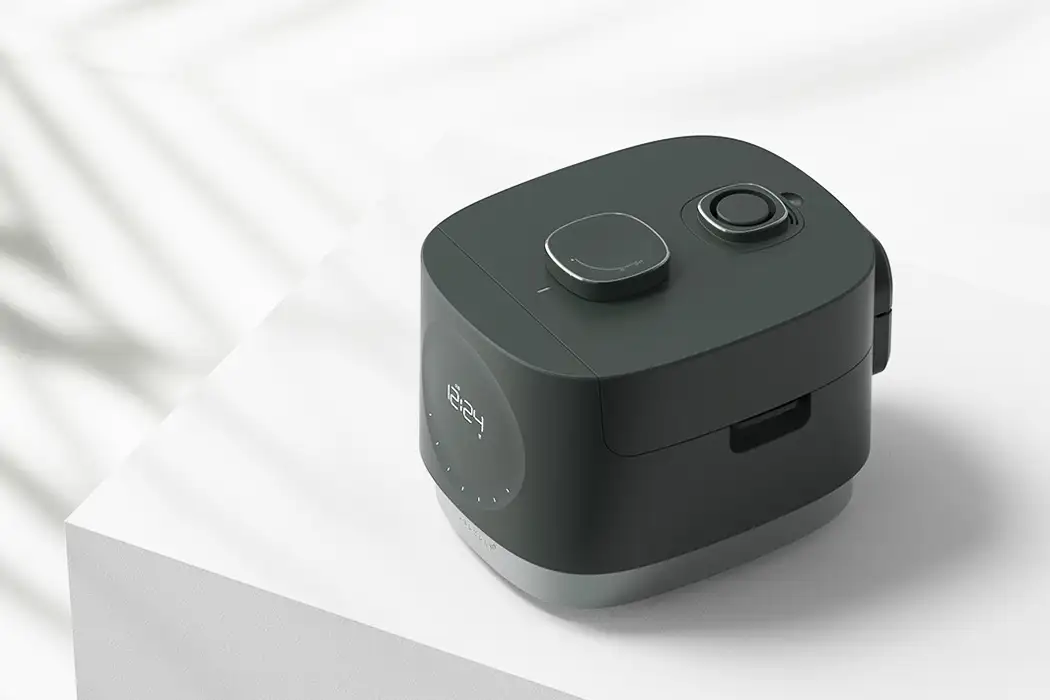
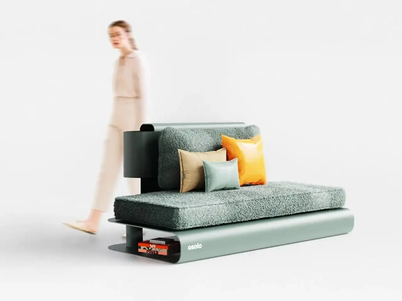
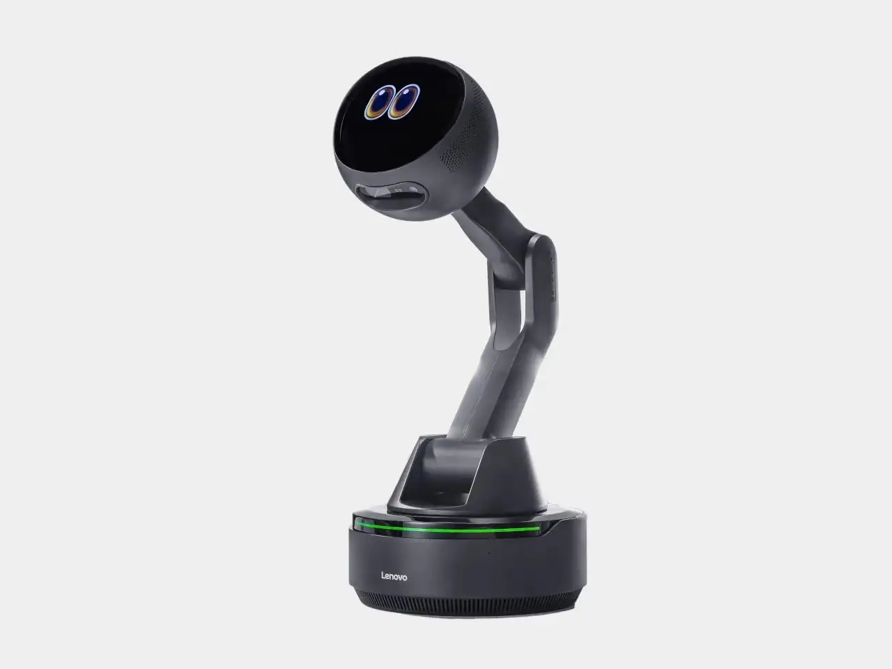
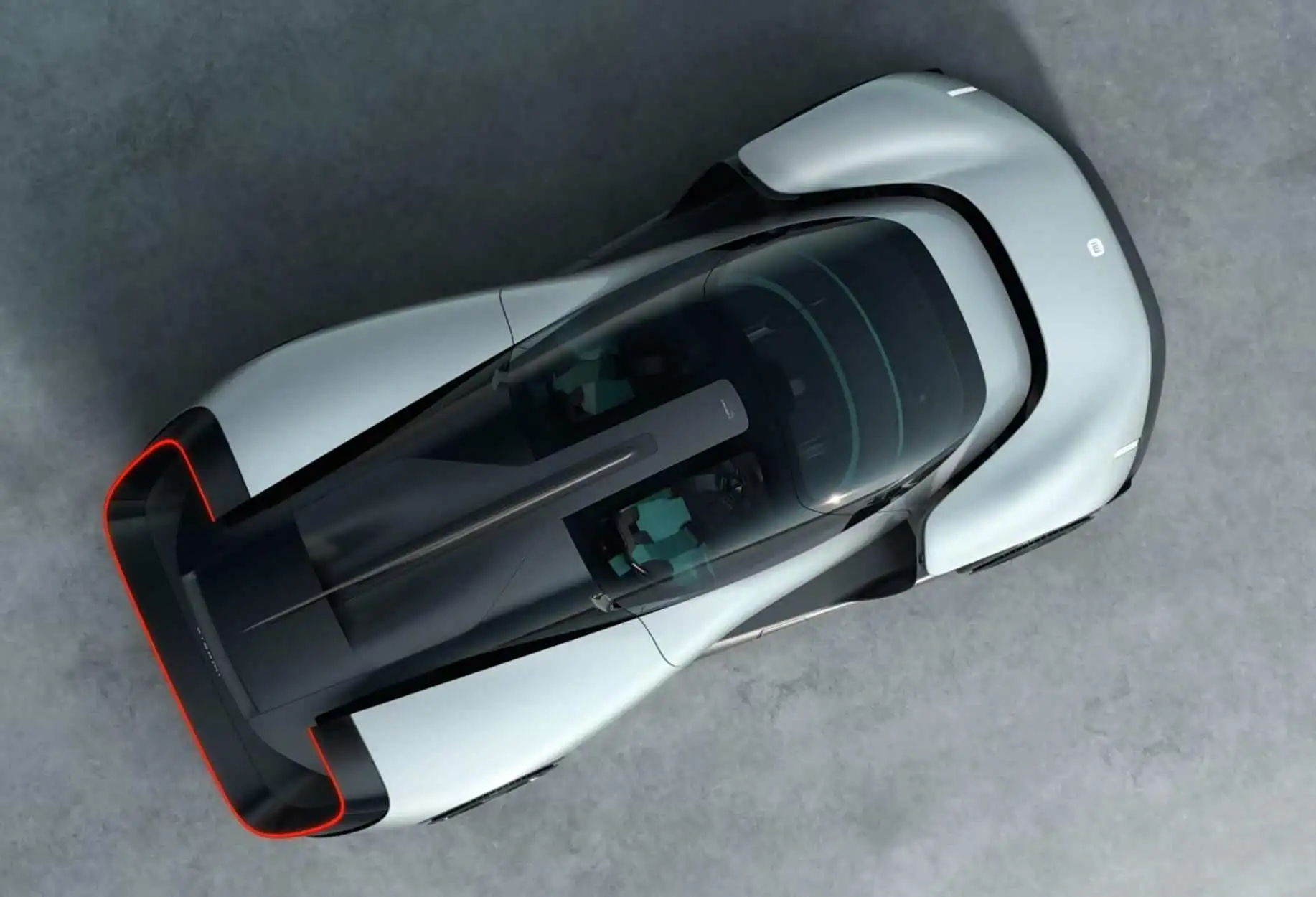
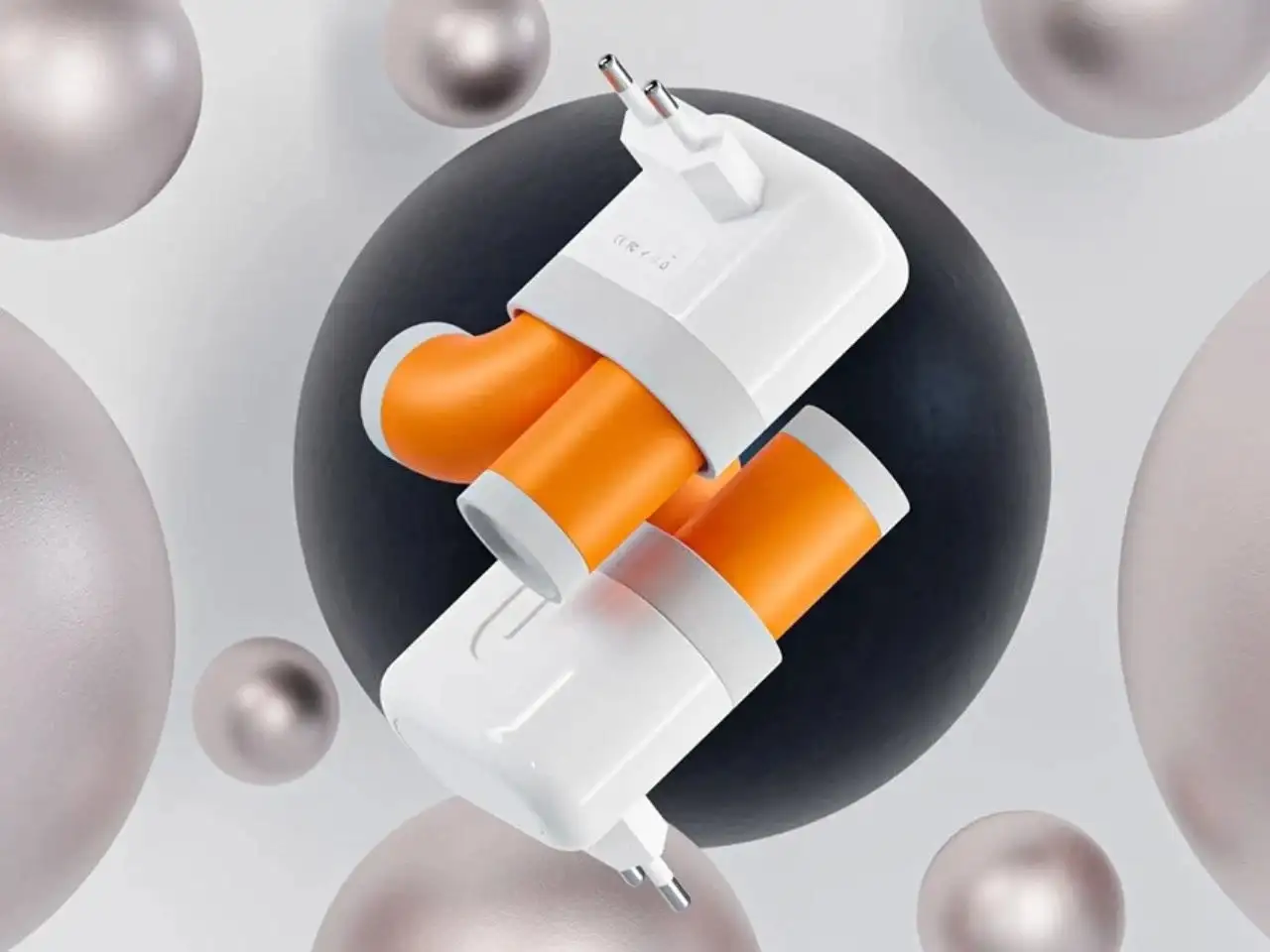
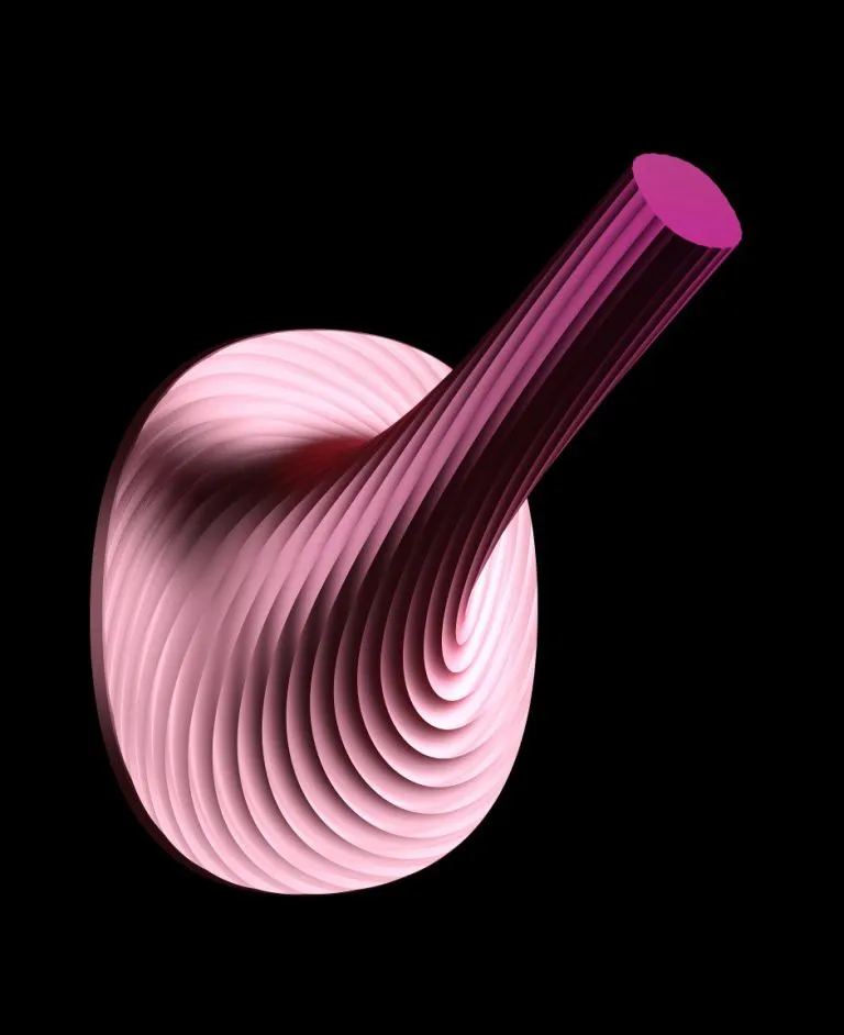
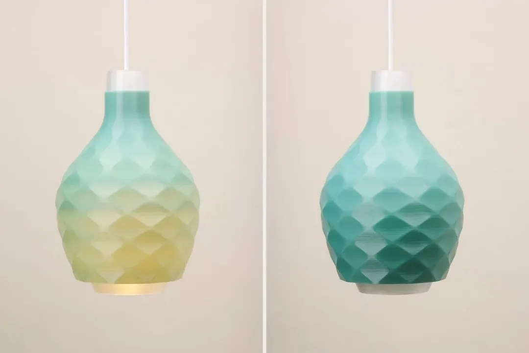
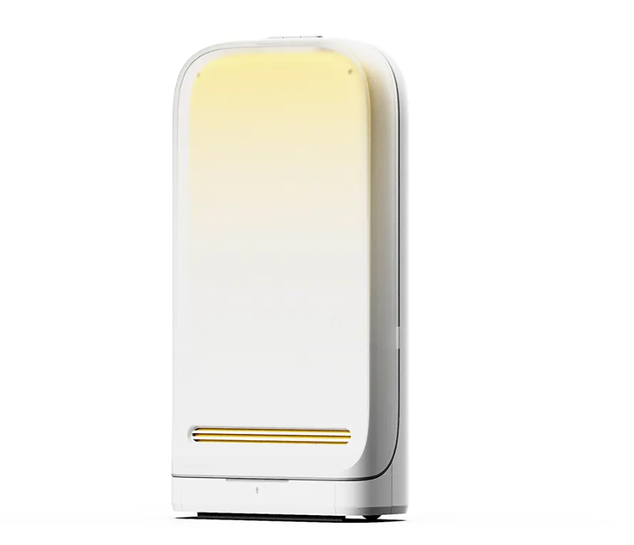
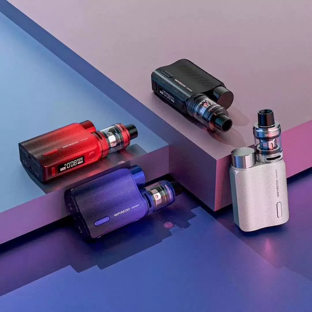
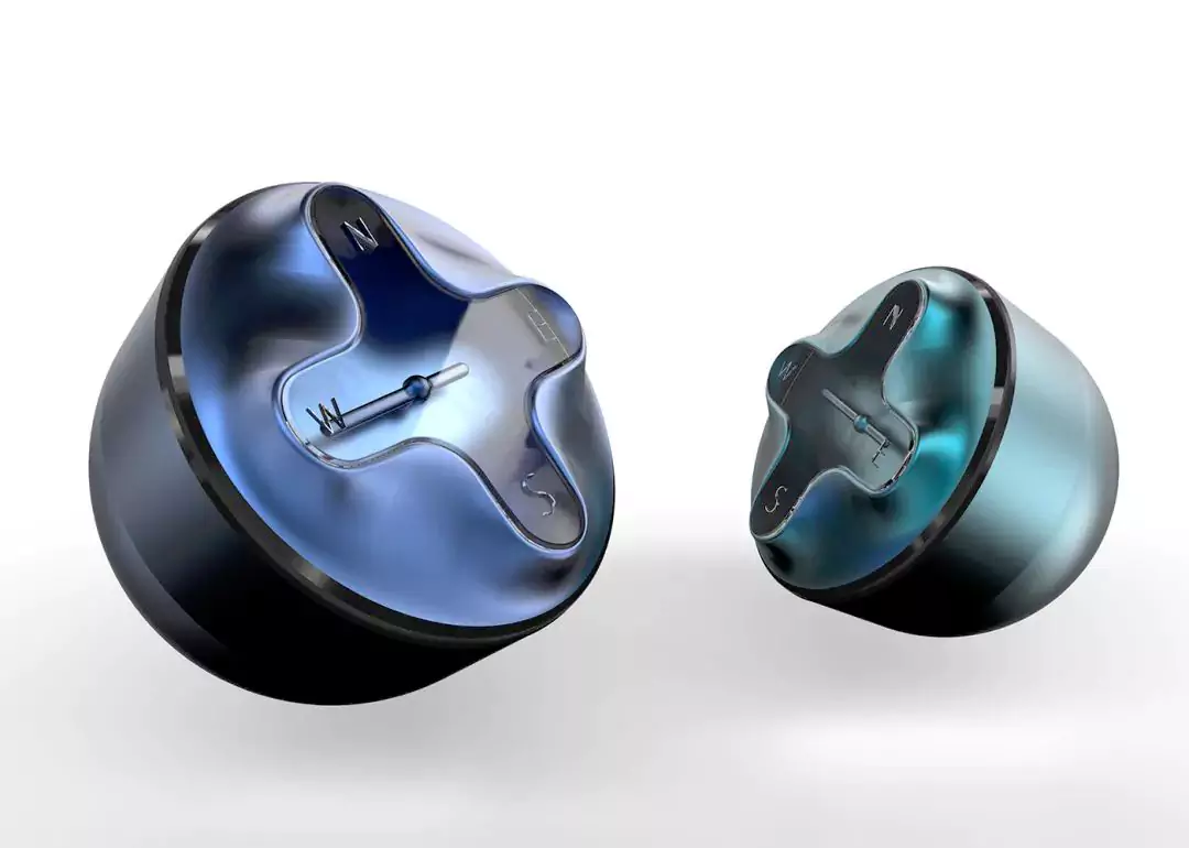
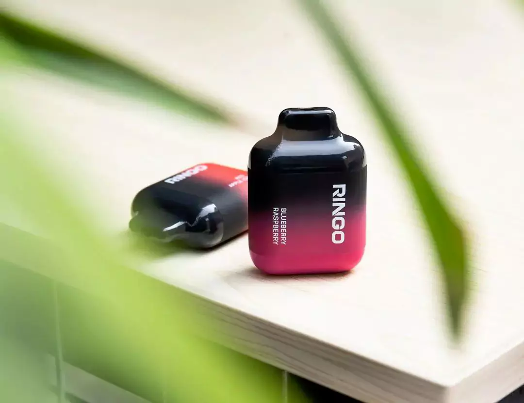
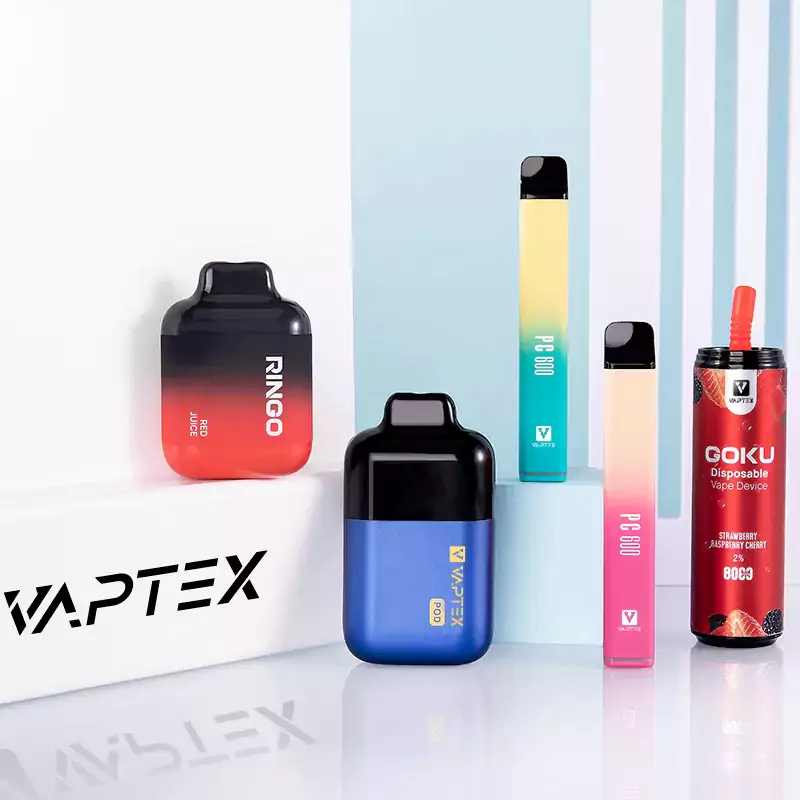
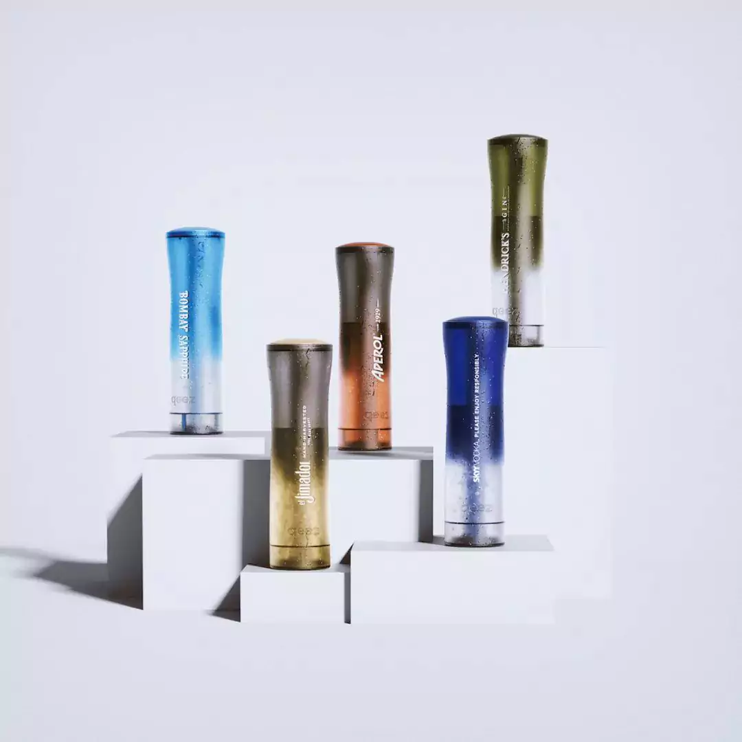
NINEIDEA:色彩渐变工业设计就像「视觉呼吸」:从晨曦般的红蓝过渡到金属质感的银灰渐变,不同色域的融合打破单调,让产品表面成为光影的画布。这种流动的色彩语言自带「视线引导」属性 —— 渐变的明度差自然划分功能区域,高饱和色向低饱和色的过渡暗示操作层级,就像给产品穿上会「说话」的外衣,不用文字就能传递信息重点。当指尖划过渐变曲面,色彩随视角变化的动态效果,让静态的工业制品有了与光线共舞的生命力。
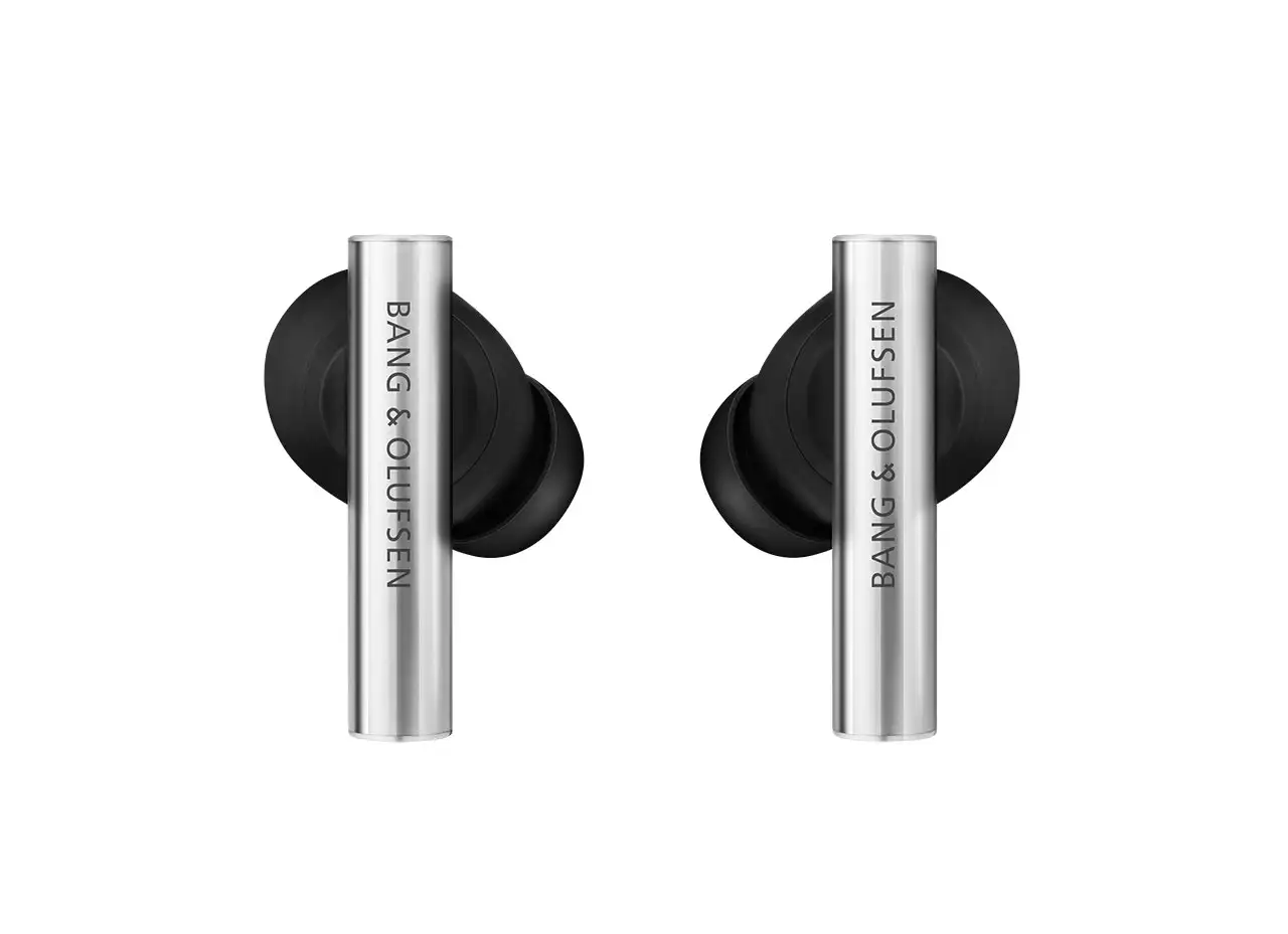
渐变色彩是设计师藏在产品里的「情绪密码」:医疗设备常用的蓝白渐变模拟天空与云朵,用冷色调降低紧张感;消费电子的霓虹渐变则像都市夜景的缩影,唤醒年轻人的潮流共鸣。这种色彩策略本质是「无国界的情感翻译」—— 暖色调渐变传递温暖包容,冷色调渐变表达科技理性,中性色渐变营造高级质感。当用户握持渐变产品时,色彩带来的心理暗示早已超越视觉层面,成为人与产品建立情感连接的「无声桥梁」。这种「功能性渐变」拒绝单纯装饰,而是将色彩变化与产品状态绑定 —— 比如耳机充电盒的呼吸灯渐变,用色彩流动暗示充电进度,让技术反馈更具人性化温度。
浏览这组色彩渐变设计图,你会发现每一道色阶过渡都藏着设计师的「双重考量」:既要让色彩成为抓眼球的视觉符号,又要让渐变服务于功能逻辑;既要突破工艺限制实现创意,又要让色彩传递产品的性格与温度。色彩渐变早已不是简单的表面涂装,而是工业设计中连接「好看」与「好用」的关键纽带 —— 当不同色域在产品表面自然交融,改变的不仅是视觉体验,更是人与技术对话的情感频率。
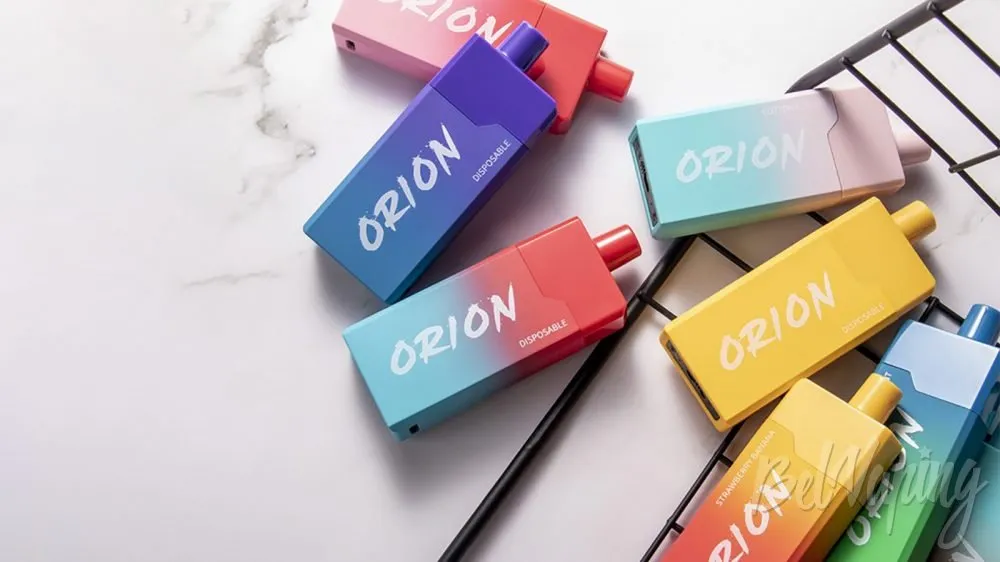
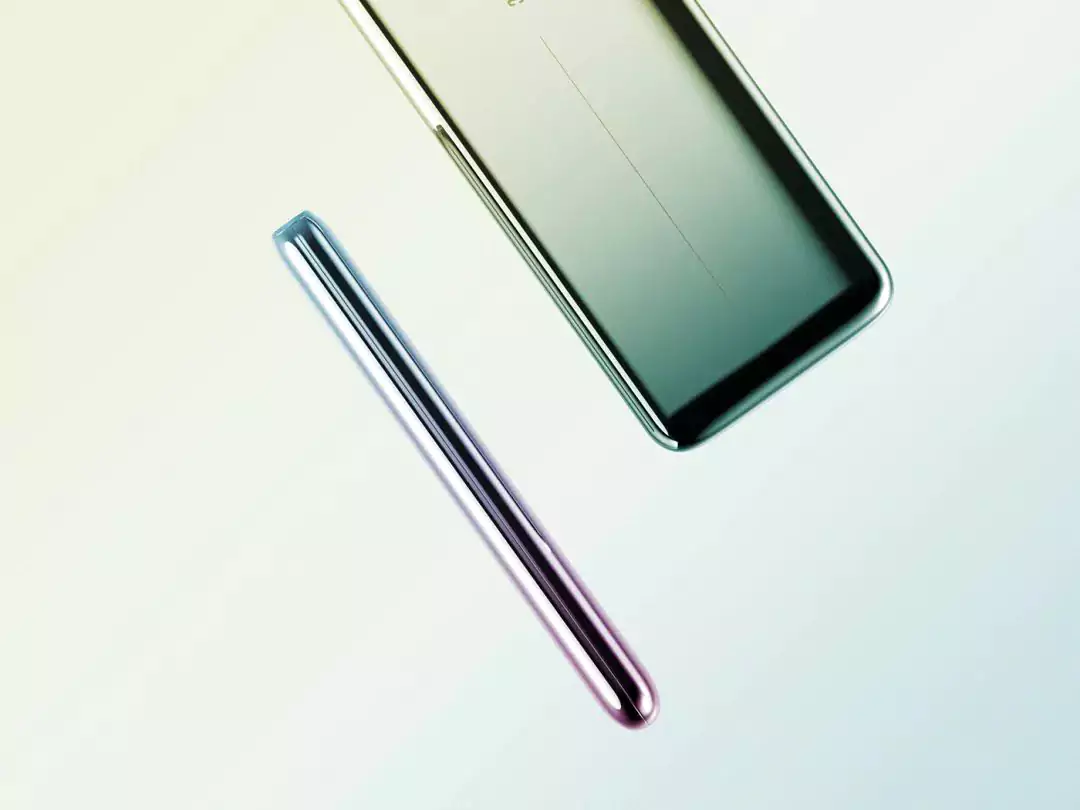

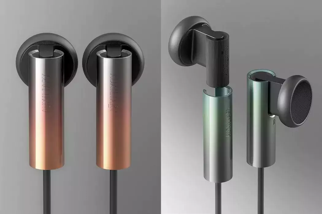
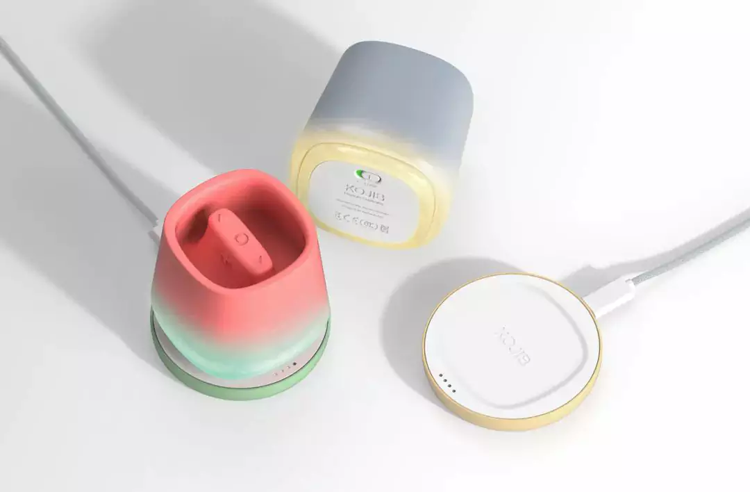


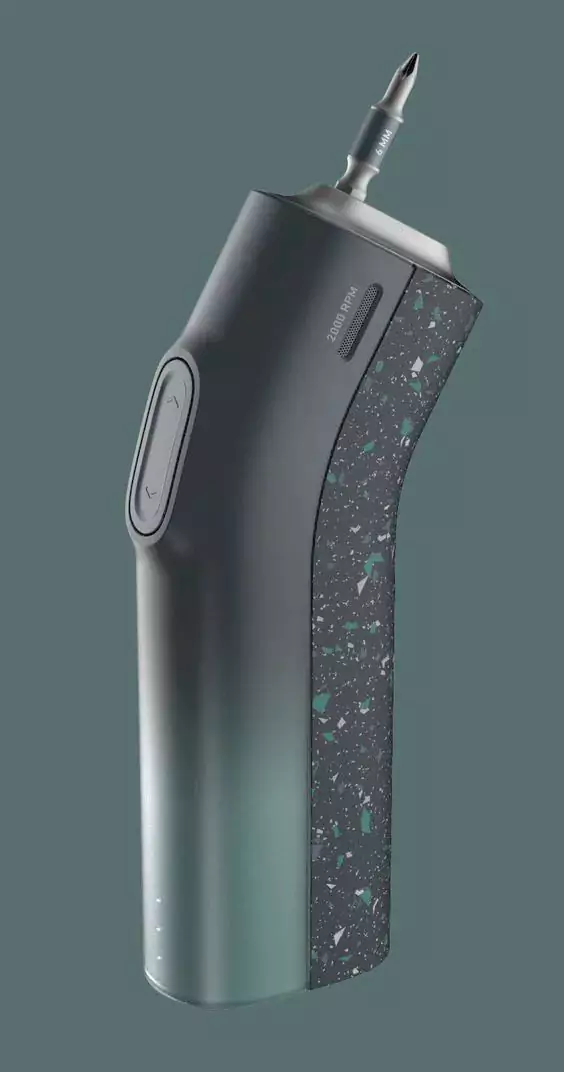
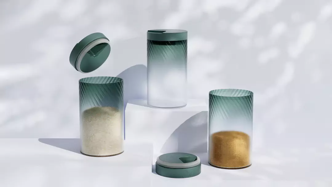
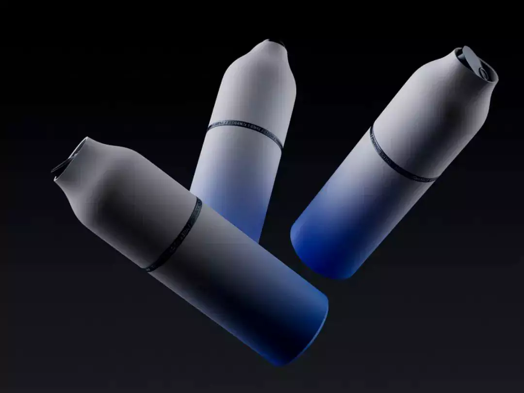
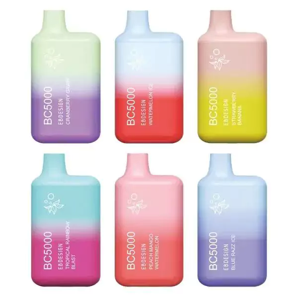
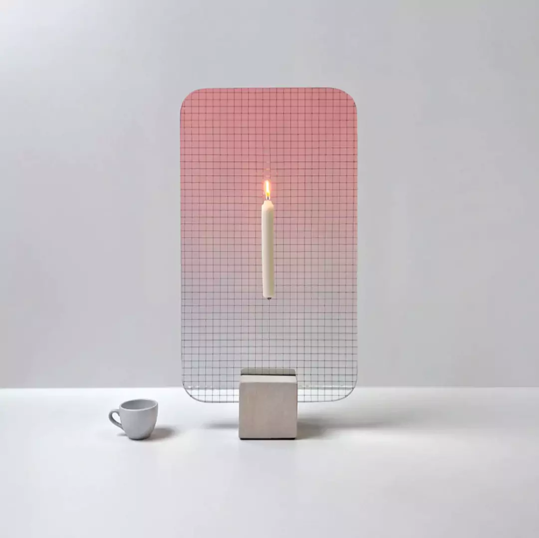
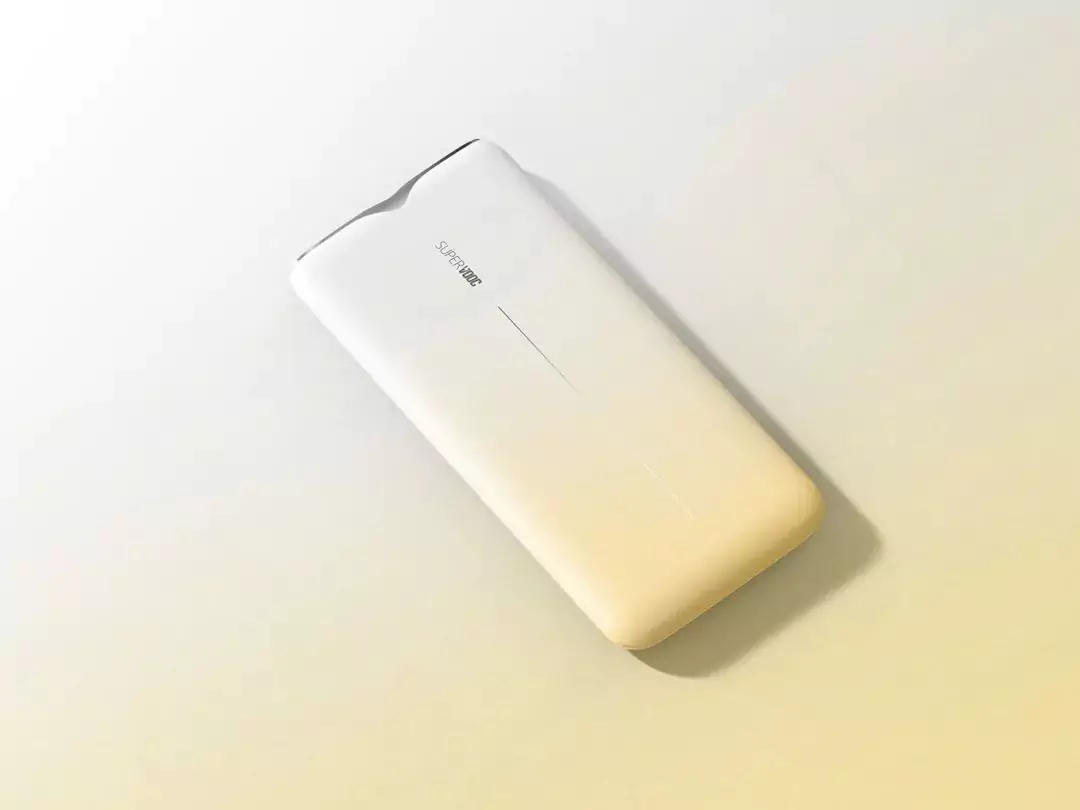
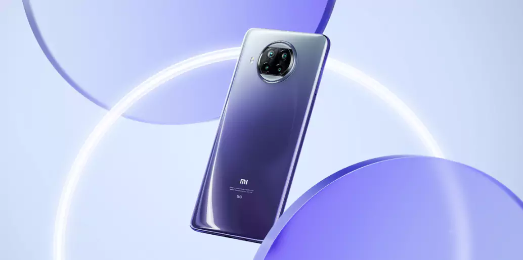
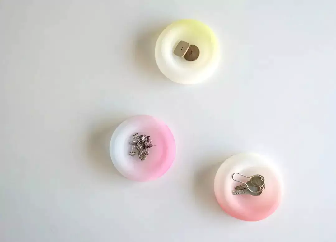

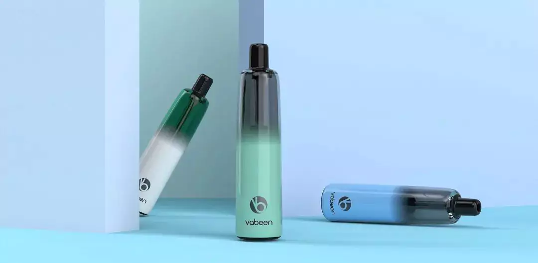
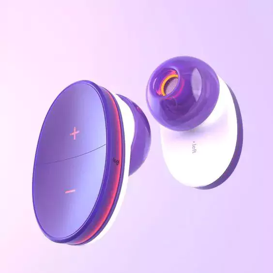
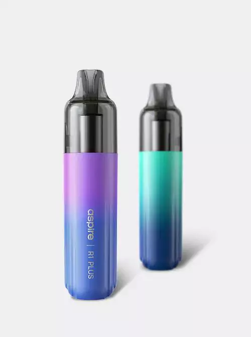

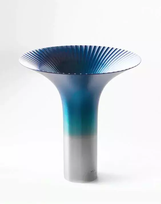
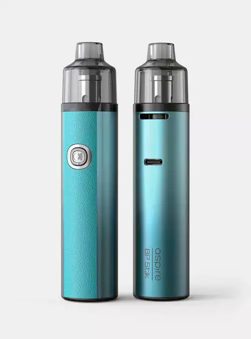

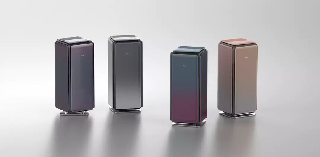
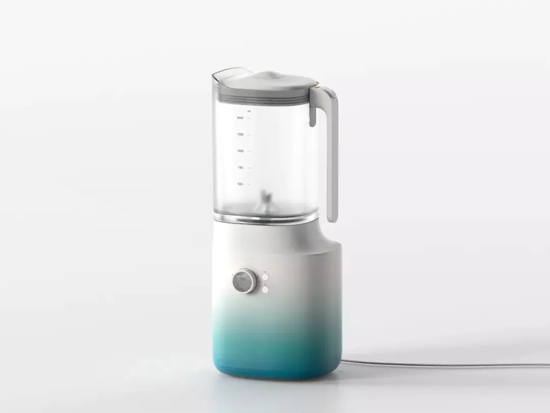
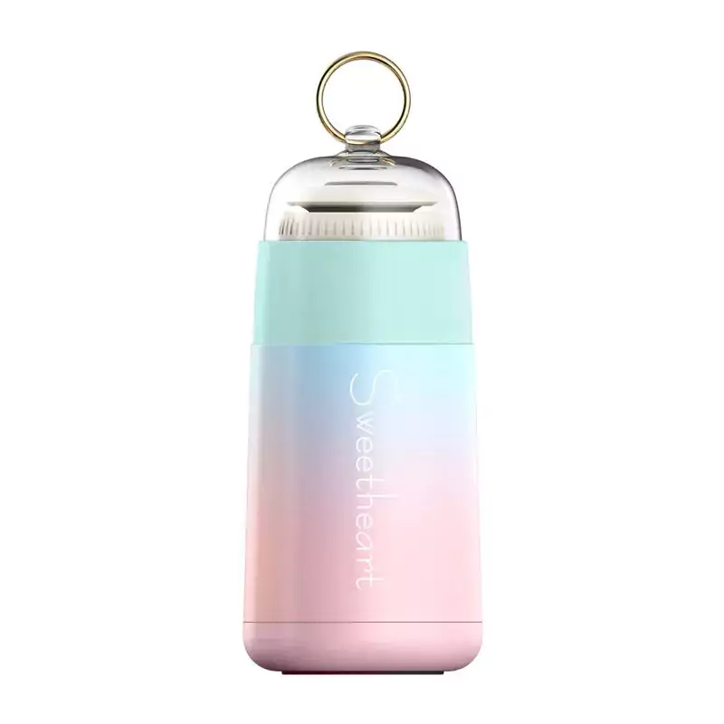
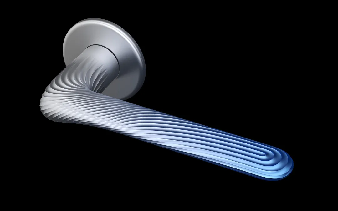


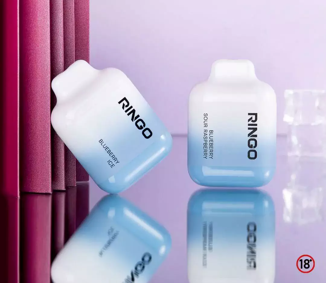

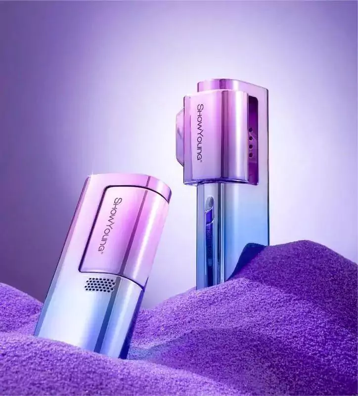
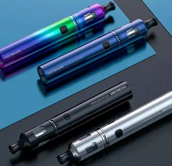
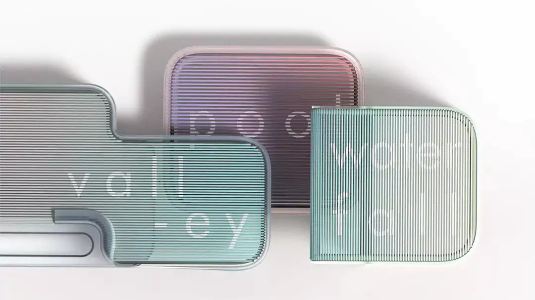
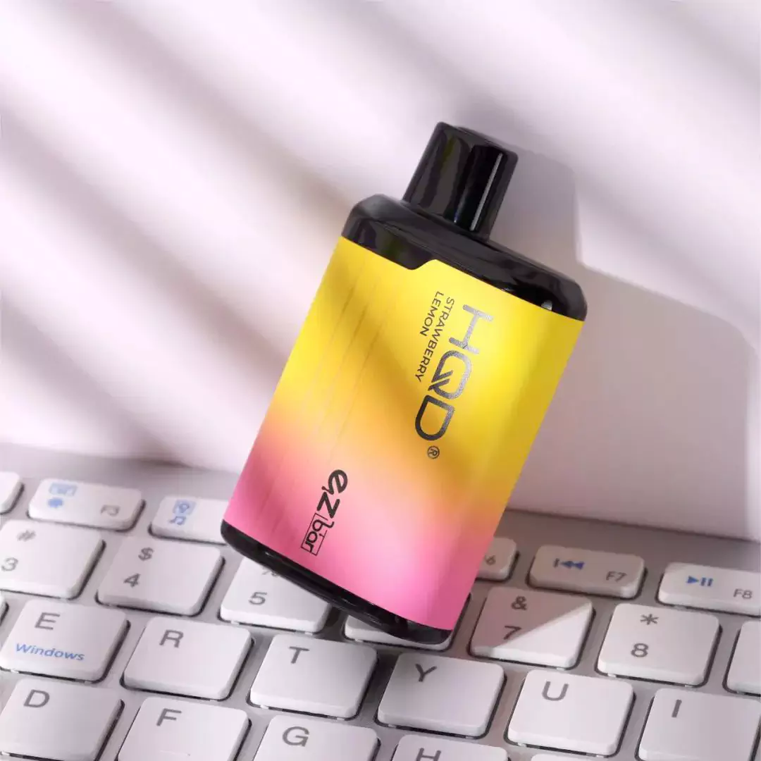

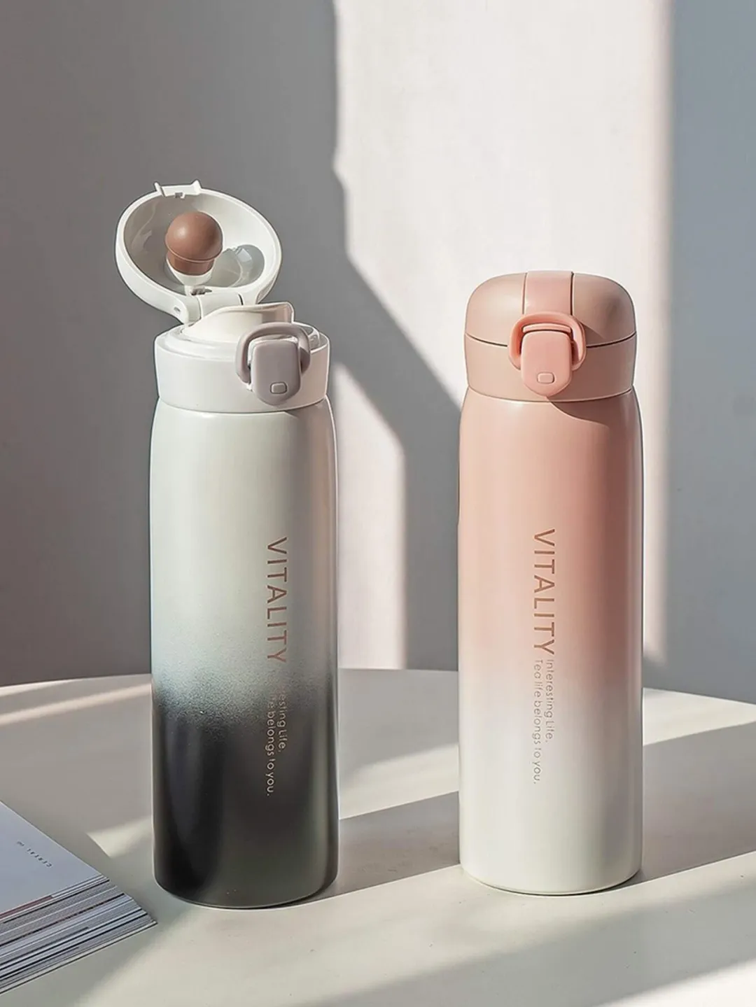

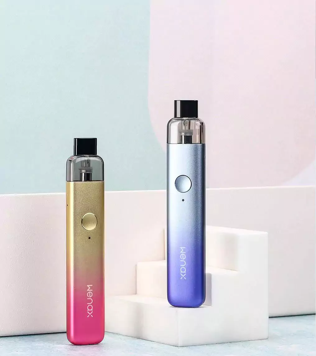


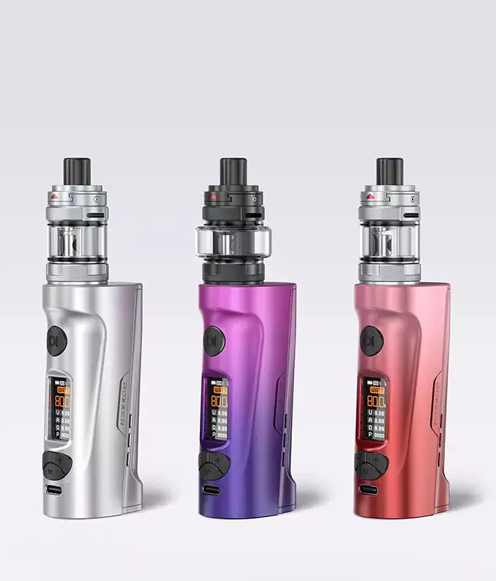


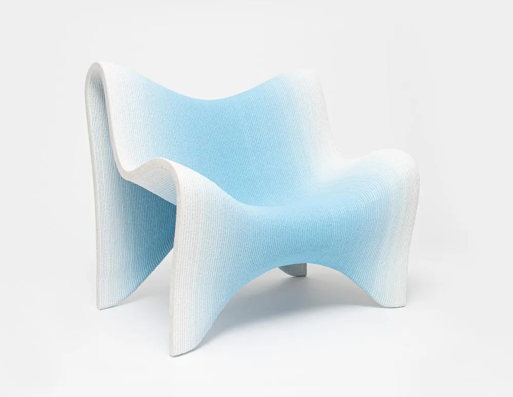
Color gradient industrial design, making the surface of the product a canvas for light and shadow
NINEIDEA: Color gradient industrial design is like “visual breathing”: from dawn like red and blue to metal like silver gray gradient, the integration of different color gamut breaks the monotony, making the product surface a canvas of light and shadow. This flowing color language comes with a “visual guidance” attribute – the gradient brightness difference naturally divides functional areas, and the transition from high saturation colors to low saturation colors implies operational hierarchy, just like putting on a product that can “speak” and convey key information without text. The dynamic effect of color changing with the viewing angle as fingertips glide over the gradient surface gives static industrial products the vitality of dancing with light.
Gradient colors are the “emotional code” hidden by designers in products: the blue and white gradient commonly used in medical devices simulates the sky and clouds, using cool tones to reduce tension; The neon gradient of consumer electronics is like a microcosm of urban night scenes, awakening the trend resonance of young people. This color strategy is essentially a ‘borderless emotional translation’ – warm color gradients convey warmth and inclusiveness, cool color gradients express technological rationality, and neutral color gradients create a high-end texture.
When users hold gradient products, the psychological implications brought by colors have already surpassed the visual level, becoming a “silent bridge” for establishing emotional connections between people and products. This’ functional gradient ‘rejects simple decoration, but binds color changes to product status – such as the breathing light gradient of the headphone charging case, which uses color flow to indicate charging progress and makes technical feedback more humanized and warm.
Browsing through this set of color gradient design diagrams, you will find that each level transition hides the designer’s “dual consideration”: to make colors eye-catching visual symbols, while also making gradients serve functional logic; We need to break through the limitations of craftsmanship to achieve creativity, while also allowing colors to convey the personality and warmth of the product. Color gradient is no longer just a simple surface coating, but a key link connecting “beauty” and “usability” in industrial design – when different color gamut naturally blends on the surface of a product, it not only changes the visual experience, but also the emotional frequency of dialogue between people and technology.


