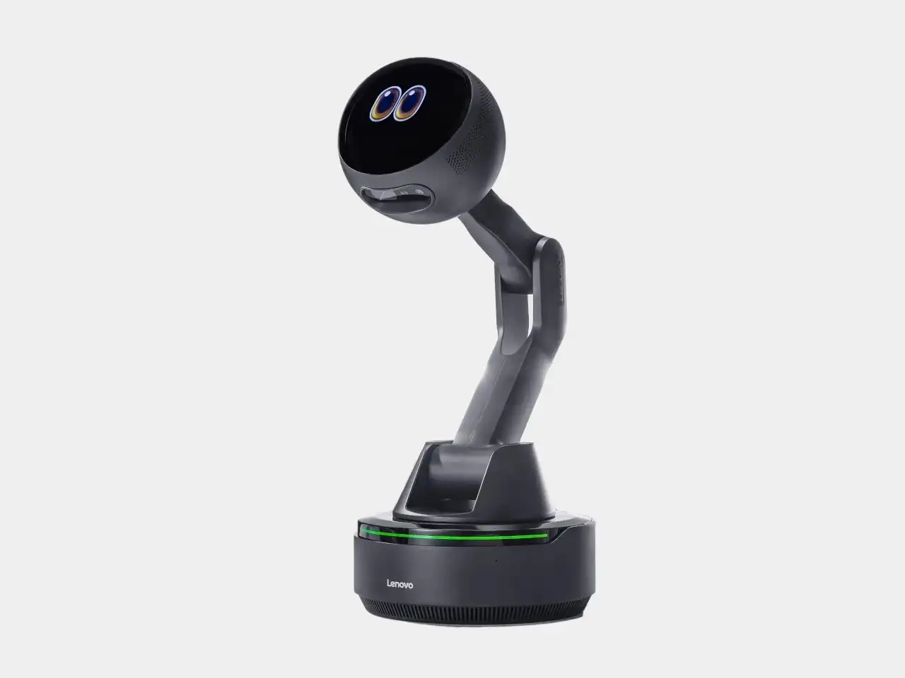
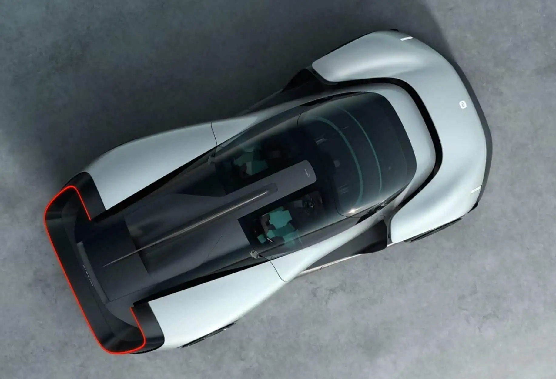
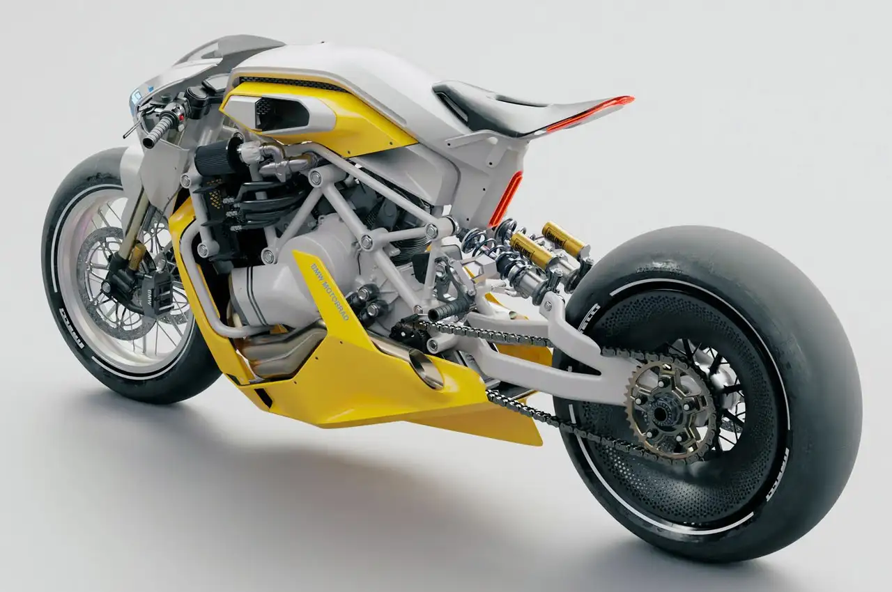
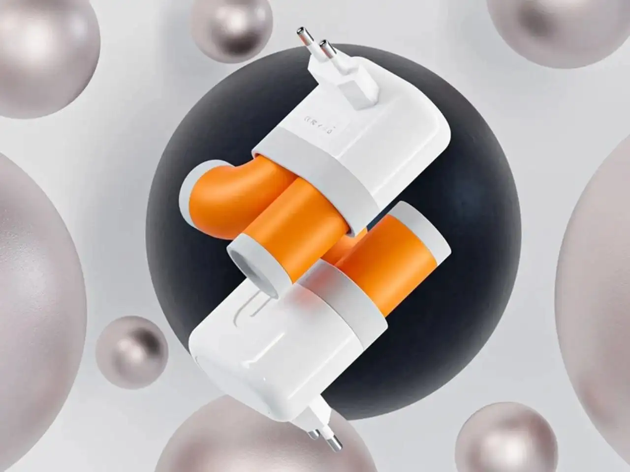
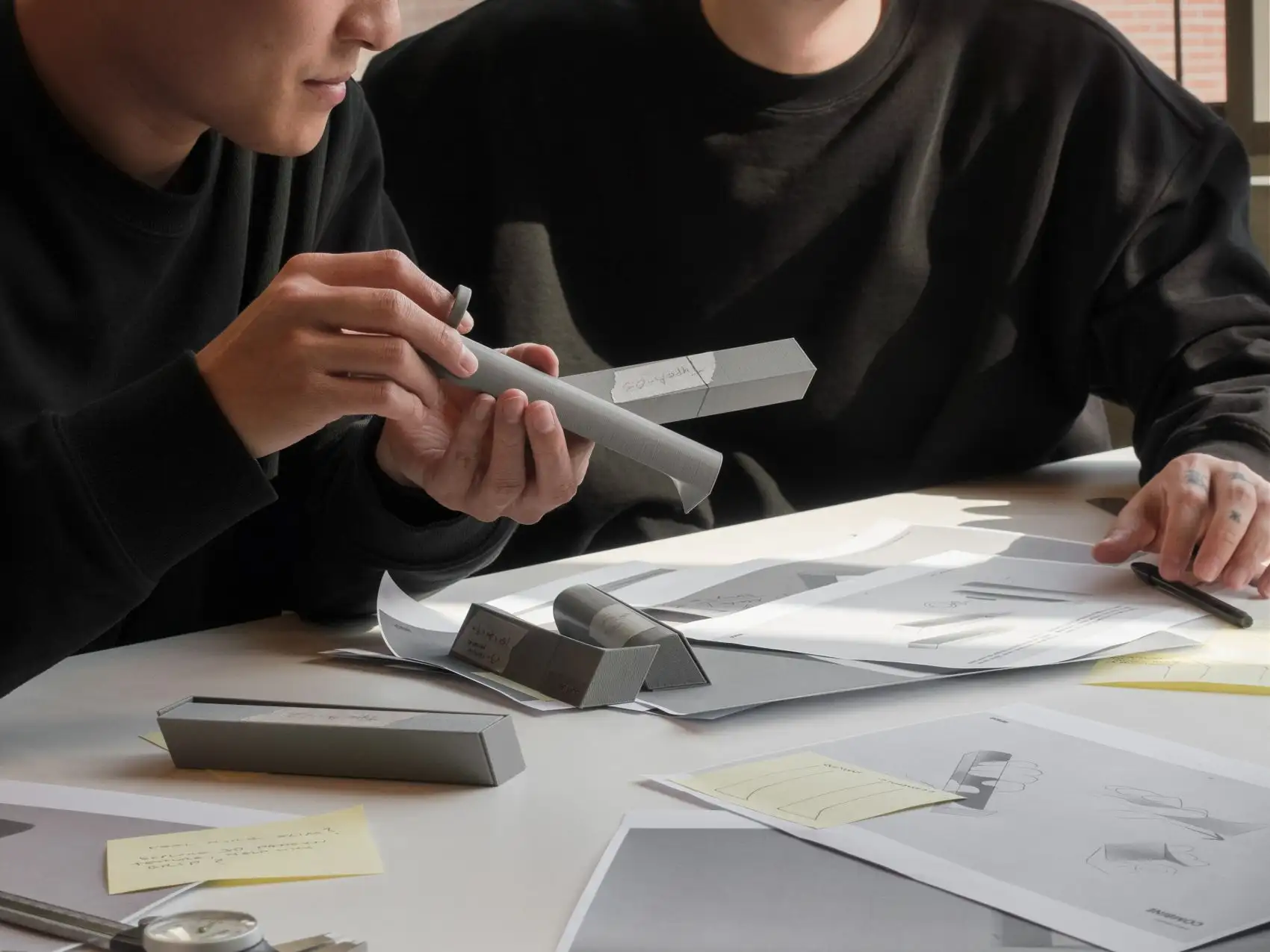
NINEIDEA:高阶工业设计一定要知道这六个字,“少即是多”(Less is More)和 “留白”(Negative Space)是两个看似相关却各有侧重的核心美学与功能原则,它们共同指向设计的 “精准性” 与 “呼吸感”,最终服务于用户体验与价值传递。
少即是多:用 “减法” 抵达本质
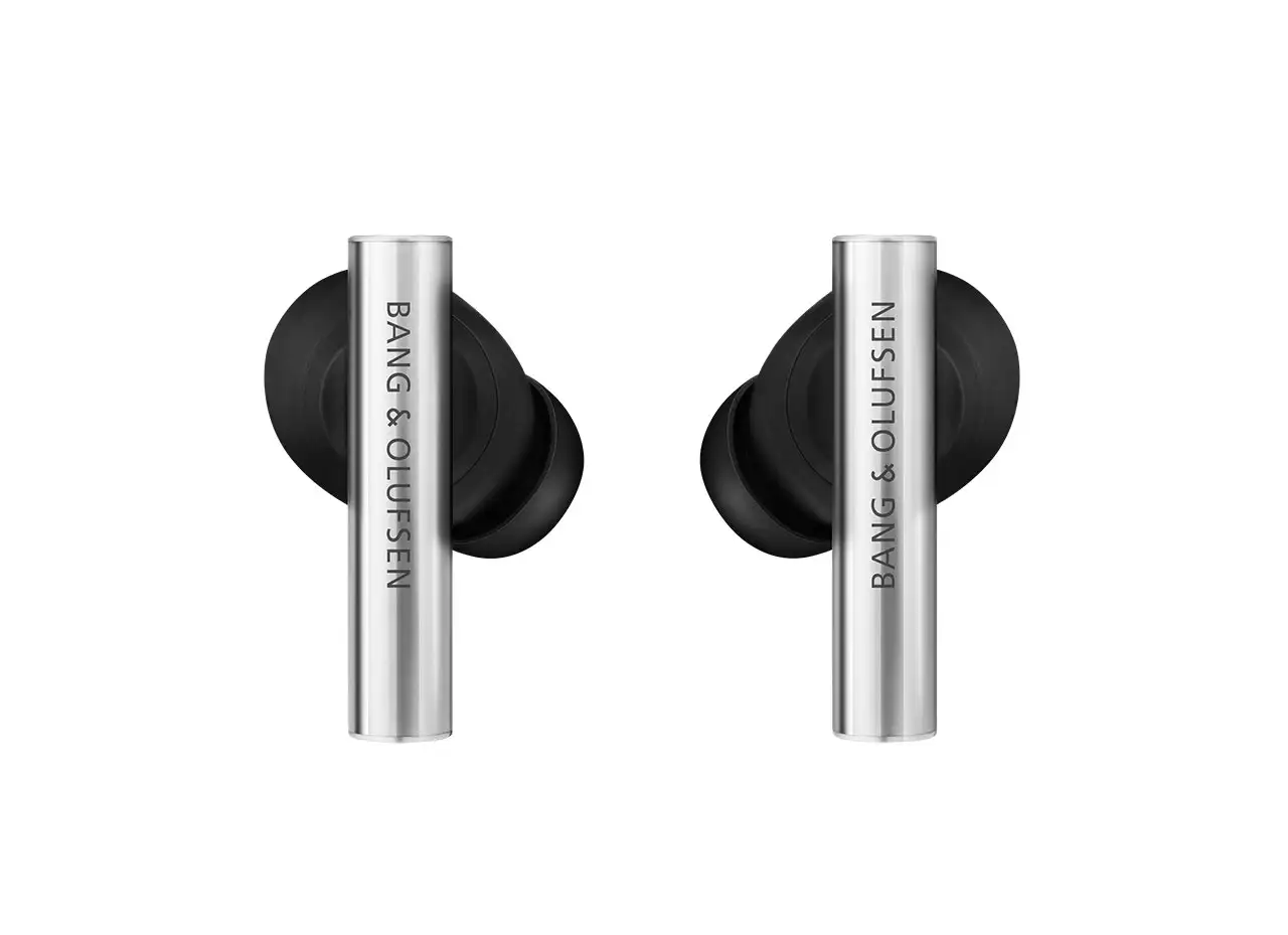
“少即是多” 由现代主义建筑大师密斯・凡・德罗(Mies van der Rohe)提出,后成为工业设计的黄金法则。它的核心不是 “简单”,而是 “去除冗余,保留核心”—— 用最少的元素(形态、色彩、功能)承载最多的价值(实用、美感、情感)。
- “少” 的本质是 “精准”:
设计中剔除一切非必要的装饰、结构或功能,只保留对用户最核心的需求。比如,苹果早期的 iPod,用一个圆形转盘替代复杂的按键,将 “听歌” 的核心功能简化到极致,却通过极简形态传递了 “易用” 与 “高级” 的体验。
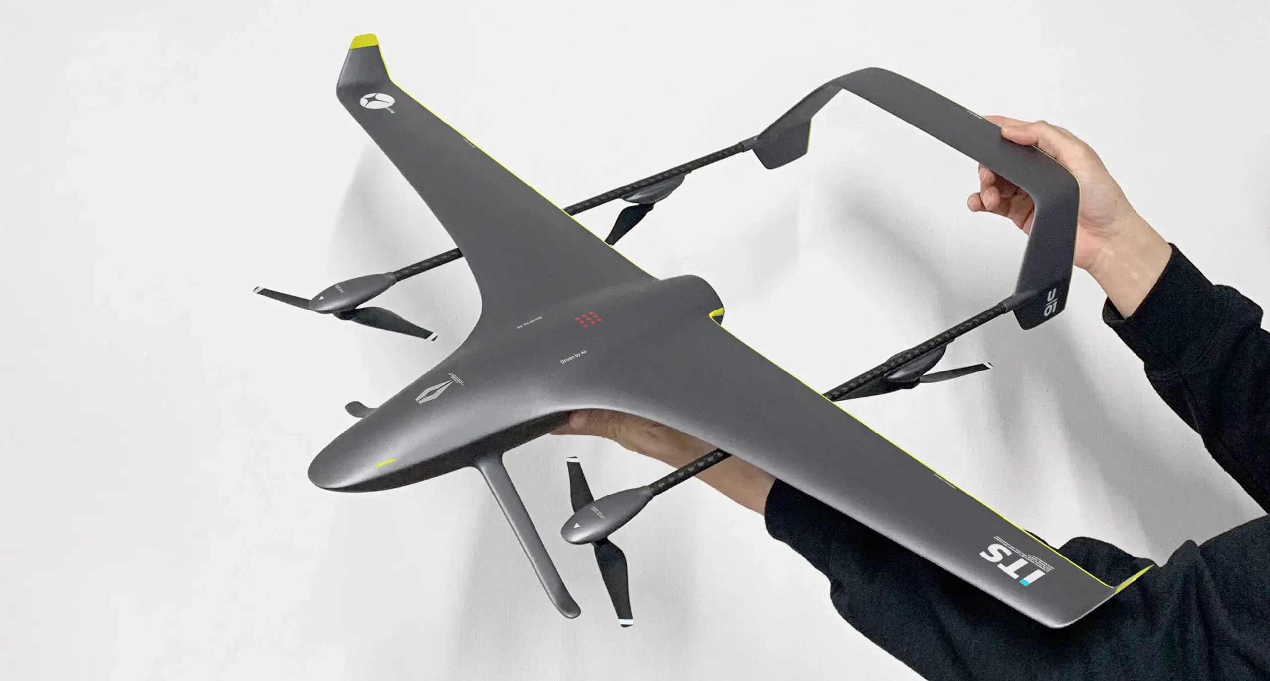
这里的 “少” 不是 “简陋”,而是对功能、材料、形态的极致提炼:多余的线条会干扰视觉,冗余的结构会增加成本,无效的功能会让用户困惑。 - “多” 的价值是 “延伸”:
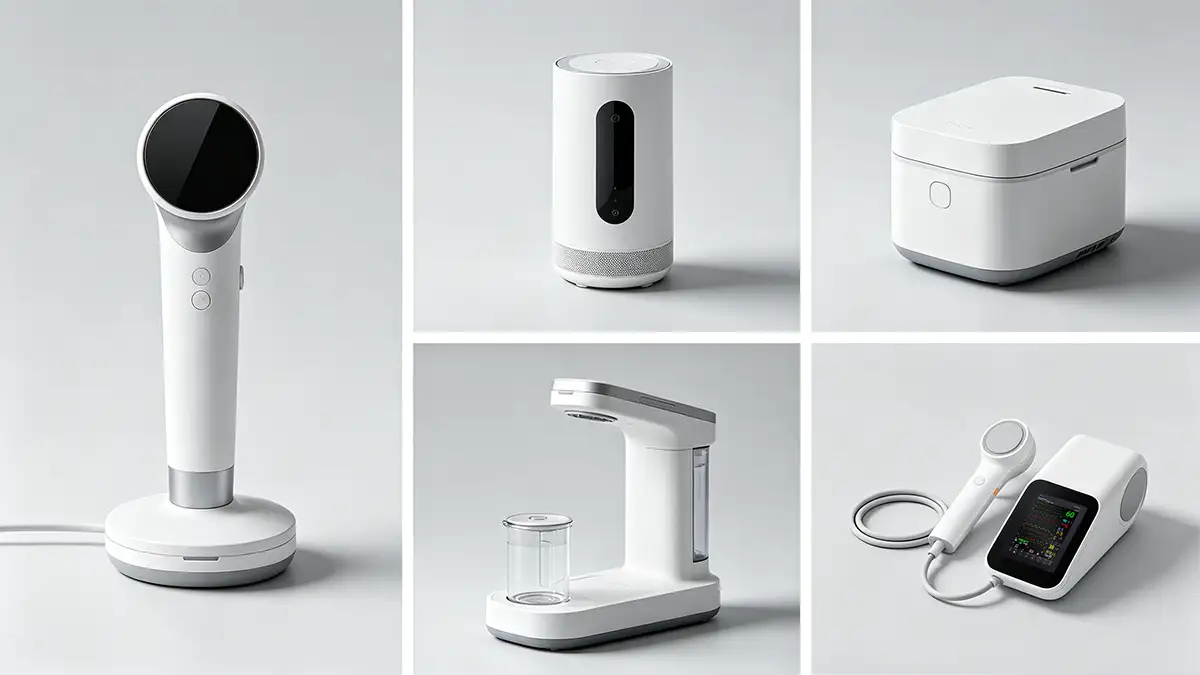
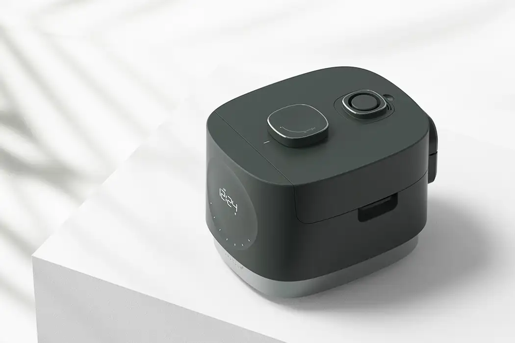
当设计剥离了冗余,剩下的核心元素反而能更强烈地传递信息。比如,无印良品的电饭煲,通体纯白、线条平直,没有多余的 logo 或装饰,却通过 “克制” 传递了 “朴素、可靠” 的品牌调性,让用户聚焦于 “做饭” 的本质功能,同时引发对 “简约生活” 的联想 —— 这种 “留白式的联想” 就是 “多” 的体现。
留白:用 “空” 创造节奏与想象
“留白” 源于东方美学(如中国水墨画、日本枯山水),在工业设计中,它指 “有意识地保留空白(物理或视觉上的),为用户留出呼吸、想象或使用的空间”。它不是 “未完成”,而是设计的 “主动退让”。
- 物理留白:给功能留余地
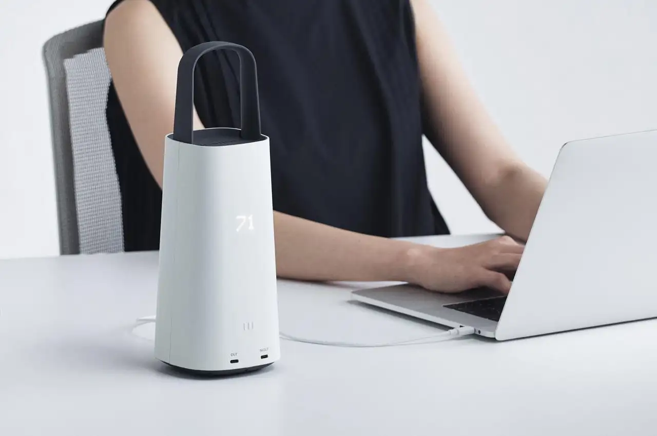
比如,桌面台灯的底座设计若留出足够的平面空间,不仅能稳定放置,还能让用户临时放手机、钥匙 —— 这种 “功能留白” 让产品从 “单一工具” 变成 “场景伙伴”。再比如,相机的握持区故意保留简洁的曲面,不堆砌按键,既方便不同手型的用户握持,也避免了误触。 - 视觉留白:给感知留节奏
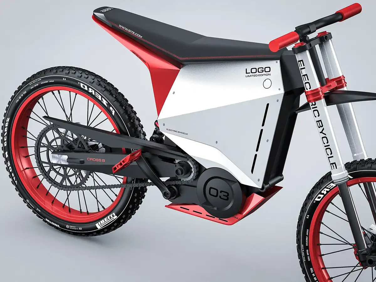
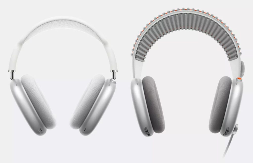
产品的形态、界面或配色中,“空白”(无装饰、低饱和区域)与 “实体”(功能区、重点元素)形成对比,引导用户的视觉焦点。比如,戴森吸尘器的机身,用透明管道与哑光金属构成 “虚实对比”,管道的 “空”(视觉上的留白)既展示了内部结构的科技感,又让复杂的功能显得轻盈不笨重。 - 情感留白:给用户留参与感
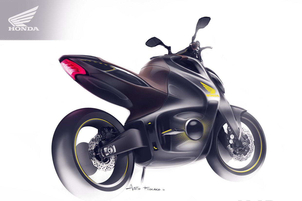
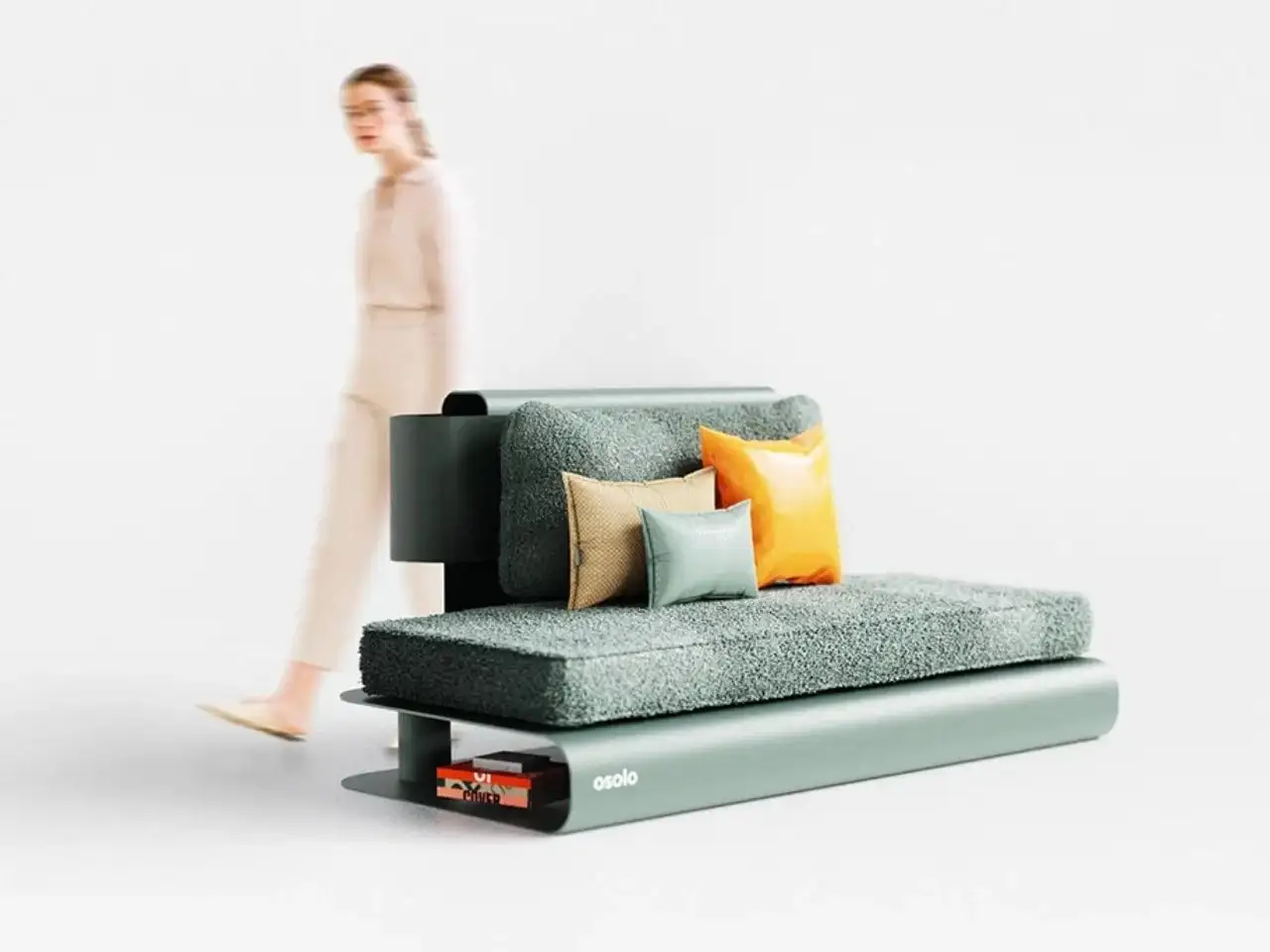
设计不把所有信息 “填满”,而是让用户通过想象补充意义。比如,北欧风格的座椅,线条极简,没有繁复的花纹,用户会根据自己的家居风格搭配靠垫、调整摆放位置 —— 产品成为 “容器”,用户的使用习惯赋予它独特的个性,这种 “共创感” 正是留白的魅力。
两者的关联与区别
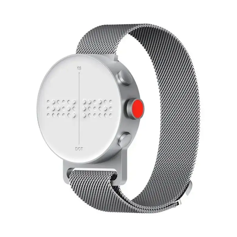
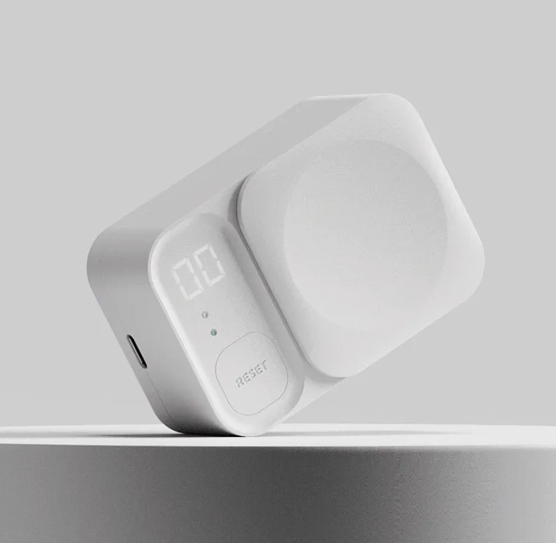
- 关联:都反对 “堆砌”,强调 “克制”。“少即是多” 通过精简元素减少干扰,“留白” 通过预留空间引导体验,最终都让设计更聚焦核心价值。
- 区别:“少即是多” 是 “做减法”,解决 “如何剔除冗余”;“留白” 是 “做节奏”,解决 “如何让留存的元素更有呼吸感”。前者是 “内容的精准”,后者是 “关系的平衡”。
在工业设计中,“少即是多” 是 “骨架”,确保设计不偏离核心价值;“留白” 是 “血肉”,让设计拥有与人互动的温度。前者让产品 “有用”,后者让产品 “好用且动人”—— 最终,都是为了让用户在复杂世界中,获得一种 “被理解” 的轻松。
@NINEIDEA九号创新 www.nineidea.com

The Six Character Decision of Advanced Industrial Design: “Less is More” and “Blank Space”
NINEIDEA: High level industrial design must know these six words. “Less is More” and “Negative Space” are two core aesthetic and functional principles that seem to be related but have their own priorities. Together, they point to the “accuracy” and “breathing” of design, and ultimately serve the user experience and value transmission.
Less is more: using subtraction to reach essence
Less is more “was proposed by the modernist architect Mies van der Rohe and later became the golden rule of industrial design. Its core is not ‘simplicity’, but ‘removing redundancy and preserving the core’ – using the least elements (form, color, function) to carry the most value (practicality, beauty, emotion).
The essence of ‘less’ is’ precision’:
Exclude all non essential decorations, structures, or functions in the design, and only retain the core needs of the user. For example, Apple’s early iPod used a circular dial instead of complex buttons, simplifying the core function of “listening to music” to the extreme, but conveying an “easy-to-use” and “advanced” experience through a minimalist form.
The ‘less’ here is not’ crude ‘, but the ultimate refinement of functionality, materials, and form: redundant lines will interfere with vision, redundant structures will increase costs, and ineffective functions will confuse users.
The value of ‘more’ is’ extension ‘:
When the design strips away redundancy, the remaining core elements can actually convey information more strongly. For example, MUJI’s rice cooker is pure white with straight lines and no unnecessary logos or decorations, but it conveys the brand tone of “simplicity and reliability” through “restraint”, allowing users to focus on the essential function of “cooking” and triggering the association of “simple life” – this “blank association” is a manifestation of “more”.
Blank space: Creating rhythm and imagination with “emptiness”
‘Blank space’ originates from Eastern aesthetics such as Chinese ink painting and Japanese dry landscape painting. In industrial design, it refers to the conscious retention of blank space (physical or visual), leaving space for users to breathe, imagine, or use. It is not ‘unfinished’, but a ‘proactive concession’ of design.
Physical blank space: leave room for functionality
For example, if the base design of a desktop desk lamp leaves enough flat space, it can not only be stably placed, but also allow users to temporarily place their phones and keys – this “functional blank space” turns the product from a “single tool” to a “scene partner”. For example, the grip area of the camera intentionally retains a simple curved surface without stacking buttons, which is convenient for users with different hand shapes to grip and avoids accidental touches.
Visual blank space: leaving rhythm for perception
In the form, interface, or color scheme of the product, the contrast between “blank” (unadorned, low saturation areas) and “solid” (functional areas, key elements) guides the user’s visual focus. For example, the body of a Dyson vacuum cleaner uses transparent pipes and matte metal to create a “virtual real contrast”. The “emptiness” of the pipes (visual blank space) not only showcases the technological sense of the internal structure, but also makes complex functions appear lightweight and not bulky.
Emotional blank space: leave a sense of participation for users
Design does not ‘fill’ all information, but rather allows users to supplement meaning through imagination. For example, Nordic style seats have minimalist lines and no complicated patterns. Users will match cushions and adjust their placement according to their home style – the product becomes a “container”, and users’ usage habits give it a unique personality. This “co creation feeling” is the charm of leaving blank space.
The correlation and difference between the two
Association: Both oppose “piling up” and emphasize “restraint”. Less is more “reduces interference by simplifying elements, while” leaving space “guides the experience by reserving space, ultimately making the design more focused on core values.
Difference: “Less is more” is “subtraction”, solving “how to eliminate redundancy”; Blank space “is” creating rhythm “, solving the problem of” how to make the retained elements more breathing “. The former is’ precision of content ‘, while the latter is’ balance of relationships’.
In industrial design, “less is more” is the “skeleton” to ensure that the design does not deviate from the core values; ‘Blank space’ is’ flesh and blood ‘, giving design a warmth of interaction with people. The former makes the product “useful”, while the latter makes the product “user-friendly and appealing” – ultimately, both are aimed at providing users with a sense of ease to be understood in a complex world.
@NINEIDEA九号创新 www.nineidea.com


