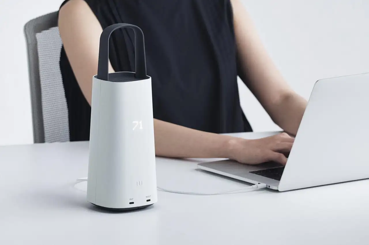
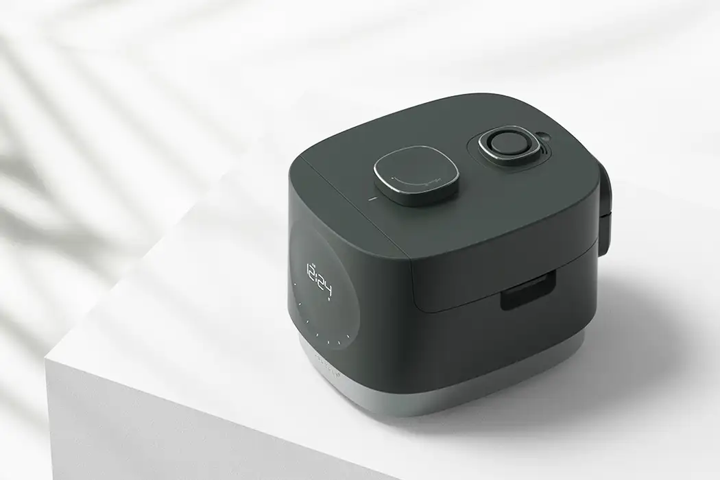
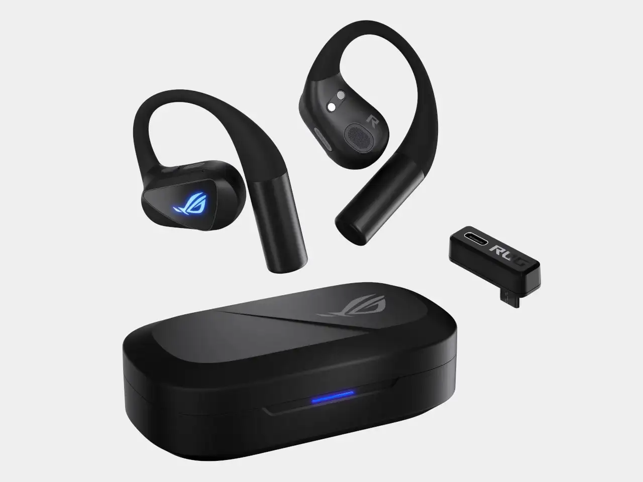
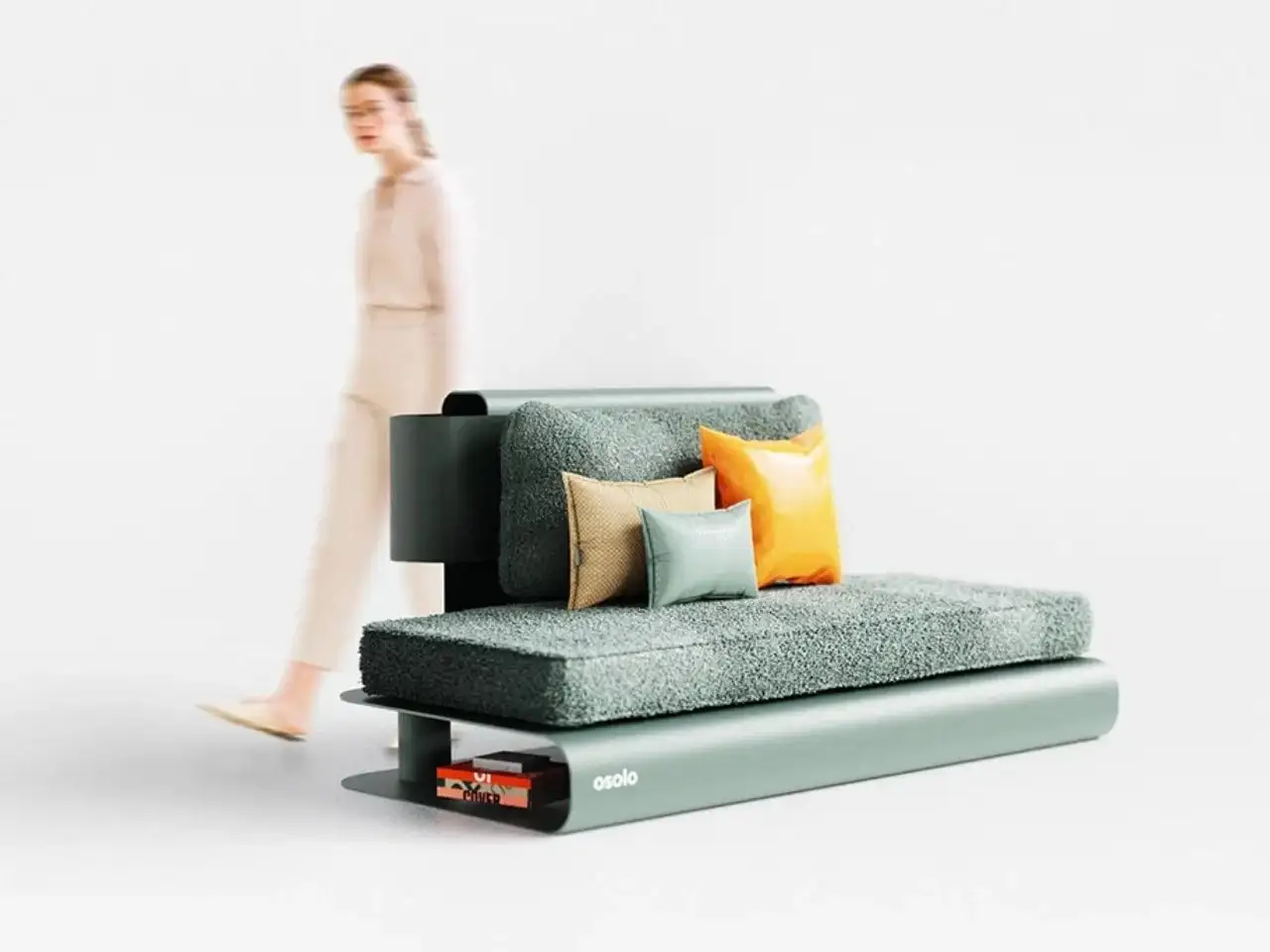
NINEIDEA:在产品设计中,配色是无声的 “推销员”。它不仅是美学表达,更是品牌与用户沟通的桥梁,直接影响消费者的认知、情感与购买决策。
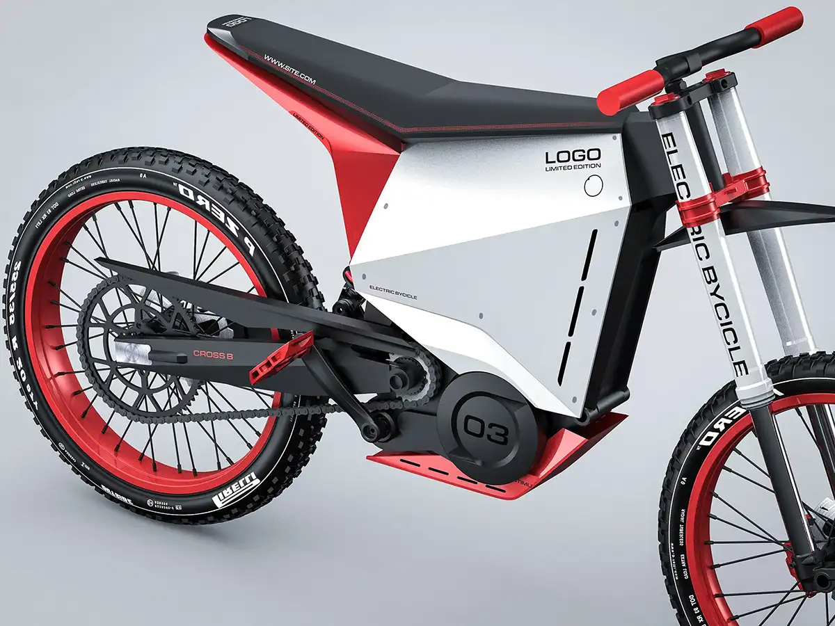
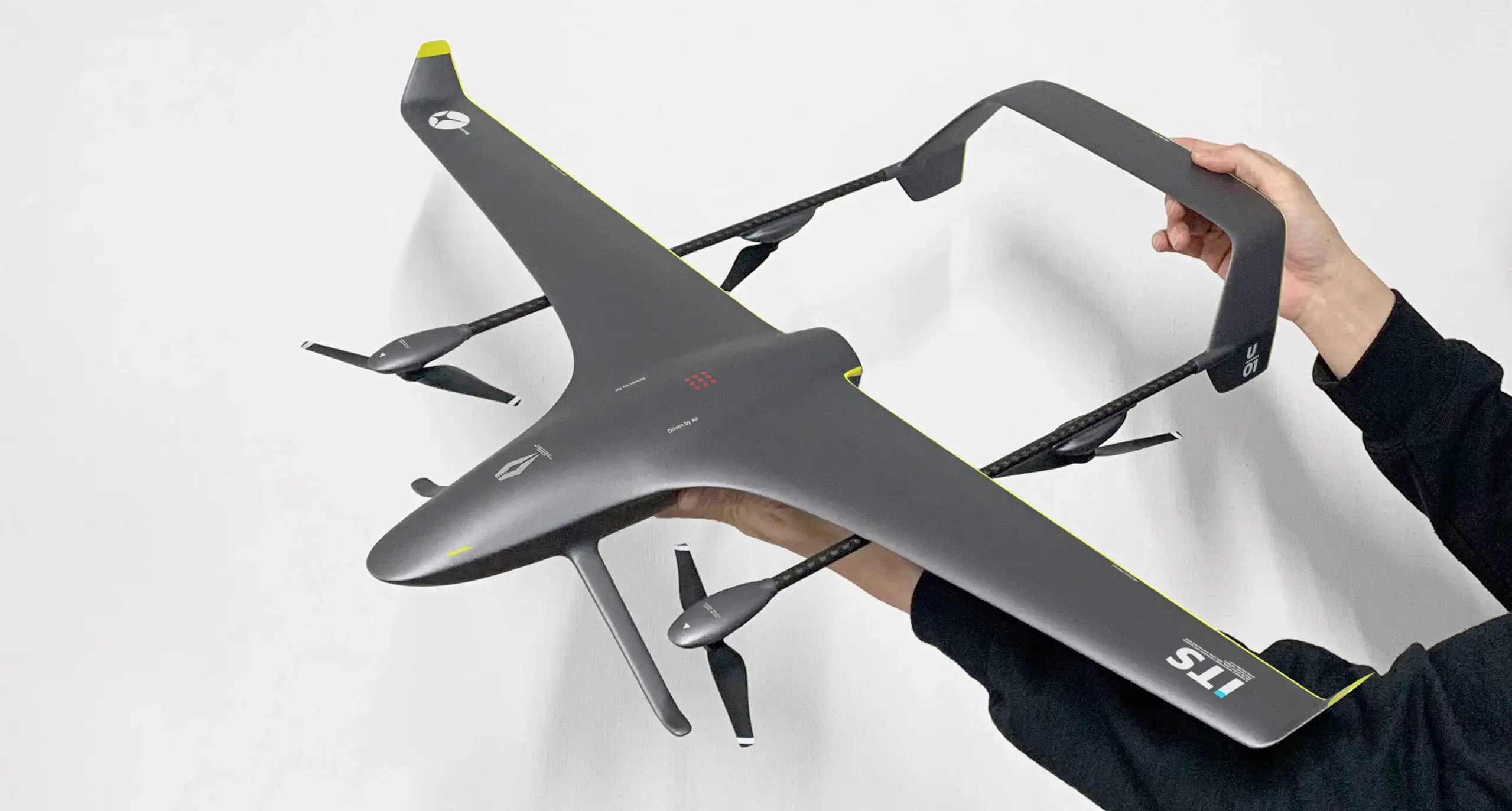
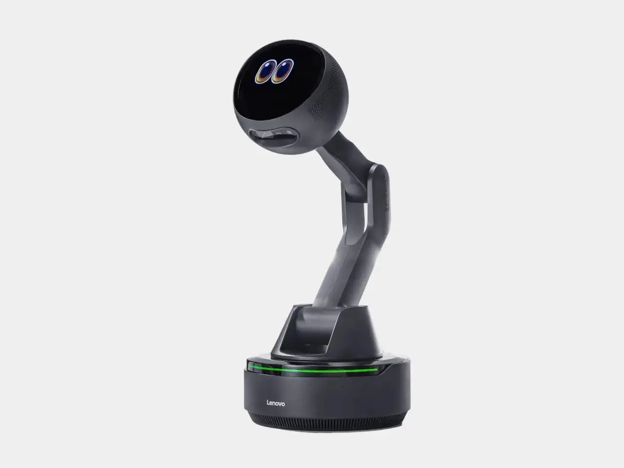
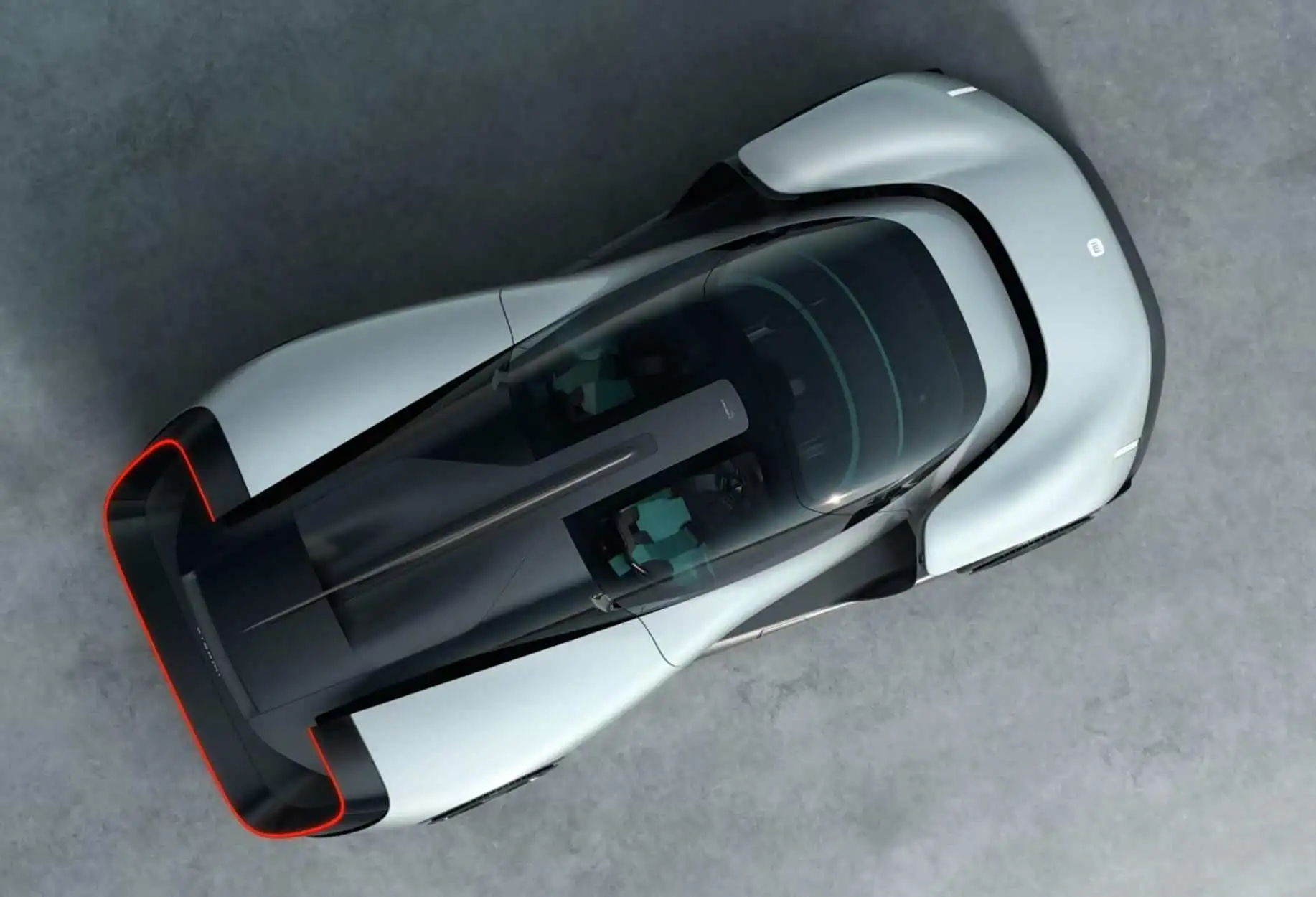
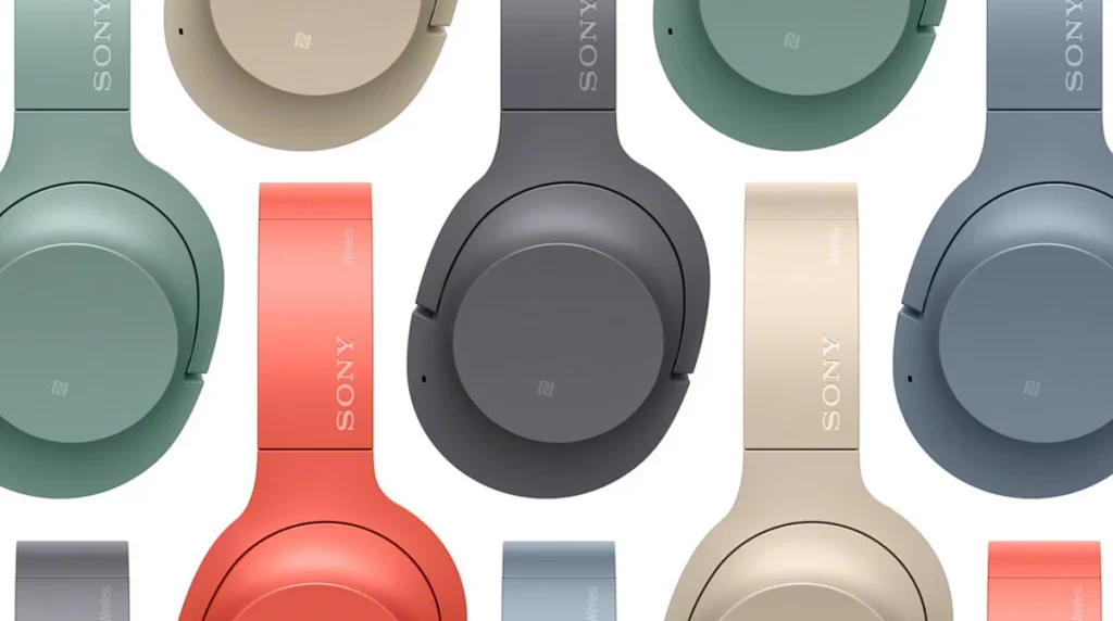
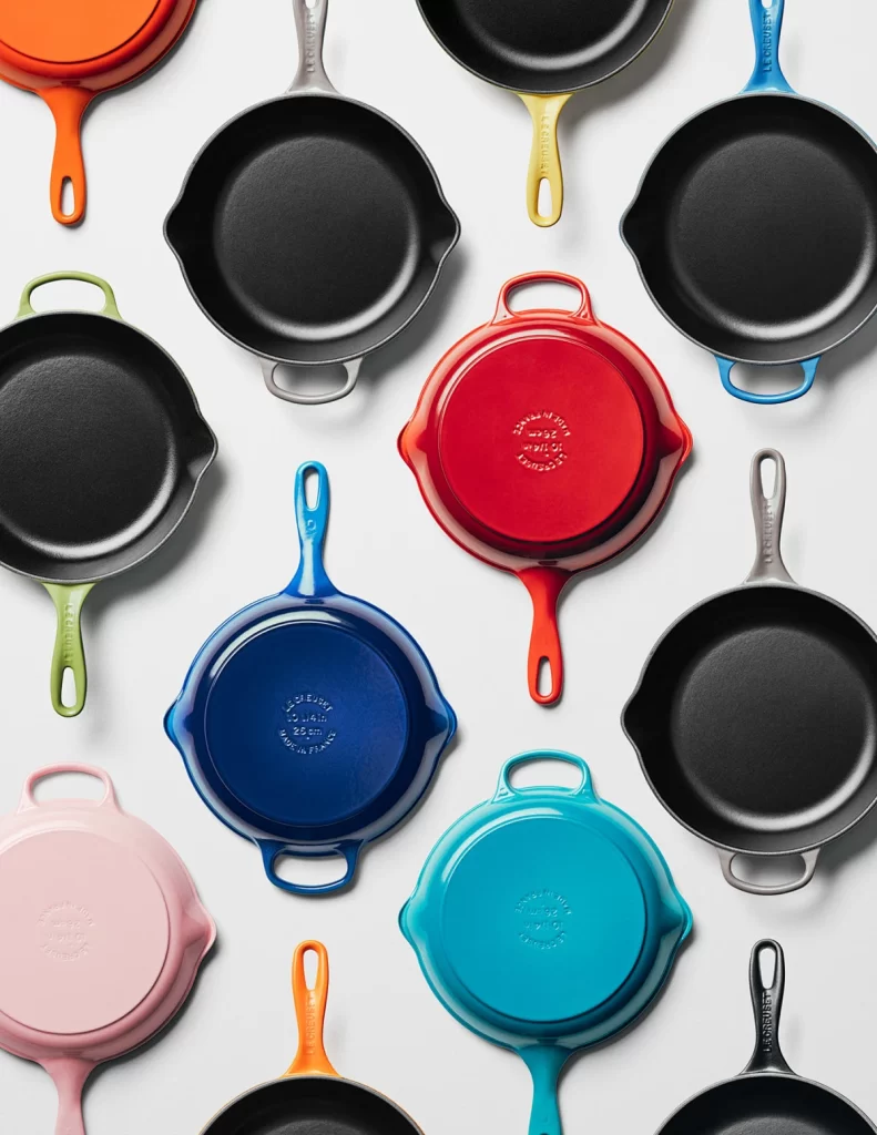
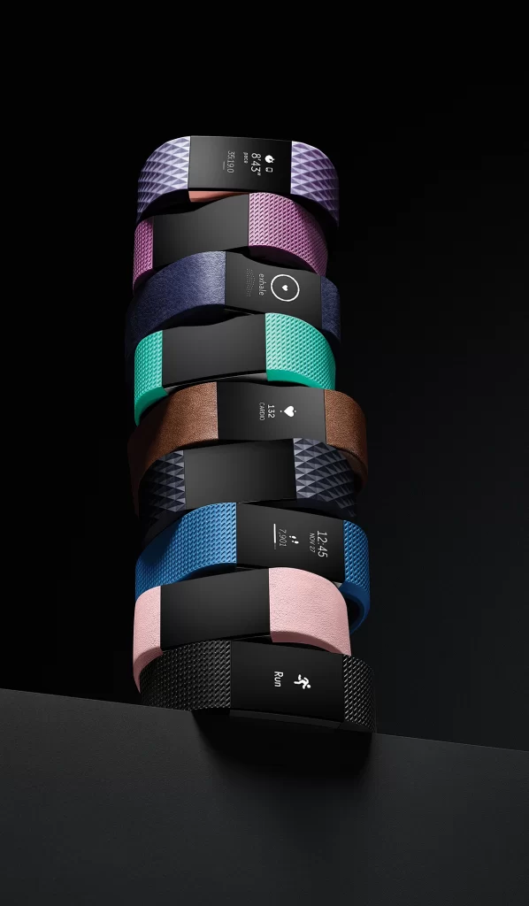
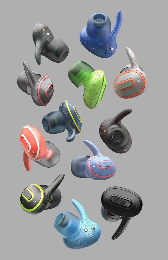
色彩是第一印象的 “敲门砖”。人类对色彩的反应速度仅需 0.05 秒,明快的配色能瞬间抓住眼球 —— 如运动品牌常用高饱和的红、黄配色,传递活力与激情;科技产品偏爱银灰、深蓝,营造专业与未来感。当消费者在电商平台浏览时,适配屏幕显示的高对比度配色(如白底黑字、亮色点缀),能显著提升产品图的点击率,让你的产品在同类竞品中 “脱颖而出”。
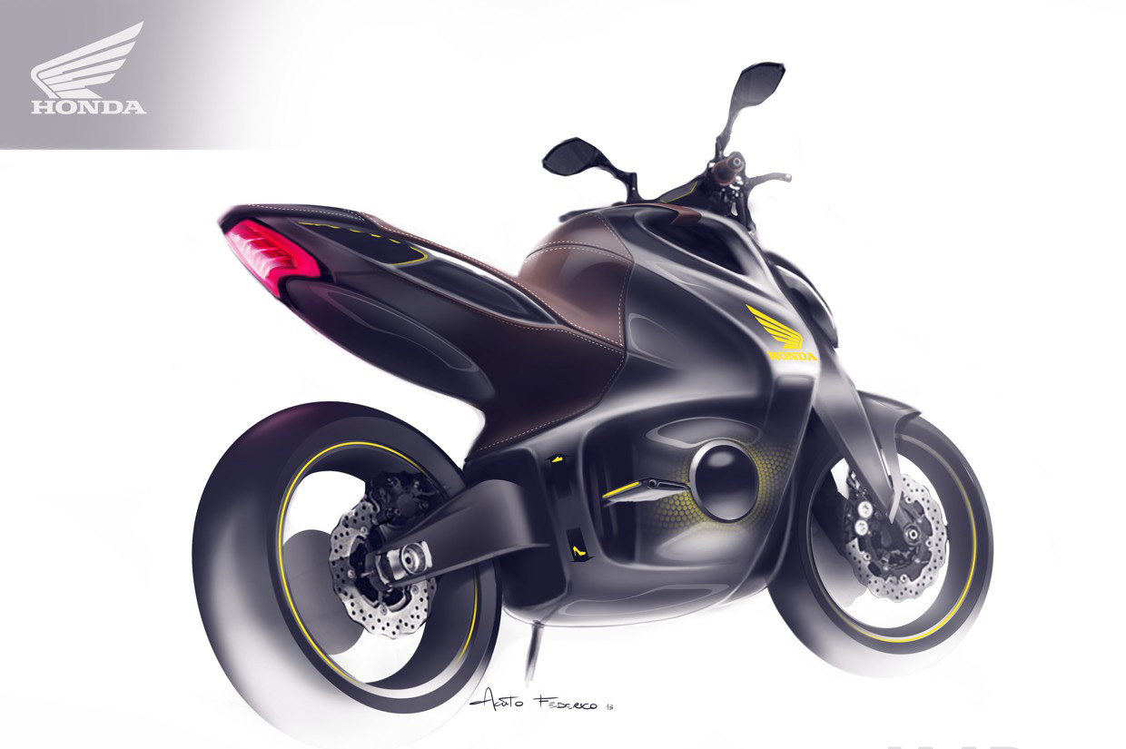
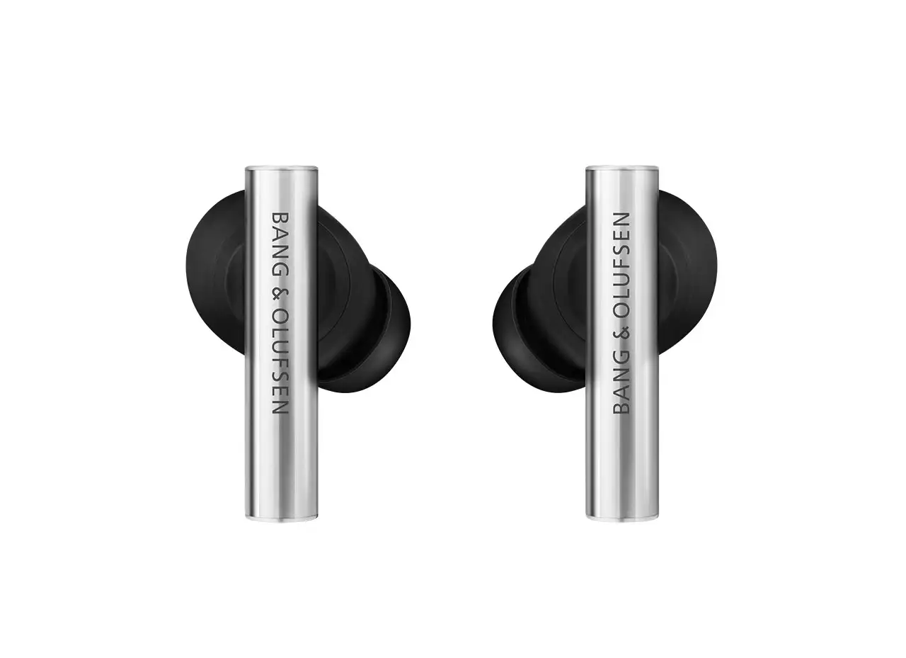
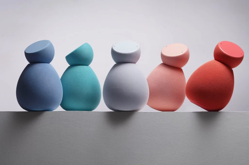
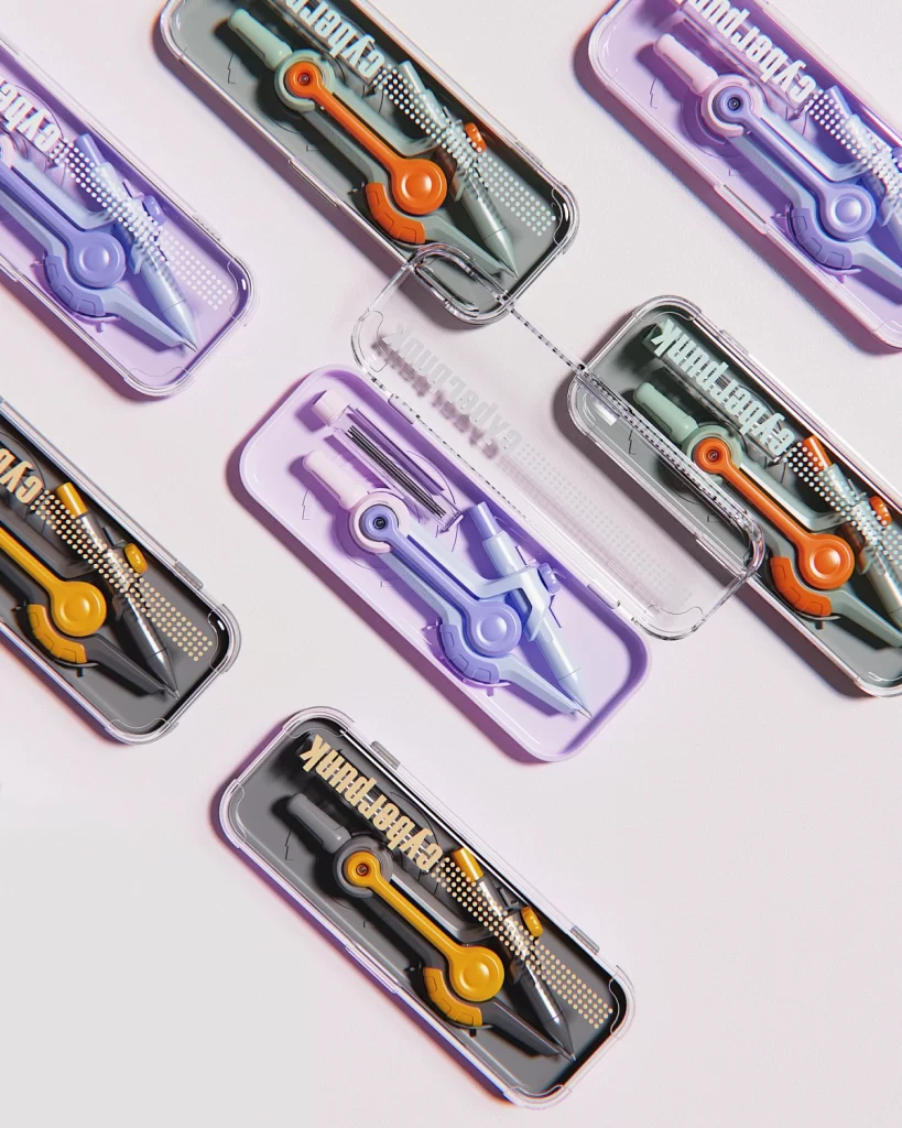
配色是品牌的 “视觉指纹”。经典案例不胜枚举:蒂芙尼蓝象征优雅与奢华,宜家黄蓝组合传递亲民与活力,这些标志性配色早已超越色彩本身,成为品牌资产的一部分。统一的配色体系能强化用户记忆,当消费者搜索 “ins 风家居”“极简设计” 时,低饱和莫兰迪色系或黑白灰组合更易触发联想,形成 “未见其形,先识其色” 的品牌辨识度。
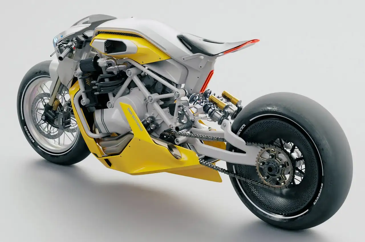
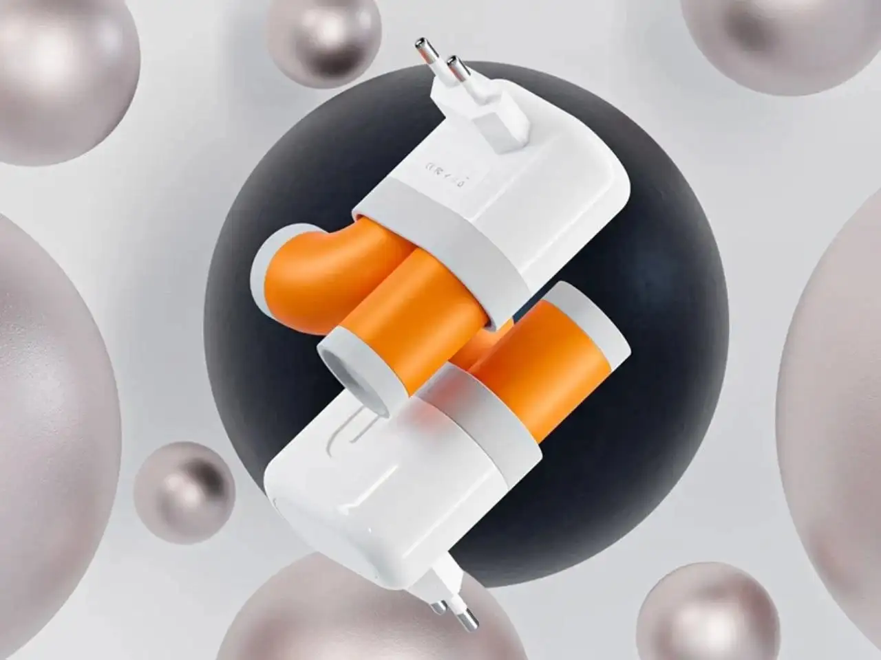
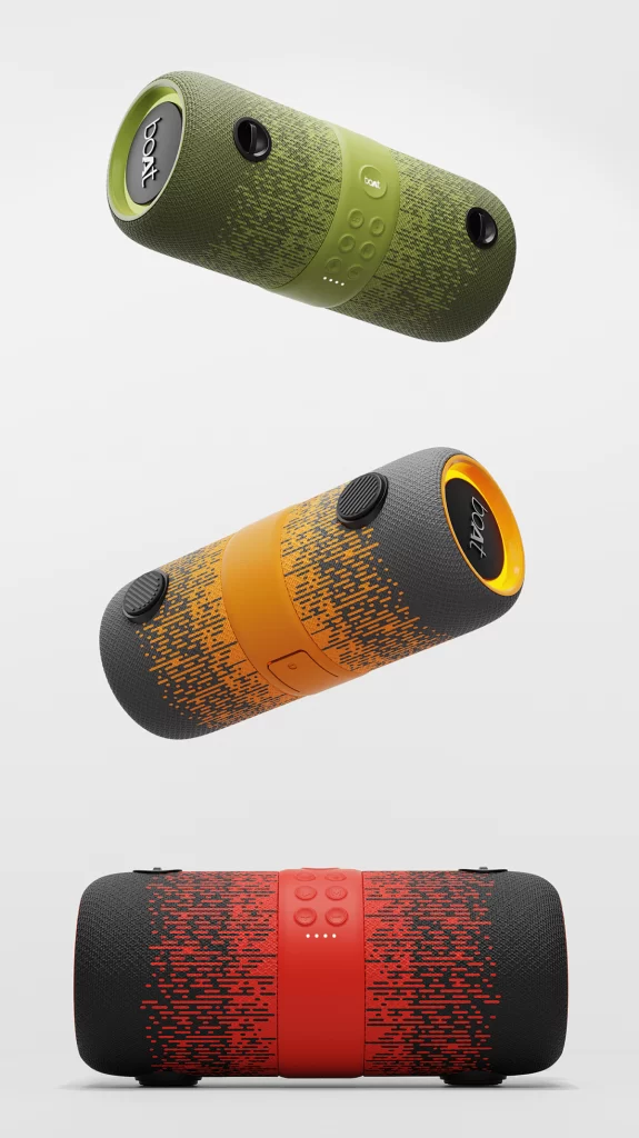
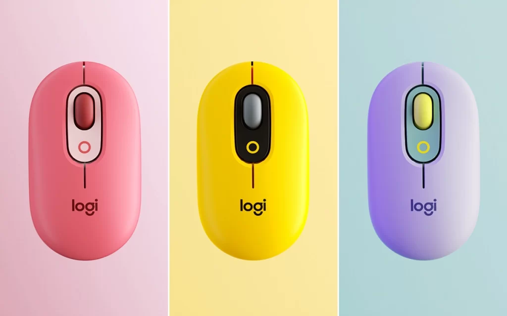
场景适配是配色的 “隐形规则”。户外装备需要醒目撞色(如橙与黑)以应对复杂环境,母婴产品倾向柔和马卡龙色传递安全感,而高端奢侈品常用黑金、香槟金彰显格调。同时,考虑使用场景的光线条件(如室内照明、户外强光)与终端载体(APP 界面、实体包装),确保色彩还原度与视觉舒适度,才能让配色真正服务于用户体验。
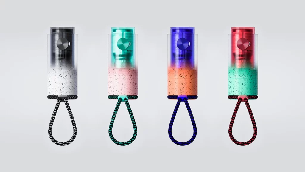
产品配色的本质,是用视觉语言讲述品牌故事。从目标用户的心理需求出发,结合场景特性与美学趋势,让色彩成为产品竞争力的起点 —— 毕竟,打动人心的设计,往往始于那一抹恰到好处的颜色。
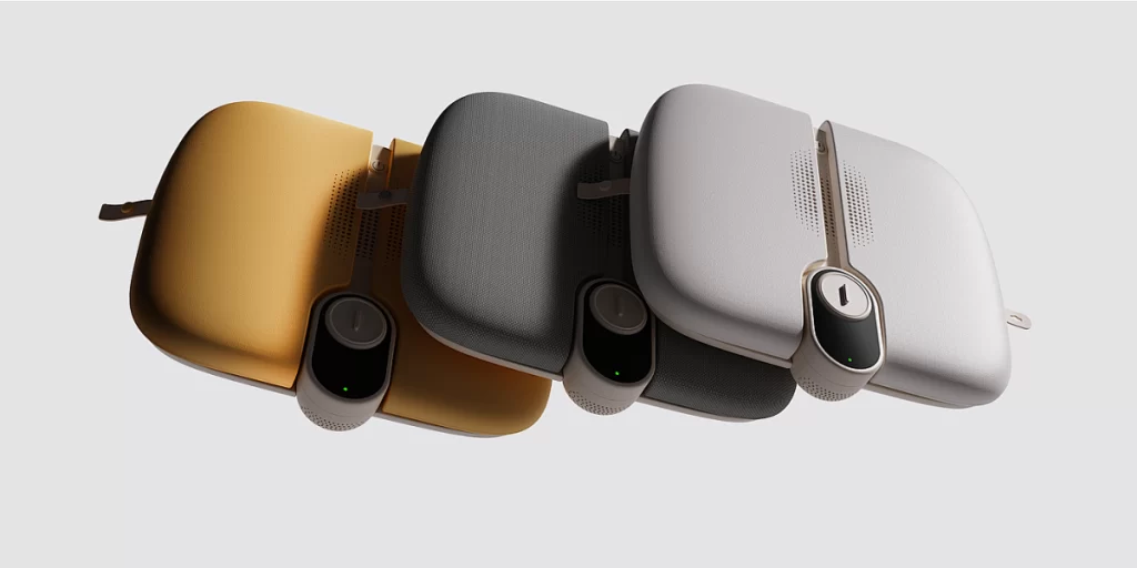
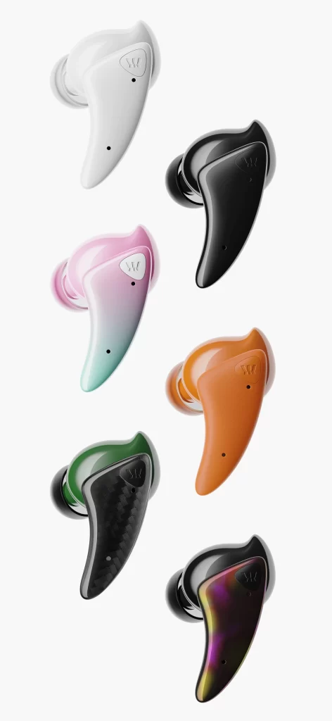
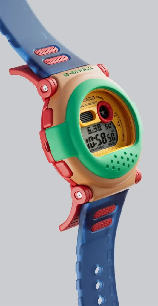
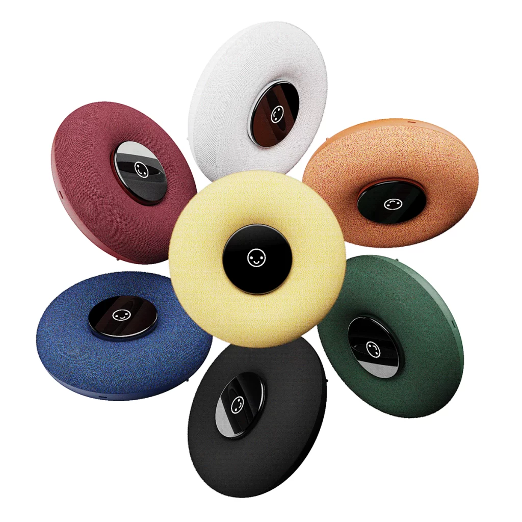
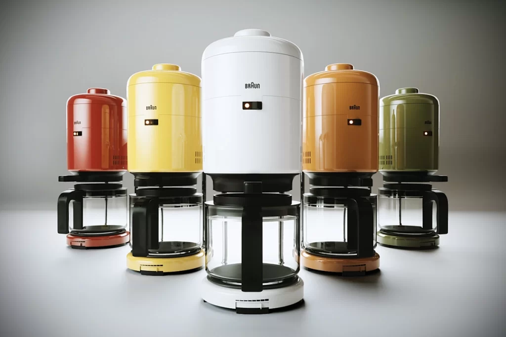
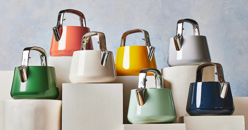
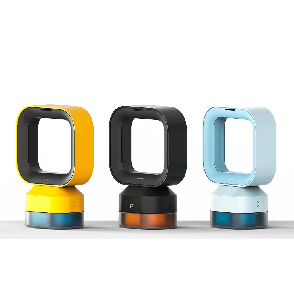
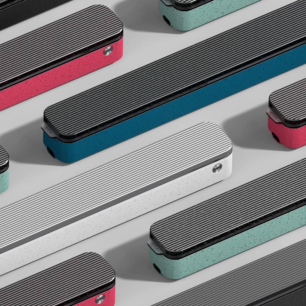
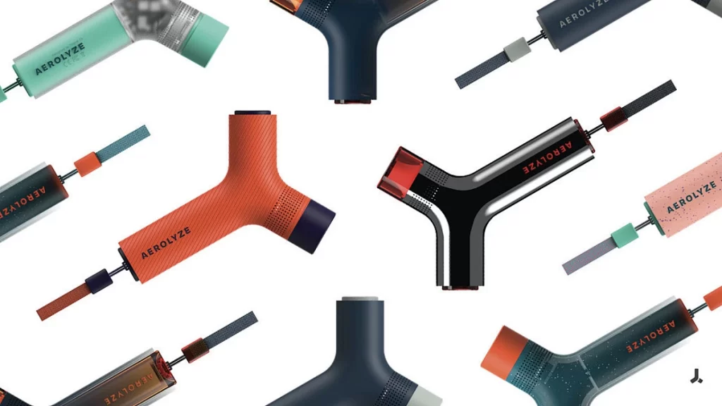
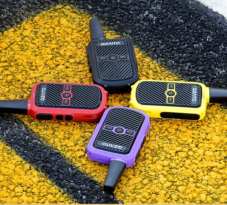
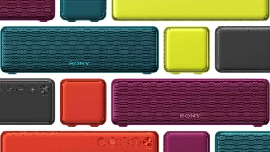
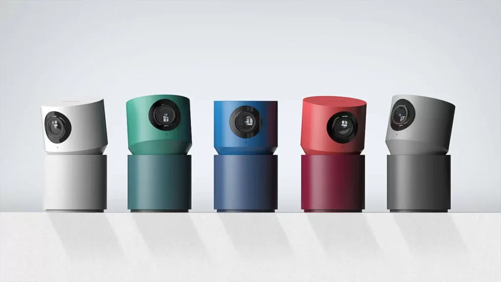
NINEIDEA:In product design, color matching is a silent ‘salesperson’. It is not only an aesthetic expression, but also a bridge for brand and user communication, directly affecting consumers’ cognition, emotions, and purchasing decisions.
Color is the first impression of the “door opener”. The human response time to color is only 0.05 seconds, and bright colors can instantly catch the eye – such as the high saturation red and yellow colors commonly used by sports brands, conveying vitality and passion; Technology products prefer silver gray and deep blue to create a sense of professionalism and futurism. When consumers browse on e-commerce platforms, adapting to high contrast color schemes displayed on the screen (such as white background, black text, and bright color accents) can significantly increase the click through rate of product images, making your product stand out among similar competitors.
Color matching is the “visual fingerprint” of a brand. There are countless classic cases: Tiffany blue symbolizes elegance and luxury, while IKEA’s yellow blue combination conveys approachability and vitality. These iconic color schemes have already surpassed color itself and become part of brand assets. A unified color scheme can enhance user memory. When consumers search for “ins style home” and “minimalist design”, low saturation Morandi color schemes or black, white, and gray combinations are more likely to trigger associations, forming a brand recognition of “recognizing the color before seeing its form”.
Scene adaptation is the ‘invisible rule’ of color matching. Outdoor equipment requires eye-catching contrasting colors (such as orange and black) to cope with complex environments. Maternal and child products tend to use soft macaron colors to convey a sense of security, while high-end luxury goods often use black gold and champagne gold to highlight style. At the same time, considering the lighting conditions of the usage scenario (such as indoor lighting, outdoor strong light) and the terminal carrier (APP interface, physical packaging), ensuring color reproduction and visual comfort, can the color matching truly serve the user experience.
The essence of product color matching is to tell the brand story through visual language. Starting from the psychological needs of the target users, combined with the characteristics of the scene and aesthetic trends, color becomes the starting point of product competitiveness – after all, design that touches people’s hearts often begins with the perfect color.


