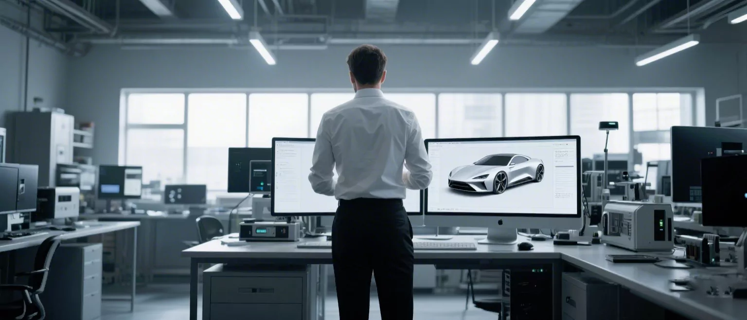
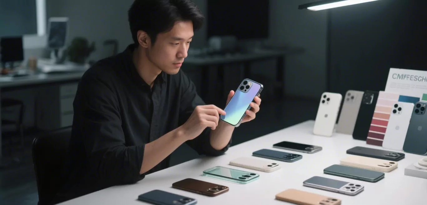
NINEIDEA:在工业设计领域,色彩不仅是视觉符号的叠加,更是传递品牌理念、影响用户决策的“超级符号”核心要素。2025 年,随着消费升级与数字化营销的深化,色彩设计已从 “辅助角色” 转变为产品差异化竞争的关键突破口。本文解析工业设计中色彩组合的策略价值,为企业提供实用方法论。
色彩是工业设计的 “无声语言”
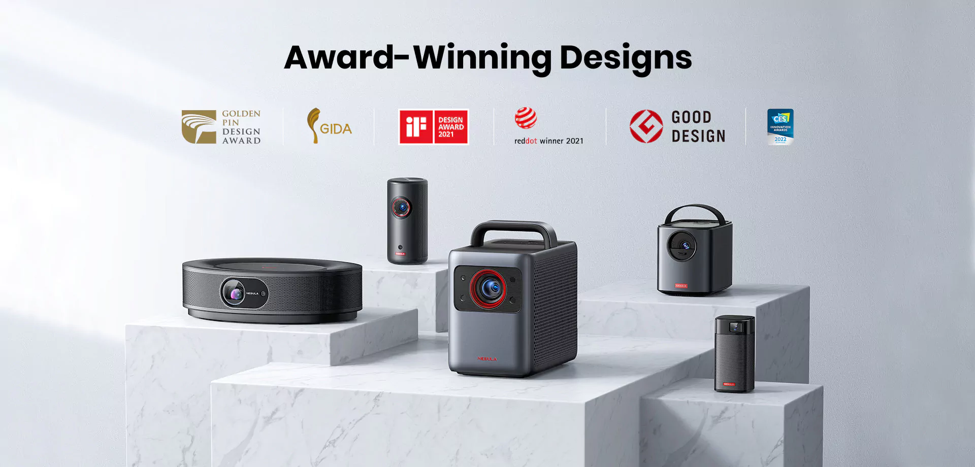
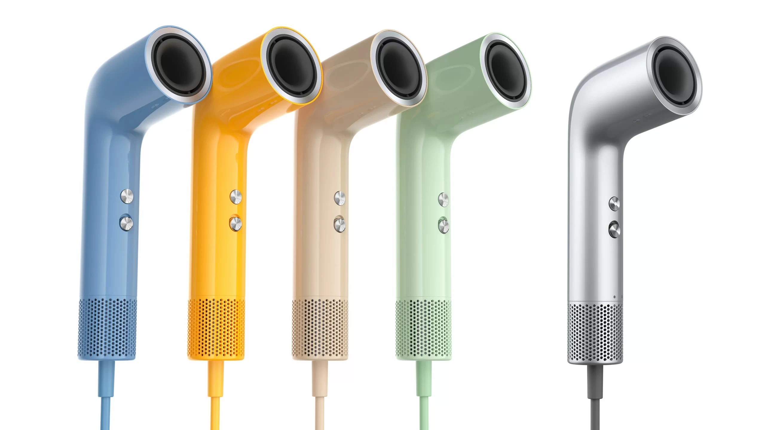
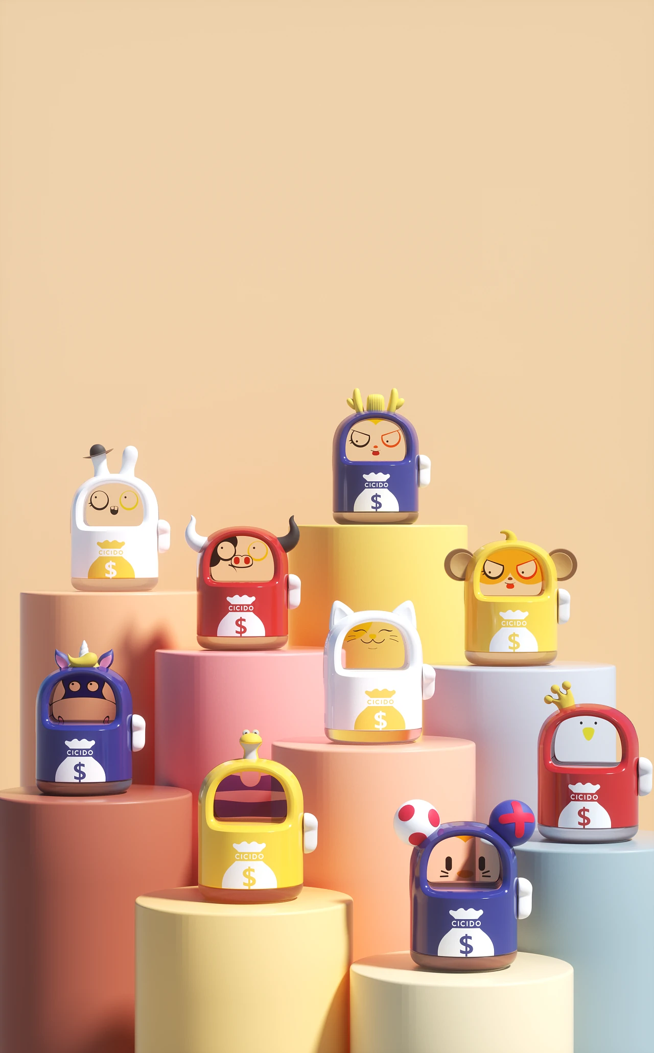
色彩心理学研究表明,用户对产品的第一印象中,色彩贡献度高达 60%。工业设计通过精准的色彩组合,能快速建立与用户的情感连接。例如,医疗设备常用中性色(如银灰、浅蓝)传递专业与安全感,而儿童智能手表则采用高饱和度撞色(如明黄 + 宝蓝)激发活力与好奇心。
色彩组合的 “黄金法则”
工业设计中的色彩搭配需遵循科学逻辑,而非单纯依赖主观审美:
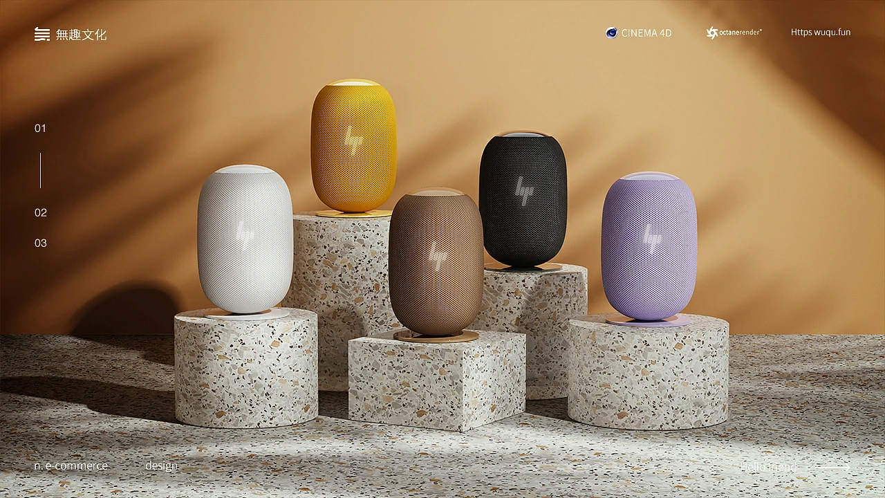
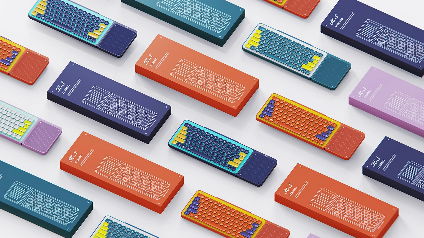
对比与和谐:通过互补色(如红与绿)或邻近色(如蓝与紫)的比例调控,平衡视觉冲击力与舒适性。
功能导向:交互界面中的警示色(如红色)、操作引导色(如绿色)需严格遵循行业标准。
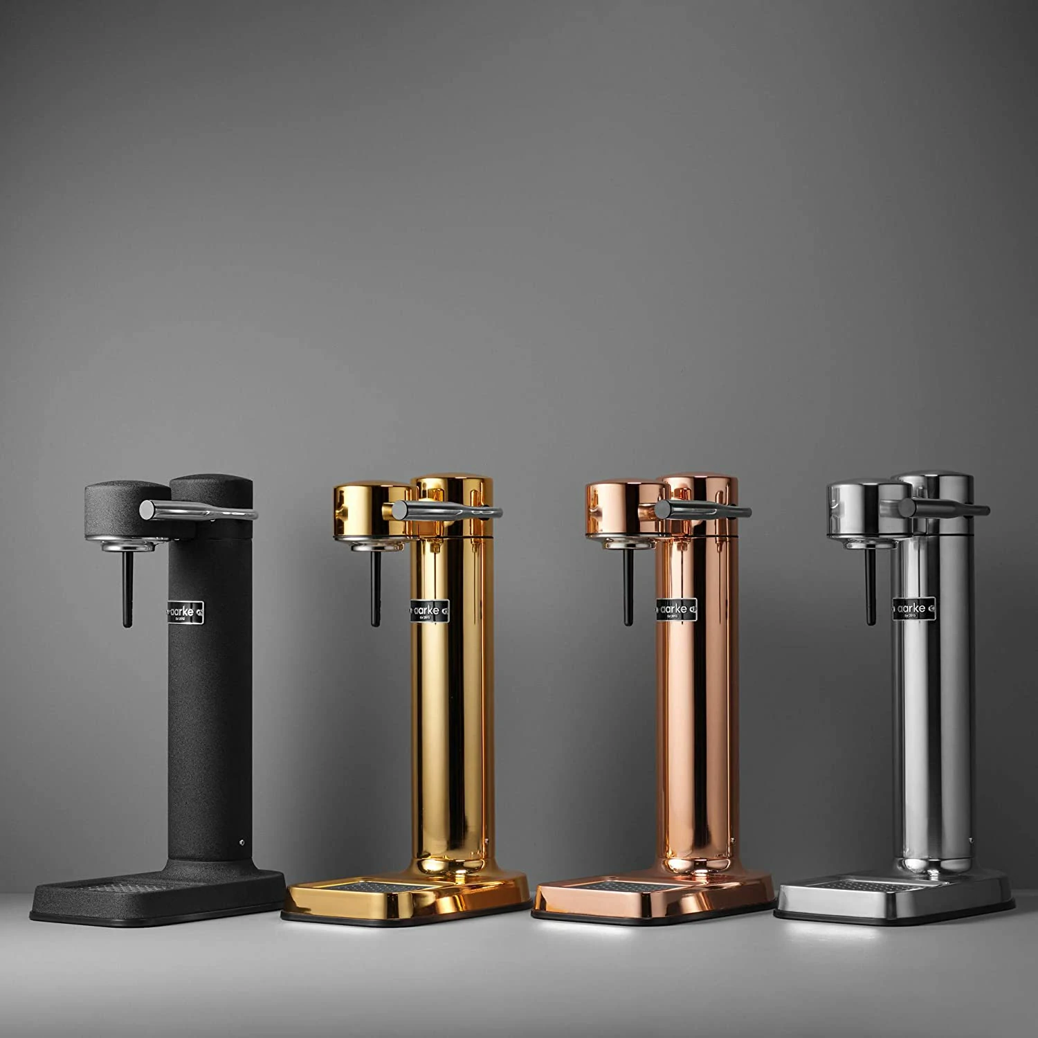
文化适配:针对不同市场进行色彩本土化,例如金色在奢侈品领域象征尊贵,在某些地区却可能寓意浮夸。
2025 年工业设计色彩趋势
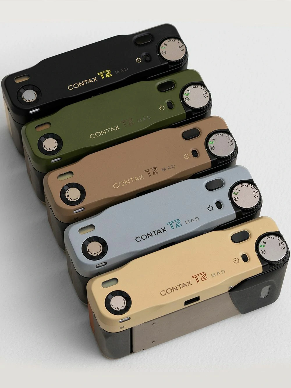
可持续色系:大地色、橄榄绿等自然色调成为环保主题产品的主流选择。
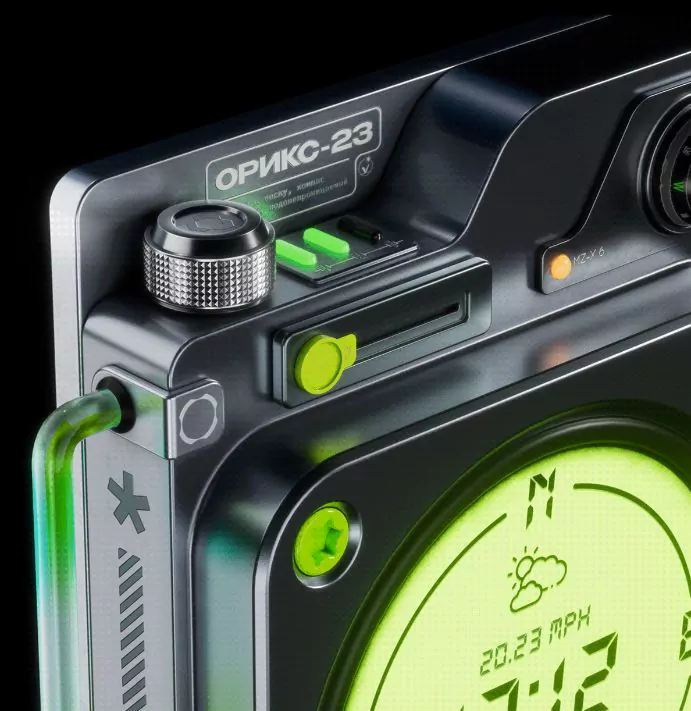
数字霓虹:荧光粉、镭射金等未来感色彩在科技产品中持续升温。
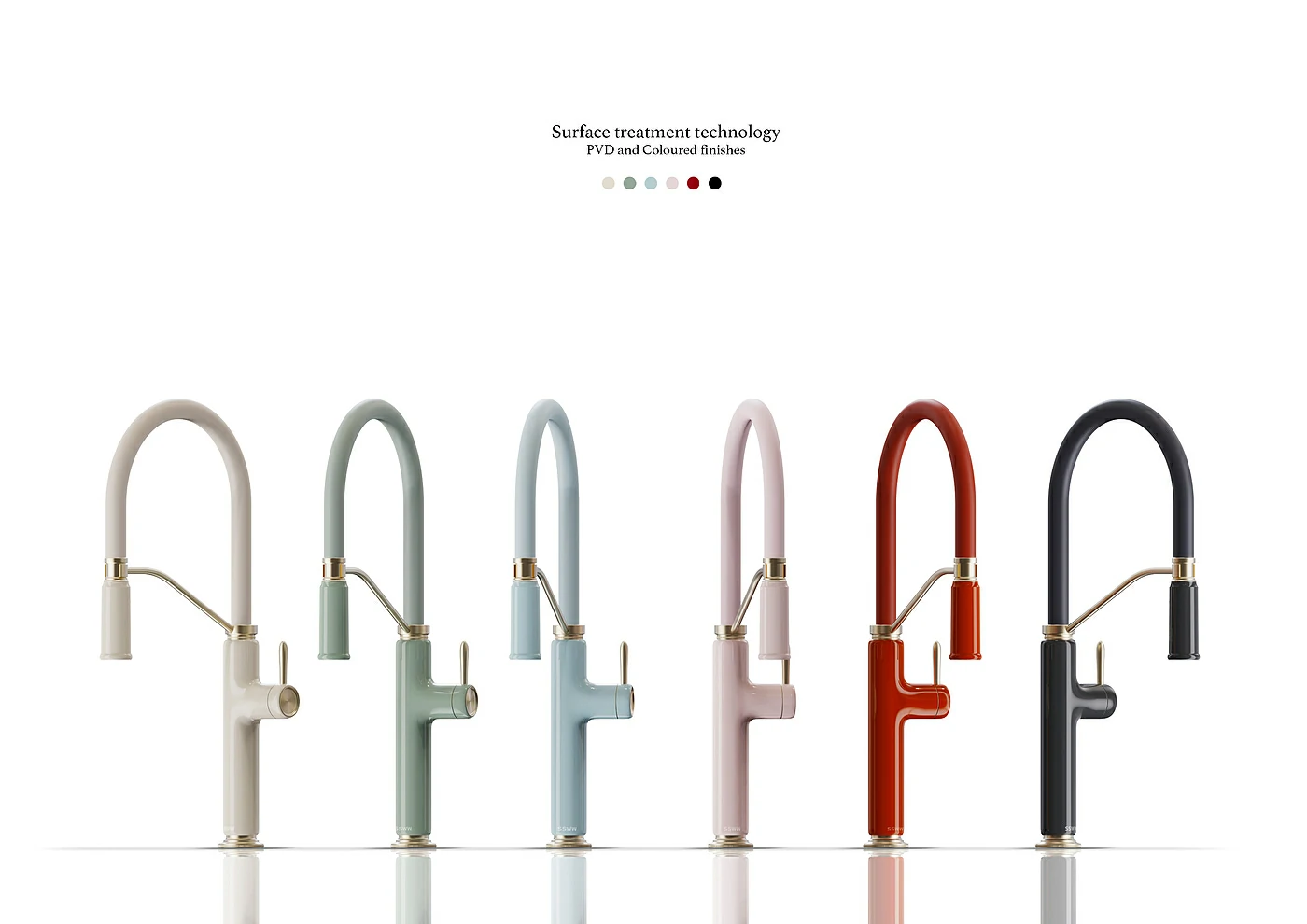
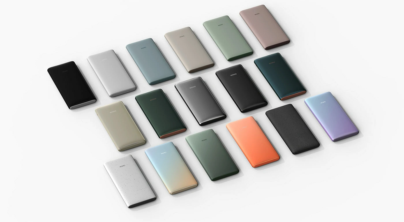
情绪治愈色:低饱和莫兰迪色系广泛应用于家居与健康设备设计。
让色彩成为产品的 “超级符号”
工业设计中的色彩组合不仅是美学表达,更是商业战略的延伸。通过科学的色彩心理学应用、文化适配,为企业打造兼具视觉吸引力与市场穿透力的产品。
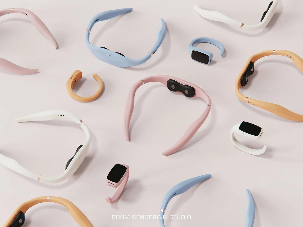
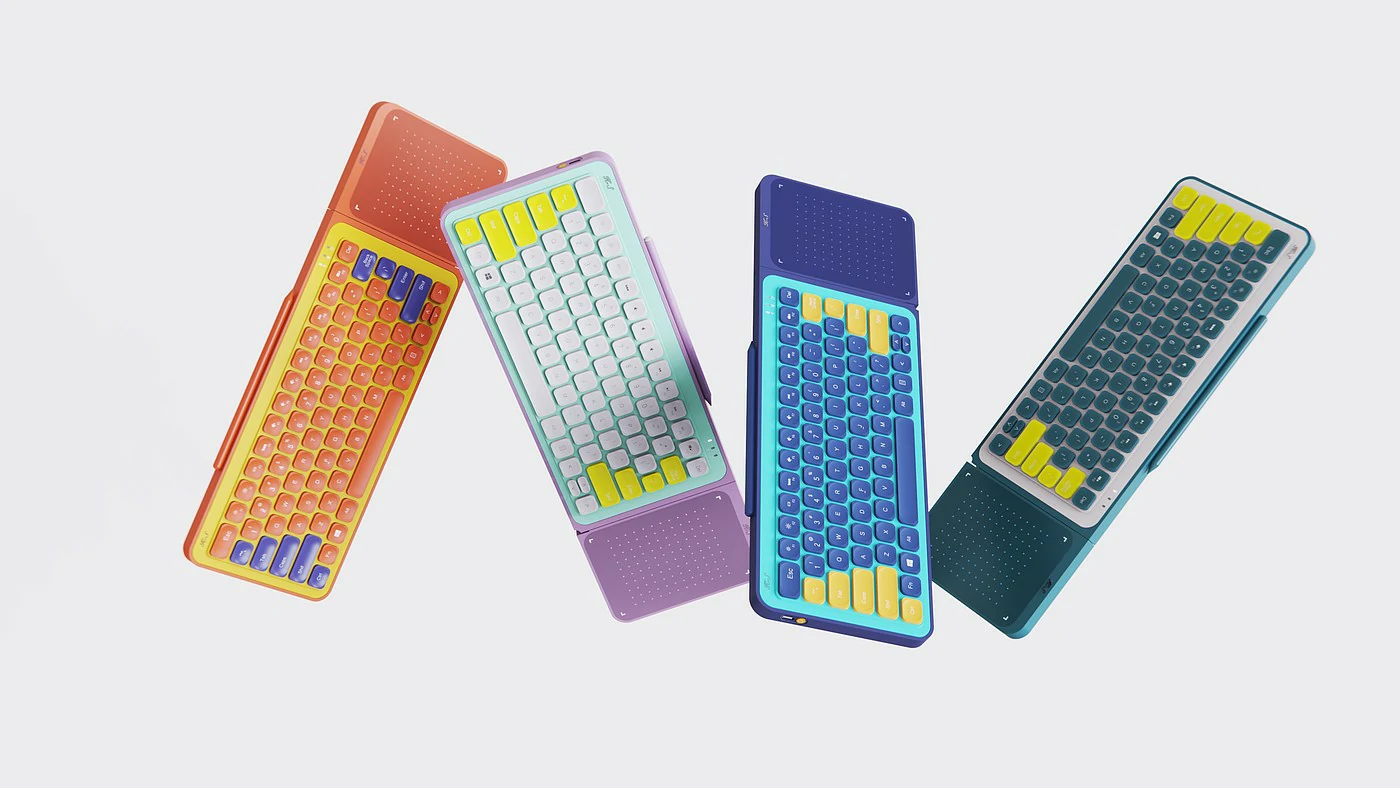


NINEIDA: In the field of industrial design, color is not only a visual symbol overlay, but also a core element of “super symbols” that convey brand concepts and influence user decisions. In 2025, with the deepening of consumer upgrading and digital marketing, color design has shifted from an “auxiliary role” to a key breakthrough in product differentiation competition. This article analyzes the strategic value of color combination in industrial design and provides practical methodology for enterprises.
Color is the ‘silent language’ of industrial design
Color psychology research shows that in users’ first impression of a product, color contributes up to 60%. Industrial design can quickly establish emotional connections with users through precise color combinations. For example, neutral colors such as silver gray and light blue are commonly used in medical devices to convey professionalism and security, while children’s smartwatches use high saturation contrasting colors such as bright yellow and navy blue to stimulate vitality and curiosity.
The ‘Golden Rule’ of Color Combination
The color matching in industrial design should follow scientific logic, rather than relying solely on subjective aesthetics:
Contrast and Harmony: By adjusting the proportion of complementary colors (such as red and green) or adjacent colors (such as blue and purple), balance visual impact and comfort.
Functional orientation: Warning colors (such as red) and operation guidance colors (such as green) in the interactive interface must strictly follow industry standards.
Cultural adaptation: localizing colors for different markets, for example, gold symbolizes luxury in the luxury goods industry, but may imply exaggeration in certain regions.
Color Trends in Industrial Design in 2025
Sustainable color schemes: Natural tones such as earthy tones and olive green have become mainstream choices for environmentally friendly themed products.
Digital neon: futuristic colors such as fluorescent powder and laser gold continue to heat up in technology products.
Emotional healing colors: The low saturation Morandi color series is widely used in home and health device design.
Make color the “super symbol” of products
The color combination in industrial design is not only an aesthetic expression, but also an extension of commercial strategy. By applying scientific color psychology and cultural adaptation, we aim to create products that combine visual appeal and market penetration for enterprises.


