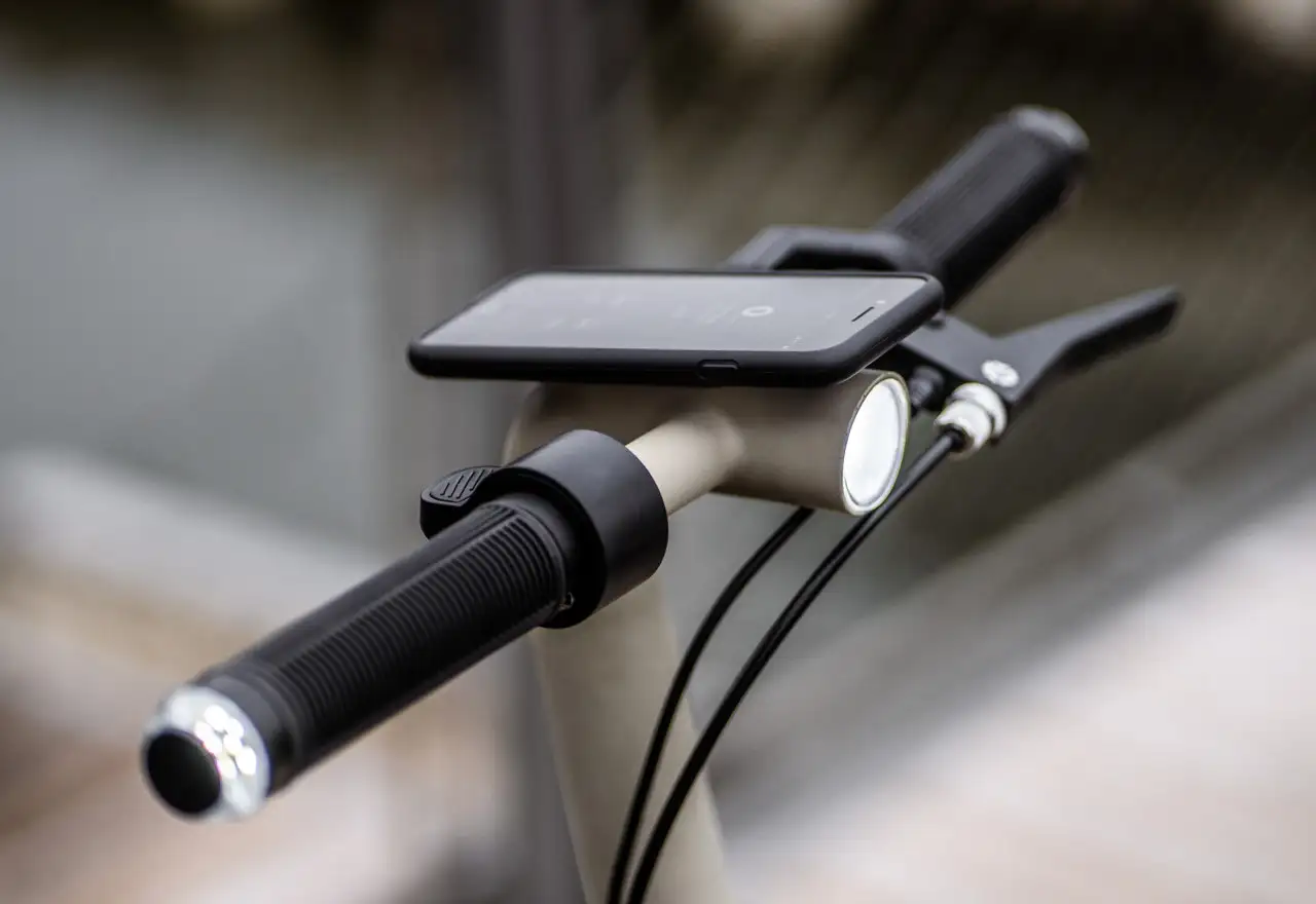
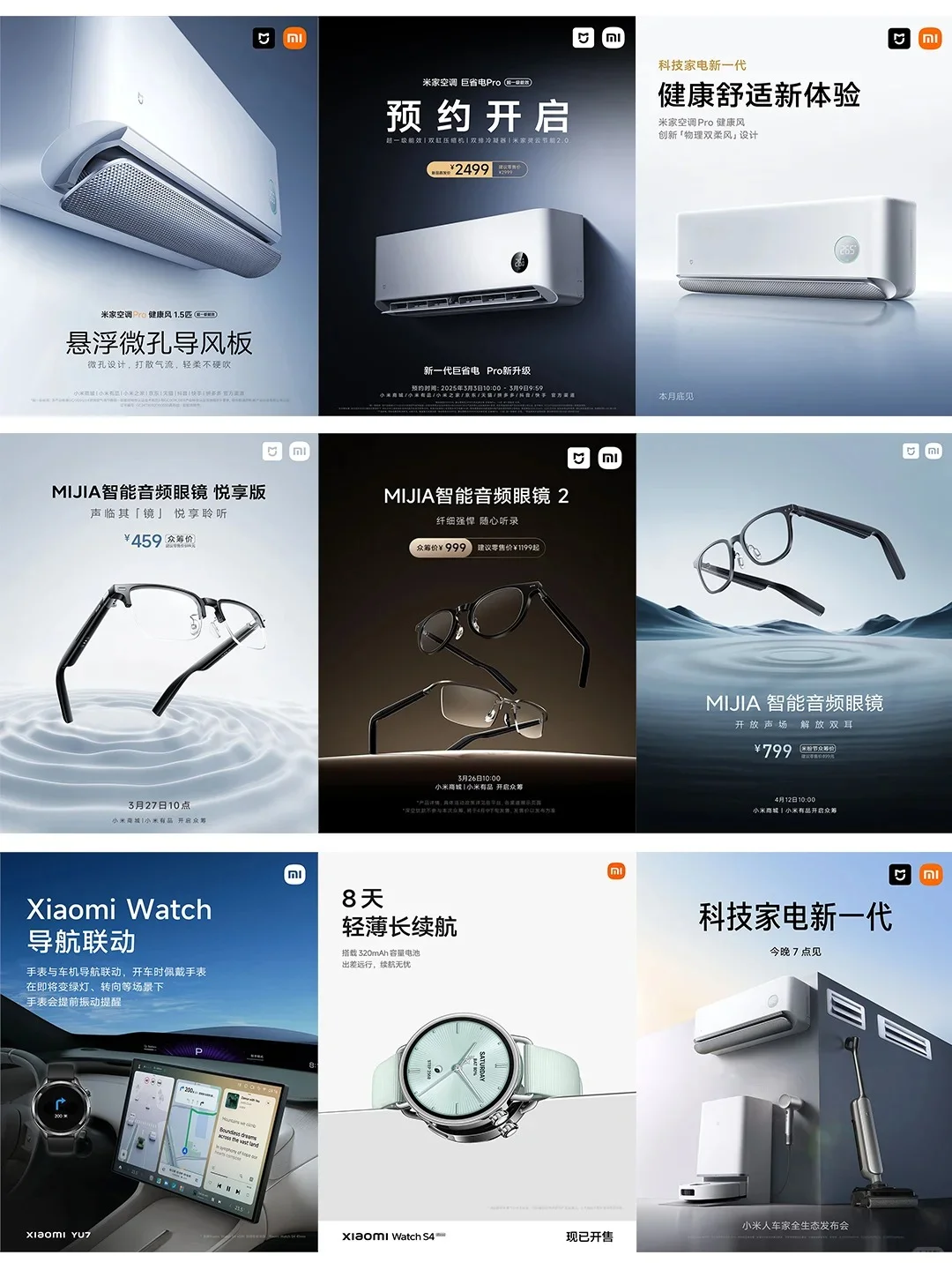
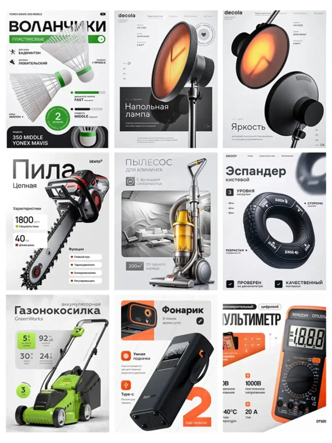
NINEIDEA:大家平时买东西,哪怕是个杯子、一部手机,第一眼注意到的肯定是颜色好不好看,摸起来手感咋样,有没有那种 “产品高级感”—— 这些其实都和工业设计CMF脱不了干系。CMF听起来挺专业,拆开来就是颜色(Color)、材料(Material)、工艺(Finishing)的组合搭配,就像给产品 “穿衣服”,穿得对不对味,直接影响大家愿不愿意多看两眼,甚至掏钱买单。
颜色(Color)
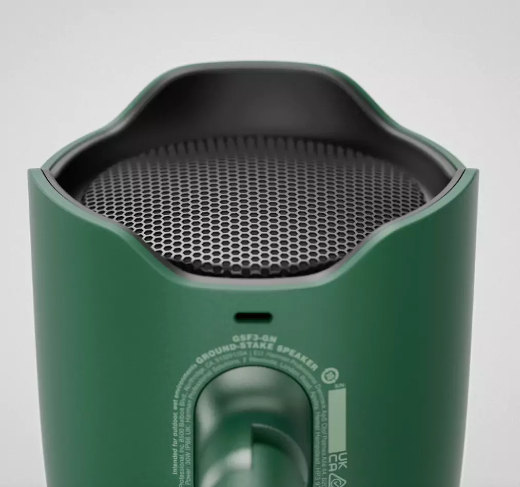
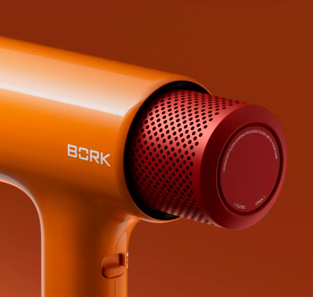
你看苹果手机每年出新色,远峰蓝、暗夜紫这些名字一出来,网上讨论度立马拉满。颜色可不是随便选的,它得带着品牌的 “性格”:特斯拉的冷灰色透着科技感,薄荷绿的戴森吹风机显得清新精致,故宫文创的朱红配色自带文化厚重感。而且颜色还会 “骗人”—— 同样体积的产品,深色显小、浅色显大,哑光色看着低调,亮面色更吸引眼球,这些小心思都是设计师用颜色在和用户 “对话”。
材料(Material)
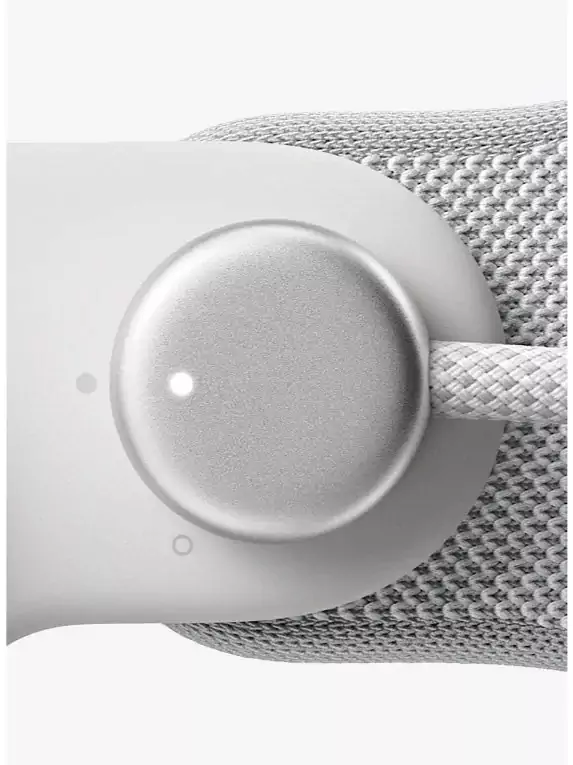
前几年戴口罩时,金属耳挂和塑料耳挂给人的感觉完全不一样,前者精致但可能夹耳朵,后者便宜但容易断,这就是材料带来的体验差异。现在很多家电喜欢用岩板、编织纹理,家具爱用胡桃木、磨砂金属,不是单纯为了贵,而是材料本身的质感能传递产品定位:实木家具让人觉得温暖自然,碳纤维配件一看就是主打轻量化高性能。材料还得 “听话”,比如手机后盖用玻璃还是陶瓷,得考虑信号、散热、重量,甚至摔地上耐不耐磕,CMF 里的材料选择从来不是 “单相思”,得和功能、成本、工艺一起打配合。
工艺(Finishing)
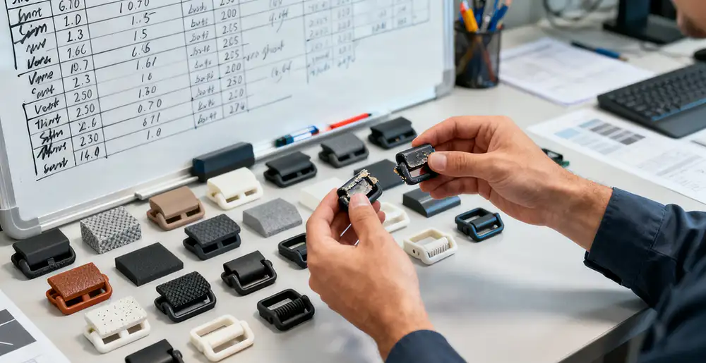
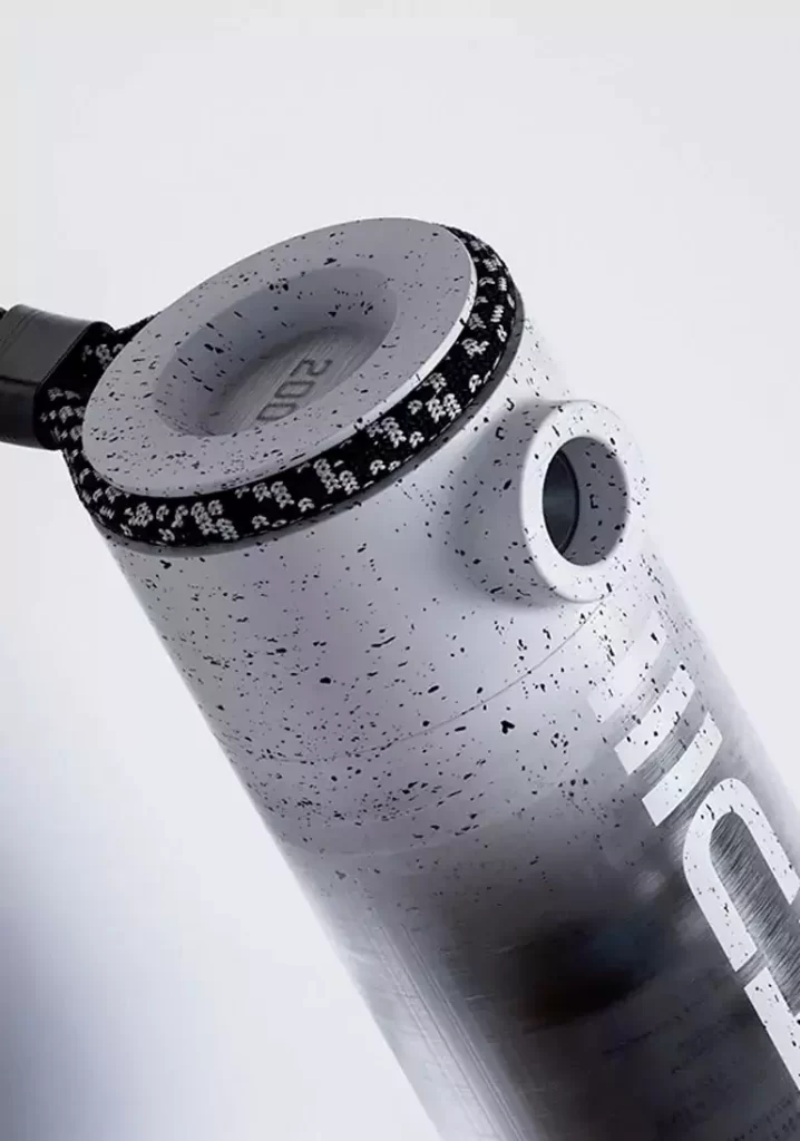
同样是金属材质,阳极氧化能做出渐变效果,喷砂处理会有细腻磨砂感,电镀工艺能呈现镜面反光 —— 工艺就像给材料 “化妆”,细节处见真章。比如小米的 “布拉格背盖” 把玻璃做出陶瓷质感,华为 Mate 系列的素皮材质通过压纹处理模拟皮革纹理,这些工艺不仅让产品好看,还解决了 “指纹收集器”“沾灰难打理” 的痛点。有时候一个看似简单的圆角、一道细微的棱线,背后可能藏着十几种工艺方案的反复测试,为的就是让用户摸起来顺手,看起来顺眼。
其实工业设计和CMF的关系,就像做饭时的食材搭配
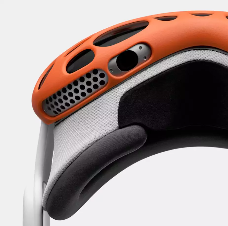
颜色是调味,决定第一口的 “味觉”;材料是主料,奠定基础质感;工艺是火候,掌控最终呈现的 “口感”。好的 CMF 不是堆贵材料、追流行色,而是让颜色、材料、工艺像乐队一样合奏 —— 比如户外冲锋衣,用荧光色保证安全识别,耐磨的尼龙面料搭配防水涂层工艺,功能和颜值都在线;再比如儿童玩具,柔和的马卡龙色减少视觉刺激,亲肤的 ABS 材料搭配无锐角打磨工艺,让家长觉得放心。
CMF是工业设计里 “看得见摸得着” 的灵魂。
当你拿到一个产品,没仔细想就觉得 “这东西做得真讲究”,那大概率是 CMF 在悄悄发力 —— 它让冰冷的工业产物有了温度,让 “能用” 变成 “想用”,让 “普通” 变成 “独特”。下次买东西时不妨多留意两眼,说不定你喜欢的那个点,正是设计师在 CMF 里藏的小心机呢。
Color+Material+Craftsmanship: The Soul of Industrial Design CMF

NINEIDEA. CMF sounds quite professional. When disassembled, it’s a combination of color, material, and finishing, just like dressing a product. Whether it’s worn correctly or not directly affects whether people are willing to take a second look or even pay for it.
Color (Color)
You see, Apple phones come in new colors every year. As soon as names like Far Peak Blue and Dark Night Purple come out, the online discussion immediately becomes full. Color is not a random choice, it has to carry the brand’s “personality”: Tesla’s cool gray exudes a sense of technology, the mint green Dyson hair dryer looks fresh and exquisite, and the Palace Museum’s cultural and creative vermilion color scheme comes with a cultural weight. Moreover, colors can also “deceive” – for products of the same volume, dark colors appear smaller, light colors appear larger, matte colors look low-key, and bright faces are more eye-catching. These careful considerations are all designers using colors to “communicate” with users.
Material
A few years ago, when wearing a mask, the feeling of metal ear hooks and plastic ear hooks was completely different. The former was delicate but could pinch the ears, while the latter was cheap but easy to break. This is the experience difference brought by the materials. Nowadays, many household appliances like to use rock panels and woven textures, and furniture likes to use walnut wood and frosted metal.
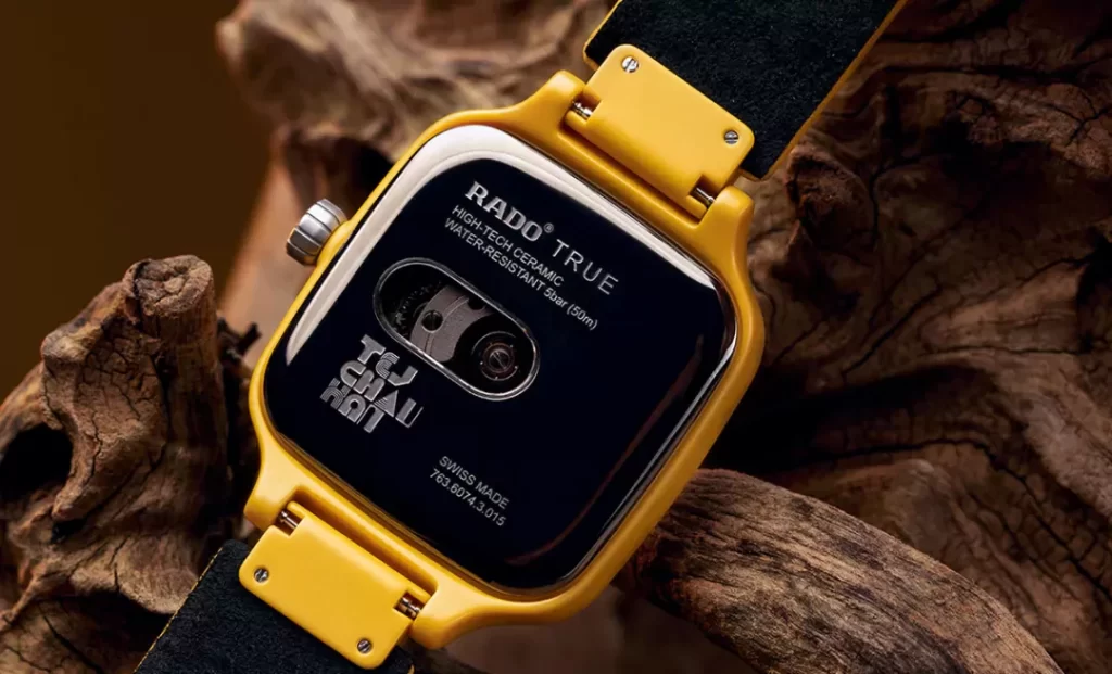
It’s not just for the sake of being expensive, but because the texture of the material itself can convey the product positioning: solid wood furniture makes people feel warm and natural, and carbon fiber accessories are obviously focused on lightweight and high-performance. The materials also need to be “obedient”, for example, whether to use glass or ceramic for the back cover of a mobile phone, you need to consider the signal, heat dissipation, weight, and even whether it can withstand being knocked on the ground. The material selection in CMF is never “unrequited love”, it needs to be coordinated with functionality, cost, and craftsmanship.
Craftsmanship (Finishing)
Similarly made of metal material, anodizing can create a gradient effect, sandblasting treatment can provide a delicate frosted feel, and electroplating process can present a mirror reflection – the process is like “makeup” for the material, with details visible. For example, Xiaomi’s “Prague back cover” creates a ceramic texture on the glass, while Huawei Mate series’ plain leather material simulates leather texture through embossing.
These processes not only make the product look good, but also solve the pain points of “fingerprint collectors” and “difficult to maintain when stained with dust”. Sometimes a seemingly simple rounded corner or a subtle edge may hide over a dozen repeated testing techniques behind it, all in order to make it easy for users to touch and look pleasing to the eye.
In fact, the relationship between product design and CMF is like the pairing of ingredients when cooking
Color is the seasoning that determines the first taste; Materials are the main ingredients, laying the foundation for texture; Craftsmanship is about the heat, which controls the final presentation of the ‘taste’. A good CMF is not about piling up expensive materials or chasing trendy colors, but about letting colors, materials, and craftsmanship play together like a band – for example, outdoor jackets use fluorescent colors to ensure safety recognition, durable nylon fabrics paired with waterproof coating technology, and both functionality and appearance are online; For example, for children’s toys, the soft macaron color reduces visual stimulation, and the skin friendly ABS material combined with non sharp angle polishing technology makes parents feel at ease.
CMF is the soul that can be seen and touched in product design.
When you receive a product and think ‘this thing is really exquisite’ without careful consideration, it is highly likely that CMF is quietly making efforts – it gives cold industrial products a temperature, turning ‘usable’ into ‘desired’, and ‘ordinary’ into ‘unique’. Next time you buy something, you may want to pay more attention. Maybe the point you like is the careful machine hidden in the CMF by the designer.


