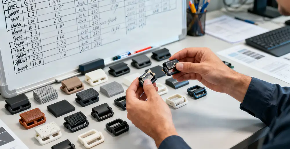
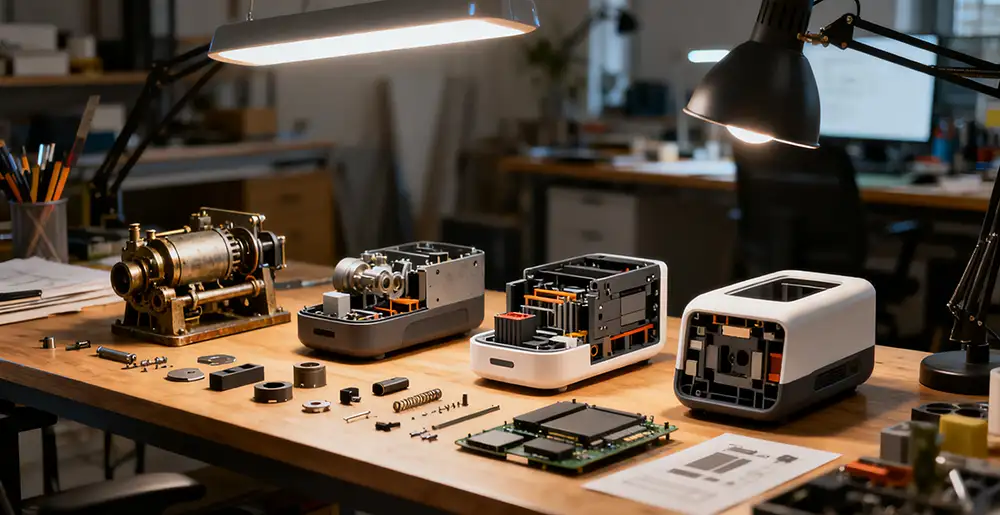
NINEIDEA:当我们把玩一个令人心动的产品,那种“说不清哪里好,但就是谁都替代不了”的感觉,往往正源于那些被精心雕琢的细节。它们不像功能那样张扬,却如同一位体贴的管家,在无声中理解你、迎合你、甚至取悦你。下面一起解码工业产品设计细节中的“魔鬼”,探究这些动人细节背后共通的设计要素:
视觉的秩序与韵律
- 一致性: 颜色、字体、图标风格、圆角大小、间距比例……整套界面的视觉语言高度统一。这不仅是美学的追求,更是降低用户认知负荷的关键。当你看到一个新页面,能凭借之前的经验本能地知道每个元素的作用,这就是细节的力量。
- 信息层级: 通过大小、粗细、颜色和留白,清晰地告诉用户“先看哪里,后看哪里”。优秀的细节设计从不让你在页面上迷失,它能引导你的视线,像一位导游般顺畅。
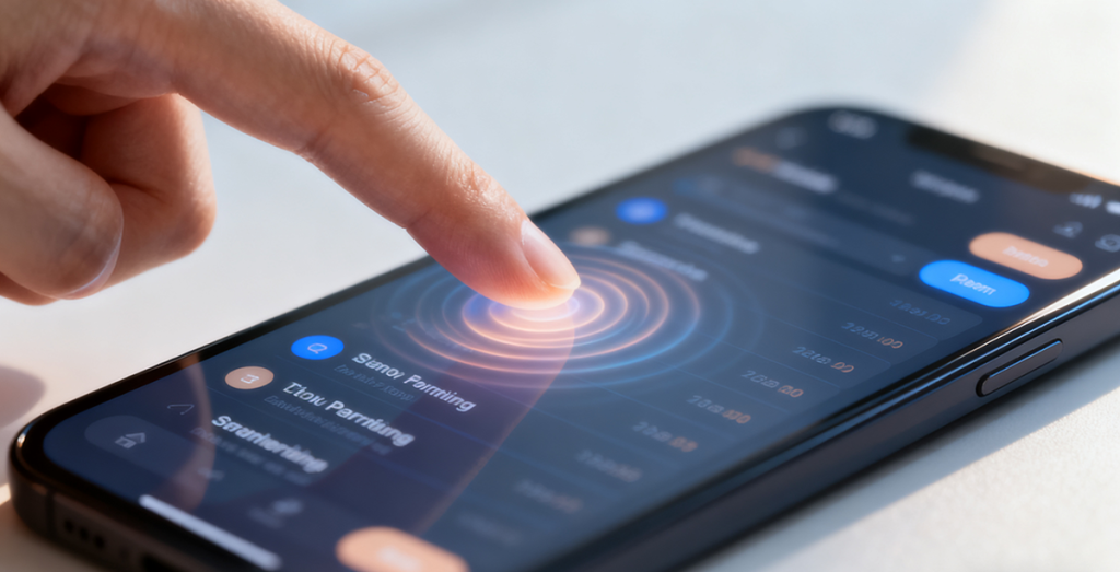
- 微交互的反馈: 按钮被按下时有轻微的色变或下沉,开关切换时有流畅的动画,列表滚动到尽头时有优雅的弹性效果……这些“会呼吸”的动画,让冷冰冰的屏幕拥有了物理世界的质感,提供了操作的确定感和愉悦感。
欣赏点: 下次可以注意一个App的加载动画,它可能是一个优雅的品牌Logo变形,而不是一个枯燥的圆圈。

交互的直觉与预见
- 防错与容错: 在你即将进行一个危险操作(如删除重要文件)前,系统会用一个非阻碍性的方式再次确认;当你输错密码时,输入框会轻微摇动提示,而不是只显示一行冷冰冰的红字。这种设计预见了你的失误,并温柔地接住了你。
- 减少操作步骤: 将最常用的功能放在最顺手的位置;支持手势操作(如左滑删除、长按编辑);提供智能的默认选项。每一个被节省的点击,都是对用户时间和精力的尊重。
- 状态的可视化: 一个上传进度条、一个“已读”回执、一个表示正在处理的加载态……让用户随时知晓系统正在发生什么,消除了不确定性带来的焦虑。
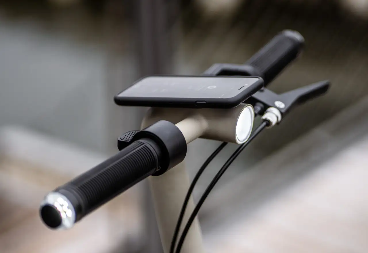
欣赏点: 很多硬件产品上的多功能按键,短按、长按、双击分别对应不同功能,这就是在有限物理空间内对交互直觉的极致探索。
情感的连接与共鸣
- 惊喜感与彩蛋: 在404错误页面放一个有趣的小动画,在下拉刷新时藏一个好玩的插画,在完成一个艰巨任务后给你一句温暖的鼓励语。这些超出预期的“小彩蛋”,瞬间拉近了产品与用户的距离,让产品拥有了人格魅力。
- 文案的温度: 将生硬的“错误代码-1001”转化为“网络好像开小差了,请稍后再试”;将“提交”按钮的文字改成“立即开启旅程”。有温度的文案,是与用户的一次真诚对话。
- 对特殊群体的关怀: 提供足够高的颜色对比度供色弱用户识别,为所有图片添加准确的替代文本供视障用户阅读,考虑左撇子的使用习惯。这种“看不见”的细节,是设计中最高的善意。
欣赏点: 可以观察一些产品在节日时,图标或界面发生的细微变化,这种“节日皮肤”就是一种情感化的细节。

工艺的质感与诚实
- 材质与触感: 一个笔记本的纸张是否顺滑且不易渗墨?一个手机外壳的涂层是否亲肤且防指纹?一个旋钮的阻尼感是否清晰且有质感?这些物理上的触觉反馈,构成了产品“高级感”的基石。
- 声音的品格: 相机快门声、键盘敲击声、车门关闭的厚重声……这些声音不是偶然,而是经过精心设计的品牌印记。它们定义了产品的“听觉Logo”。
- 结构的合理性: 接口的排列是否便于同时插拔?散热孔的设计是否兼具功能与美学?内部元件的布局是否为了更好的维修性?这些藏在“皮肤”之下的骨骼,体现了设计者对产品全生命周期的思考。
欣赏点: 苹果MacBook的MagSafe磁吸充电口,不仅防止绊倒,那一声清脆的“咔嗒”声和顺滑的吸附感,本身就是一种享受。
优秀的细节设计,本质上是一场无声的对话
它不在于堆砌多少炫技的功能,而在于:
- 它是否「理解」我? (直觉)
- 它是否「尊重」我? (效率)
- 它是否「关心」我? (情感)
- 它是否「超越」我的期待? (惊喜)
下次当你去欣赏那些令人拍案叫绝的设计细节时,不妨带着这些视角去解读。你会发现,每一个微小的“哇塞”瞬间,背后都是设计者对用户深刻洞察与不懈追求的结晶。

魔鬼在细节中,但天使,也在那里。
@NINEIDEA九号创新 www.nineidea.com
NINEIDEA: When we play with an exciting product, the feeling of “I can’t say where it is good, but no one can replace it” is often due to the carefully carved details. They are not as flashy as their functions, but like a considerate butler who silently understands, caters to, and even pleases you. Let’s decode the “devil” in the design details of industrial products and explore the common design elements behind these touching details:
Visual order and rhythm
Consistency: The visual language of the entire interface is highly unified in terms of color, font, icon style, corner size, spacing ratio, etc. This is not only the pursuit of aesthetics, but also the key to reducing user cognitive load. When you see a new page, you can instinctively know the function of each element based on your previous experience, which is the power of details.
Information hierarchy: Clearly tell users “where to look first, then where to look” through size, thickness, color, and white space. Excellent detail design never leaves you lost on the page, it guides your gaze smoothly like a tour guide.
Feedback from micro interactions: there is a slight color change or sinking when the button is pressed, smooth animations when the switch is switched, and elegant elastic effects when the list scrolls to the end… These “breathing” animations give the cold screen a physical world texture, providing a sense of certainty and pleasure in operation.
Appreciation point: Next time, you can pay attention to the loading animation of an app, which may be an elegant brand logo transformation instead of a boring circle.
Intuition and foresight in interaction
Error prevention and tolerance: Before you are about to perform a dangerous operation (such as deleting important files), the system will confirm again in a non obstructive manner; When you enter the wrong password, the input box will shake slightly to prompt, instead of just displaying a cold red line. This design foresaw your mistakes and gently caught you.
Reduce operational steps: Place the most commonly used functions in the most convenient location; Support gesture operations (such as left swipe to delete, long press to edit); Provide intelligent default options. Every saved click is a respect for the user’s time and energy.
Visualization of status: an upload progress bar, a “read” receipt, a loading status indicating processing… allows users to be aware of what is happening in the system at any time, eliminating anxiety caused by uncertainty.
Appreciation point: The multifunctional buttons on many hardware products, short press, long press, and double-click correspond to different functions, which is the ultimate exploration of interactive intuition in limited physical space.
Emotional connection and resonance
Surprise and Easter eggs: Put a fun little animation on the 404 error page, hide a fun illustration when refreshing from the drop-down menu, and give you a warm encouragement after completing a difficult task. These unexpected “little Easter eggs” instantly brought the product closer to the user, giving the product a personality charm.
The warmth of the copy: Transform the rigid “error code-1001” into “the network seems to have gone wrong, please try again later”; Change the text of the ‘submit’ button to ‘start the journey immediately’. A warm copy is a sincere conversation with users.
Care for special groups: Provide sufficient color contrast for color weak users to recognize, add accurate alternative text to all images for visually impaired users to read, and consider the usage habits of left-handed users. This kind of ‘invisible’ detail is the highest goodwill in design.
Appreciation point: You can observe the subtle changes in the icons or interfaces of some products during holidays, and this “holiday skin” is an emotional detail.
The texture and honesty of craftsmanship
Material and Touch: Is the paper of a notebook smooth and not prone to ink leakage? Is the coating on a phone case skin friendly and fingerprint resistant? Is the damping sensation of a knob clear and textured? These physical tactile feedbacks form the cornerstone of the product’s “high-end feel”.
The quality of sound: camera shutter sound, keyboard tapping sound, heavy sound of car door closing… These sounds are not accidental, but carefully designed brand imprints. They define the ‘auditory logo’ of the product.
Rationality of structure: Is the arrangement of interfaces convenient for simultaneous plugging and unplugging? Does the design of the heat dissipation hole have both functionality and aesthetics? Is the layout of internal components for better maintainability? These bones hidden under the ‘skin’ reflect the designer’s thinking about the entire lifecycle of the product.
Appreciation point: The MagSafe magnetic charging port on Apple MacBook not only prevents tripping, but also has a crisp “click” sound and smooth suction feeling, which is a kind of enjoyment in itself.
Excellent detail design is essentially a silent dialogue
It’s not about stacking flashy skills, but about:
Does it ‘understand’ me? (Intuition)
Does it ‘respect’ me? (Efficiency)
Does it ‘care’ about me? (Emotions)
Does it exceed my expectations? (Surprise)
Next time you appreciate those stunning design details, why not interpret them from these perspectives. You will find that every tiny ‘wow’ moment is the result of the designer’s profound insight and relentless pursuit of the user.
The devil is in the details, but the angel is also there.
@NINEIDEA九号创新 www.nineidea.com


